'use client';

import { BellOffIcon, CheckCheckIcon, SettingsIcon } from 'lucide-react';
import { useState } from 'react';

import { cn } from '@/lib/utils';
import { Avatar, AvatarFallback, AvatarImage } from '@/components/ui/avatar';
import { Badge } from '@/components/ui/badge';
import { Button } from '@/components/ui/button';
import {
  Card,
  CardContent,
  CardFooter,
  CardHeader,
  CardTitle,
} from '@/components/ui/card';
import {
  Tabs,
  TabsContent,
  TabsList,
  TabsTrigger,
} from '@/components/ui/tabs';
import { Tooltip, TooltipTrigger } from '@/components/ui/tooltip';

type Notification = {
  id: number;
  actor: string;
  slug: string;
  action: string;
  target: string;
  time: string;
  read: boolean;
  mention?: boolean;
};

const initialNotifications: Notification[] = [
  {
    id: 1,
    actor: 'Priya Raman',
    slug: 'priya-raman',
    action: 'mentioned you in',
    target: 'AUR-142 · Push notification opt-in copy',
    time: '12 min ago',
    read: false,
    mention: true,
  },
  {
    id: 2,
    actor: 'Daniel Achterberg',
    slug: 'daniel-achterberg',
    action: 'assigned you',
    target: 'AUR-157 · Billing v2 proration edge cases',
    time: '48 min ago',
    read: false,
  },
  {
    id: 3,
    actor: 'Oskar Berg',
    slug: 'oskar-berg',
    action: 'commented on',
    target: 'AUR-138 · Onboarding carousel flickers on Android 14',
    time: '2 hours ago',
    read: false,
  },
  {
    id: 4,
    actor: 'Elin Dahl',
    slug: 'elin-dahl',
    action: 'moved to Done',
    target: 'AUR-129 · Empty state for archived projects',
    time: '3 hours ago',
    read: true,
  },
  {
    id: 5,
    actor: 'Beacon Deploys',
    slug: 'beacon-deploys',
    action: 'deployed build #482 to staging for',
    target: 'Billing v2',
    time: '5 hours ago',
    read: true,
  },
  {
    id: 6,
    actor: 'Noah Fischer',
    slug: 'noah-fischer',
    action: 'accepted your invite to',
    target: 'Design System',
    time: 'Yesterday',
    read: true,
  },
  {
    id: 7,
    actor: 'Elin Dahl',
    slug: 'elin-dahl',
    action: 'mentioned you in',
    target: 'Design System · Token naming v3',
    time: 'Yesterday',
    read: true,
    mention: true,
  },
  {
    id: 8,
    actor: 'Beacon',
    slug: 'beacon-reminders',
    action: 'reminder: due tomorrow',
    target: 'AUR-151 · Rename plan tiers in checkout',
    time: 'Yesterday',
    read: false,
  },
];

const initials = (name: string) =>
  name
    .split(' ')
    .map((part) => part[0])
    .join('')
    .slice(0, 2);

/**
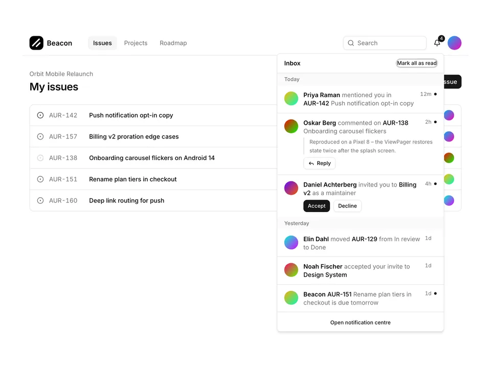
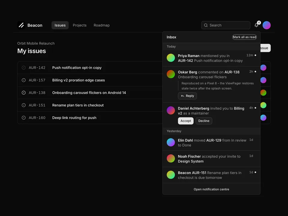
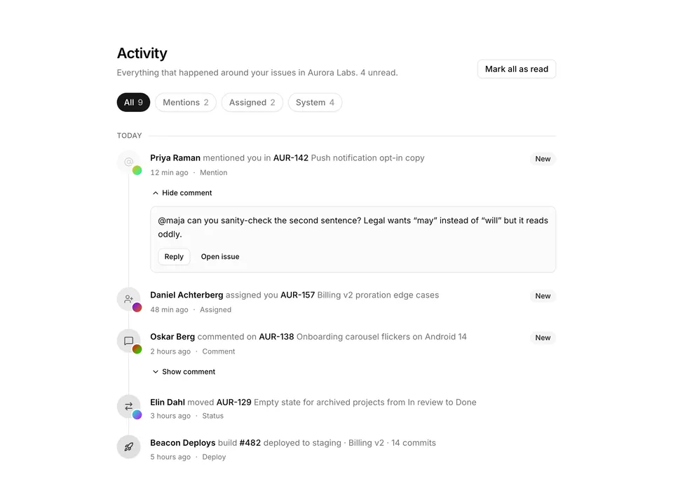
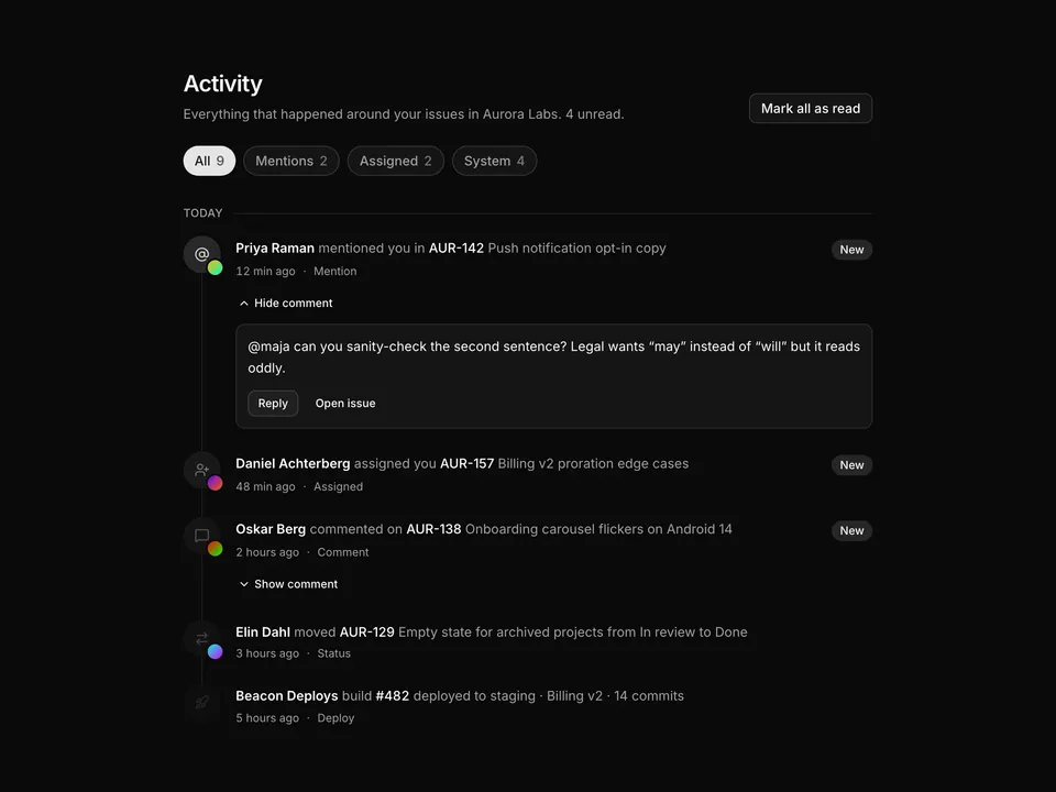
 * Notification centre panel in a max-w-md Card: header with unread-count Badge and a "Mark all as read" action, Tabs for All / Unread / Mentions, Avatar rows with bold actors and unread dots, and a "View all" footer link.
 */
export default function Notifications01() {
  const [items, setItems] = useState(initialNotifications);
  const unread = items.filter((item) => !item.read).length;

  const markAllRead = () =>
    setItems((prev) => prev.map((item) => ({ ...item, read: true })));
  const markRead = (id: number) =>
    setItems((prev) =>
      prev.map((item) => (item.id === id ? { ...item, read: true } : item))
    );

  const renderList = (list: Notification[], emptyCopy: string) =>
    list.length === 0 ? (
      <div className="flex flex-col items-center gap-2 px-6 py-12 text-center">
        <span className="flex size-10 items-center justify-center rounded-full bg-muted text-muted-foreground">
          <BellOffIcon aria-hidden="true" className="size-5" />
        </span>
        <p className="font-medium text-foreground text-sm">You are all caught up</p>
        <p className="text-muted-foreground text-sm">{emptyCopy}</p>
      </div>
    ) : (
      <ul className="divide-y">
        {list.map((item) => (
          <li key={item.id}>
            <button
              className={cn(
                'flex w-full items-start gap-3 px-6 py-3.5 text-left transition-colors hover:bg-muted/50 focus-visible:bg-muted/50 focus-visible:outline-none',
                !item.read && 'bg-primary/5'
              )}
              onClick={() => markRead(item.id)}
              type="button"
            >
              <Avatar className="mt-0.5 size-9">
                <AvatarImage
                  alt={item.actor}
                  src={`https://avatar.vercel.sh/${item.slug}`}
                />
                <AvatarFallback className="text-xs">
                  {initials(item.actor)}
                </AvatarFallback>
              </Avatar>
              <div className="min-w-0 flex-1 space-y-0.5">
                <p className="text-foreground text-sm leading-snug">
                  <span className="font-semibold">{item.actor}</span>{' '}
                  <span className="text-muted-foreground">{item.action}</span>{' '}
                  <span className="font-medium">{item.target}</span>
                </p>
                <p className="text-muted-foreground text-xs tabular-nums">{item.time}</p>
              </div>
              <span
                aria-label={item.read ? undefined : 'Unread'}
                className={cn(
                  'mt-2 size-2 shrink-0 rounded-full',
                  item.read ? 'bg-transparent' : 'bg-primary'
                )}
              />
            </button>
          </li>
        ))}
      </ul>
    );

  return (
    <div className="w-full max-w-md px-4 py-8">
      <Card className="gap-0 py-0">
        <CardHeader className="flex flex-row items-center gap-3 border-b px-6 py-4">
          <CardTitle className="flex items-center gap-2 text-base">
            Notifications
            {unread > 0 ? (
              <Badge className="tabular-nums" variant="secondary">
                {unread} new
              </Badge>
            ) : null}
          </CardTitle>
          <div className="ml-auto flex items-center gap-1">
            <TooltipTrigger>
              <Button
                aria-label="Mark all as read"
                className="text-muted-foreground"
                isDisabled={unread === 0}
                onPress={markAllRead}
                size="icon-sm"
                type="button"
                variant="ghost"
              >
                <CheckCheckIcon aria-hidden="true" />
              </Button>
              <Tooltip>Mark all as read</Tooltip>
            </TooltipTrigger>
            <TooltipTrigger>
              <Button
                aria-label="Notification settings"
                className="text-muted-foreground"
                size="icon-sm"
                type="button"
                variant="ghost"
              >
                <SettingsIcon aria-hidden="true" />
              </Button>
              <Tooltip>Notification settings</Tooltip>
            </TooltipTrigger>
          </div>
        </CardHeader>

        <Tabs className="gap-0" defaultSelectedKey="all">
          <div className="border-b px-6 py-2">
            <TabsList className="h-8">
              <TabsTrigger className="px-3 text-xs" id="all">
                All
              </TabsTrigger>
              <TabsTrigger className="gap-1.5 px-3 text-xs" id="unread">
                Unread
                {unread > 0 ? (
                  <span className="rounded-full bg-primary px-1.5 font-medium text-[10px] text-primary-foreground tabular-nums">
                    {unread}
                  </span>
                ) : null}
              </TabsTrigger>
              <TabsTrigger className="px-3 text-xs" id="mentions">
                Mentions
              </TabsTrigger>
            </TabsList>
          </div>
          <CardContent className="px-0">
            <TabsContent id="all">
              {renderList(items, 'No notifications yet.')}
            </TabsContent>
            <TabsContent id="unread">
              {renderList(
                items.filter((item) => !item.read),
                'Nothing unread. Enjoy the quiet.'
              )}
            </TabsContent>
            <TabsContent id="mentions">
              {renderList(
                items.filter((item) => item.mention),
                'Nobody has mentioned you recently.'
              )}
            </TabsContent>
          </CardContent>
        </Tabs>

        <CardFooter className="justify-center border-t px-6 py-3">
          <a
            className="font-medium text-primary text-sm underline-offset-4 hover:underline"
            href="#"
          >
            View all notifications
          </a>
        </CardFooter>
      </Card>
    </div>
  );
}