BlocksSign upSign up on muted background with logo

shadcn/ui Sign up block for React AriaSign up on muted background with logo

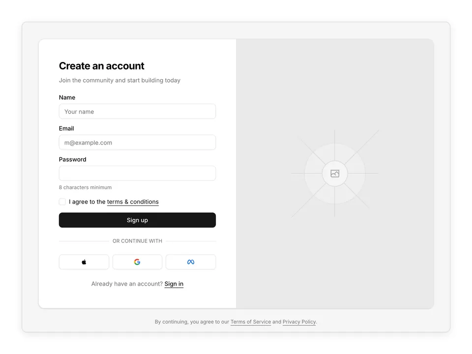
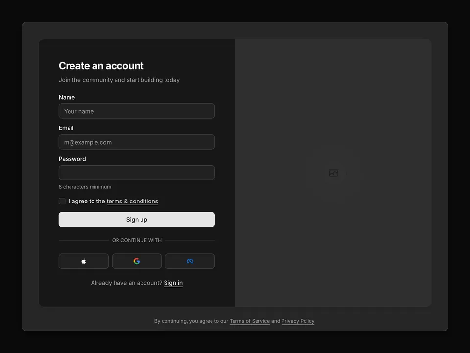
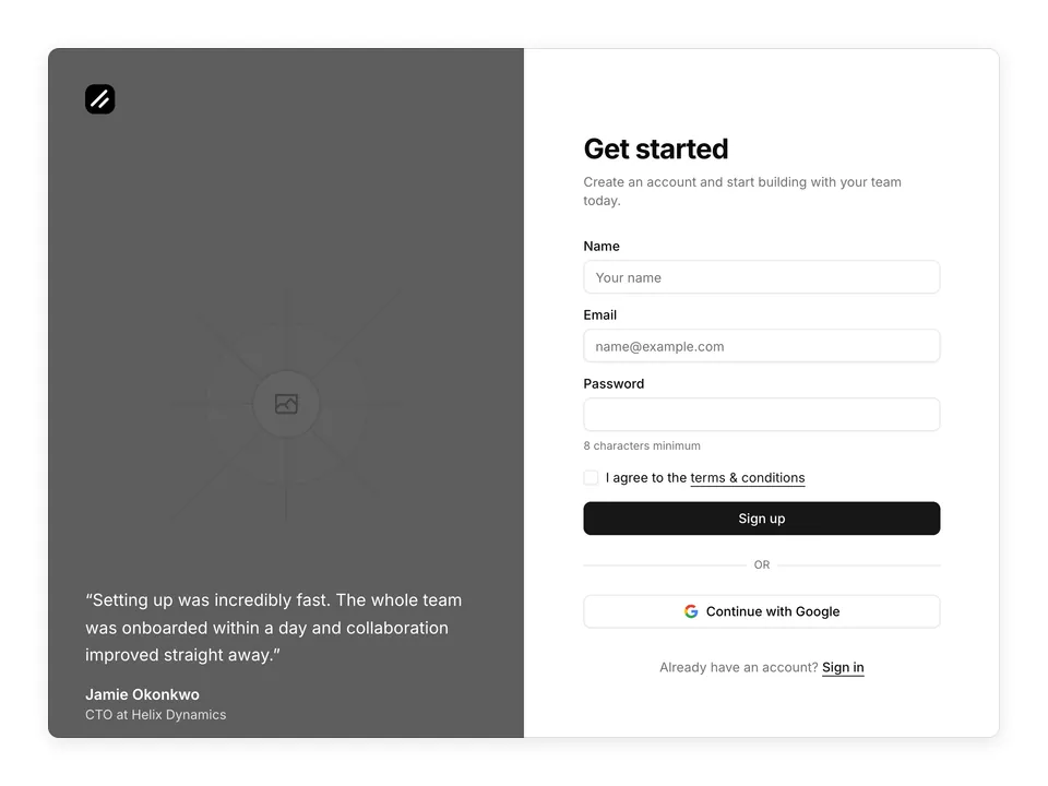
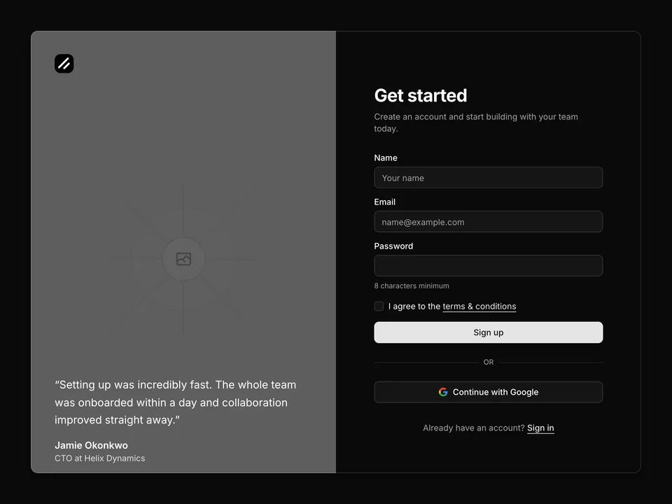
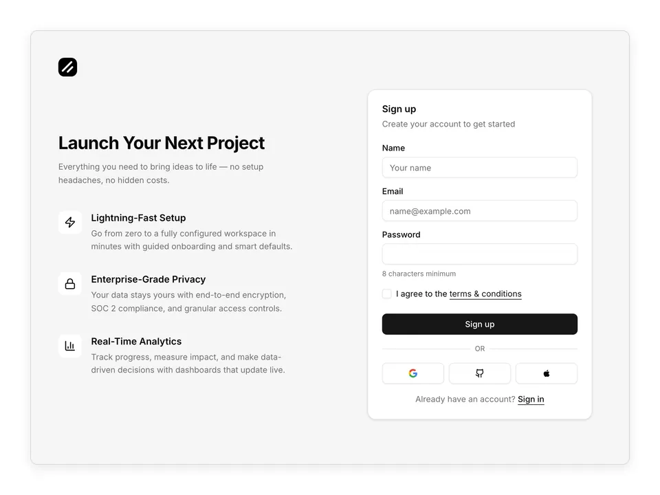
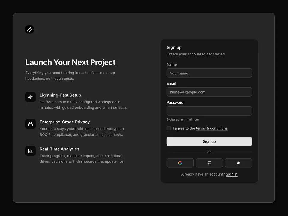
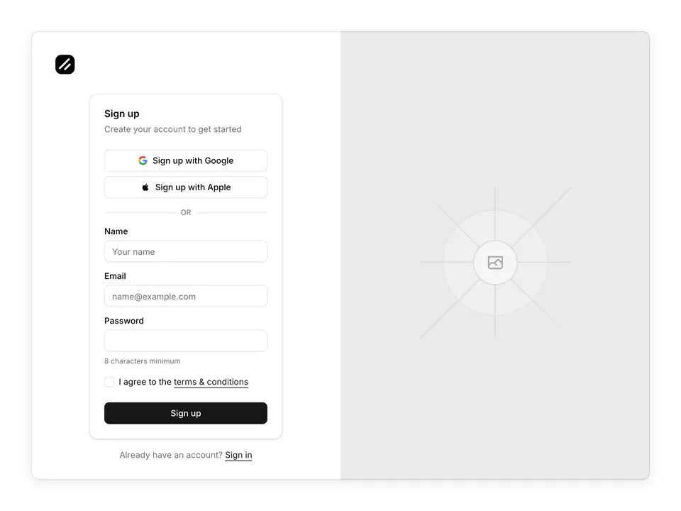
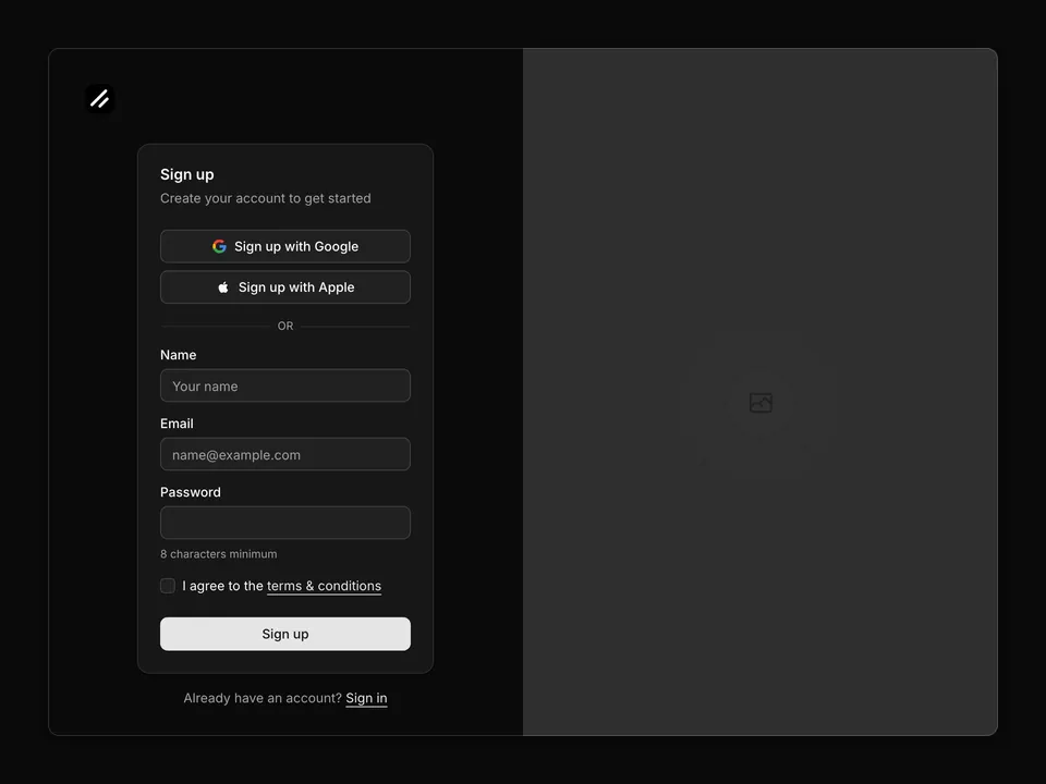
A centered shadcn/ui sign up card on a muted background with your logo above the form. Features Google and Apple OAuth buttons, email and password fields with validation hints, and a required terms checkbox. Uses semantic tokens so it adapts to any shadcn/ui theme. Install this Pro Block via the CLI command above.

Free@shadcnpro/aria/sign-up-02

Preview

Installation

npx shadcn@latest add @shadcnpro/aria/sign-up-02

First time? Add the @shadcnpro registry to components.json as shown in Installation. Free blocks install without a license key.

Let your AI editor install it

The shadcn/ui Pro MCP server lets Cursor, Claude Code and VS Code find and install blocks like Sign up on muted background with logo from one prompt. It is included in every Pro plan.

Add the shadcn/ui components

Sign up on muted background with logo uses Button, Card, Checkbox, Input and Label, from the React Aria components set up in your components.json.

npx shadcn@latest add button card checkbox input label

Copy the code

Paste it into components/blocks/sign-up-02.tsx.

components/blocks/sign-up-02.tsx
'use client';

import React from 'react';
import { Button } from '@/components/ui/button';
import { Input } from '@/components/ui/input';
import { Label } from '@/components/ui/label';
import { Checkbox } from '@/components/ui/checkbox';
import {
  Card,
  CardContent,
  CardDescription,
  CardFooter,
  CardHeader,
  CardTitle,
} from '@/components/ui/card';

function GoogleIcon({ className }: { className?: string }) {
  return (
    <svg className={className} viewBox="0 0 24 24" aria-hidden>
      <path
        d="M22.56 12.25c0-.78-.07-1.53-.2-2.25H12v4.26h5.92a5.06 5.06 0 0 1-2.2 3.32v2.77h3.57c2.08-1.92 3.28-4.74 3.28-8.1z"
        fill="#4285F4"
      />
      <path
        d="M12 23c2.97 0 5.46-.98 7.28-2.66l-3.57-2.77c-.98.66-2.23 1.06-3.71 1.06-2.86 0-5.29-1.93-6.16-4.53H2.18v2.84C3.99 20.53 7.7 23 12 23z"
        fill="#34A853"
      />
      <path
        d="M5.84 14.09c-.22-.66-.35-1.36-.35-2.09s.13-1.43.35-2.09V7.07H2.18C1.43 8.55 1 10.22 1 12s.43 3.45 1.18 4.93l2.85-2.22.81-.62z"
        fill="#FBBC05"
      />
      <path
        d="M12 5.38c1.62 0 3.06.56 4.21 1.64l3.15-3.15C17.45 2.09 14.97 1 12 1 7.7 1 3.99 3.47 2.18 7.07l3.66 2.84c.87-2.6 3.3-4.53 6.16-4.53z"
        fill="#EA4335"
      />
    </svg>
  );
}

function AppleIcon({ className }: { className?: string }) {
  return (
    <svg className={className} viewBox="0 0 24 24" aria-hidden>
      <path
        d="M17.05 20.28c-.98.95-2.05.8-3.08.35-1.09-.46-2.09-.48-3.24 0-1.44.62-2.2.44-3.06-.35C2.79 15.25 3.51 7.59 9.05 7.31c1.35.07 2.29.74 3.08.8 1.18-.24 2.31-.93 3.57-.84 1.51.12 2.65.72 3.4 1.8-3.12 1.87-2.38 5.98.48 7.13-.57 1.5-1.31 2.99-2.54 4.09l.01-.01zM12.03 7.25c-.15-2.23 1.66-4.07 3.74-4.25.29 2.58-2.34 4.5-3.74 4.25z"
        fill="currentColor"
      />
    </svg>
  );
}

export default function SignUp02() {
  return (
    <div className="flex min-h-svh flex-col items-center justify-center gap-6 bg-muted p-6 md:p-10">
      <div className="flex w-full max-w-sm flex-col gap-6">
        <a href="#" className="flex items-center justify-center gap-2 self-center">
          <img src="/logo.png" alt="" className="size-8 rounded-lg object-cover" />
        </a>
        <Card className="w-full">
          <CardHeader>
            <CardTitle>Sign up</CardTitle>
            <CardDescription>Create your account to get started</CardDescription>
          </CardHeader>
          <form>
            <CardContent className="space-y-4">
              <div className="flex flex-col gap-2">
                <Button type="button" variant="outline" className="w-full">
                  <GoogleIcon className="size-4 shrink-0" />
                  Sign up with Google
                </Button>
                <Button type="button" variant="outline" className="w-full">
                  <AppleIcon className="size-4 shrink-0" />
                  Sign up with Apple
                </Button>
              </div>
              <div className="relative">
                <div className="absolute inset-0 flex items-center">
                  <span className="w-full border-t border-border" />
                </div>
                <div className="relative flex justify-center text-xs uppercase">
                  <span className="bg-card px-2 text-muted-foreground">Or</span>
                </div>
              </div>
              <div className="space-y-2">
                <Label htmlFor="sign-up-02-name">Name</Label>
                <Input id="sign-up-02-name" name="name" placeholder="Your name" autoComplete="name" required />
              </div>
              <div className="space-y-2">
                <Label htmlFor="sign-up-02-email">Email</Label>
                <Input id="sign-up-02-email" name="email" type="email" placeholder="name@example.com" autoComplete="email" required />
              </div>
              <div className="space-y-2">
                <Label htmlFor="sign-up-02-password">Password</Label>
                <Input id="sign-up-02-password" name="password" type="password" autoComplete="new-password" required />
                <p className="text-xs text-muted-foreground">8 characters minimum</p>
              </div>
              <div className="flex items-center gap-2">
                <Checkbox id="sign-up-02-terms" name="terms" isRequired />
                <Label htmlFor="sign-up-02-terms" className="text-sm font-normal inline">
                  I agree to the{' '}<a href="#" className="text-primary underline underline-offset-4 hover:no-underline">terms &amp; conditions</a>
                </Label>
              </div>
            </CardContent>
            <CardFooter className="flex flex-col gap-4 pt-6">
              <Button type="submit" className="w-full">Sign up</Button>
            </CardFooter>
          </form>
        </Card>
        <p className="text-center text-sm text-muted-foreground">
          Already have an account?{' '}
          <a href="#" className="text-primary underline underline-offset-4 hover:no-underline">
            Sign in
          </a>
        </p>
      </div>
    </div>
  );
}

Use it

Import it where you need it and update the import path to match your project.

Usage
import SignUp02 from '@/components/blocks/sign-up-02';

export default function Page() {
  return <SignUp02 />;
}

Overview

Sign up on muted background with logo is a free sign up block for shadcn/ui and React Aria. It is built from the Button, Card, Checkbox, Input and Label components, and installs as a single file you own and can edit.

It only uses semantic tokens such as bg-background, text-muted-foreground and border-border, so it follows your theme, radius and fonts and switches with dark mode. It is a full-page layout that fills the viewport and adapts from desktop to mobile. The same layout is in the shadcn/ui Pro Figma kit, so design and code start from one source.

Category
Sign up
Component library
React Aria (react-aria-components)
Also available for
Radix UI, Base UI
Built with
Button, Card, Checkbox, Input and Label
npm packages
None
Files
components/blocks/sign-up-02.tsx
Access
Free, installs without a license key

Frequently asked questions

Pricing, installation and React Aria details for Sign up on muted background with logo.