'use client';

import { PlusIcon } from 'lucide-react';

import { Button } from '@/components/ui/button';
import {
  Select,
  SelectContent,
  SelectItem,
  SelectTrigger,
  SelectValue,
} from '@/components/ui/select';

const photo = (id: string) =>
  `https://images.unsplash.com/photo-${id}?auto=format&fit=crop&w=800&q=80`;

const products = [
  {
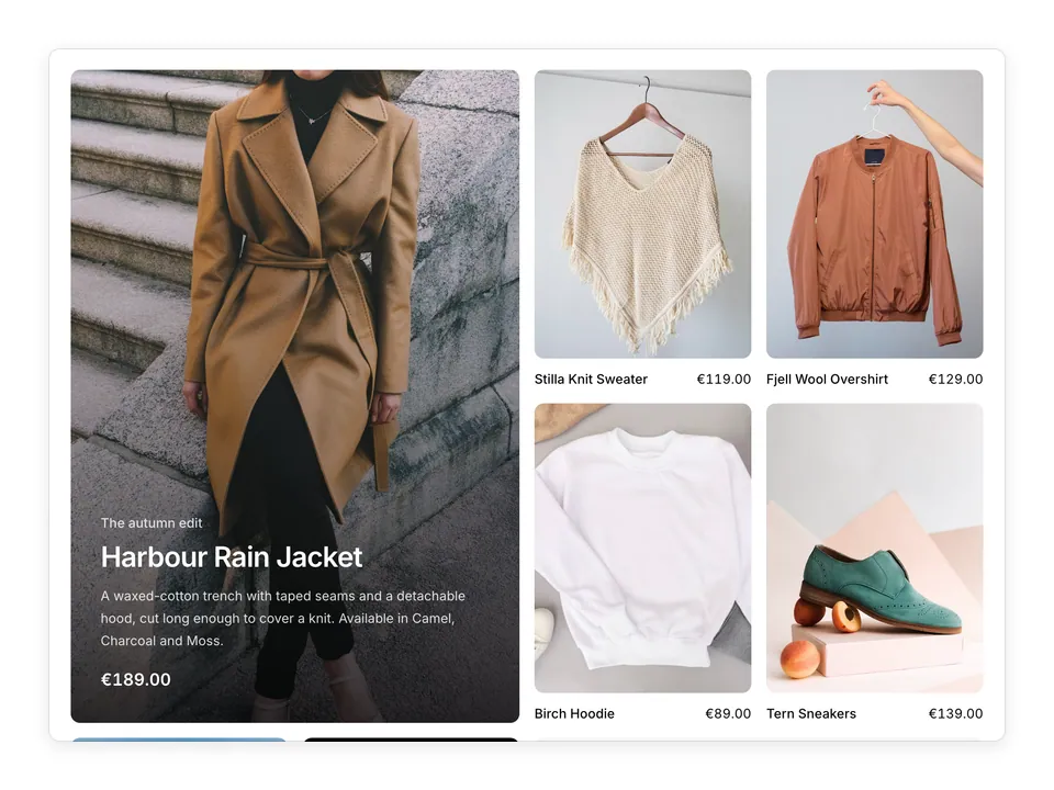
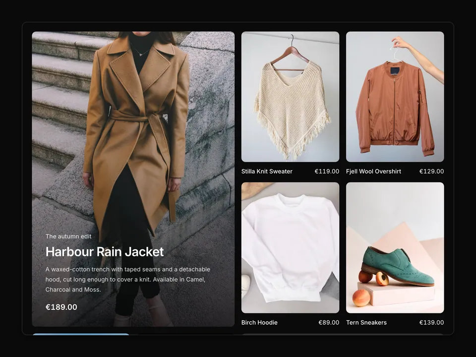
    name: 'Fjell Wool Overshirt',
    price: '€129.00',
    image: photo('1591047139829-d91aecb6caea'),
    colors: ['#d8cbb4', '#3a3a3a', '#5d6b4a'],
  },
  {
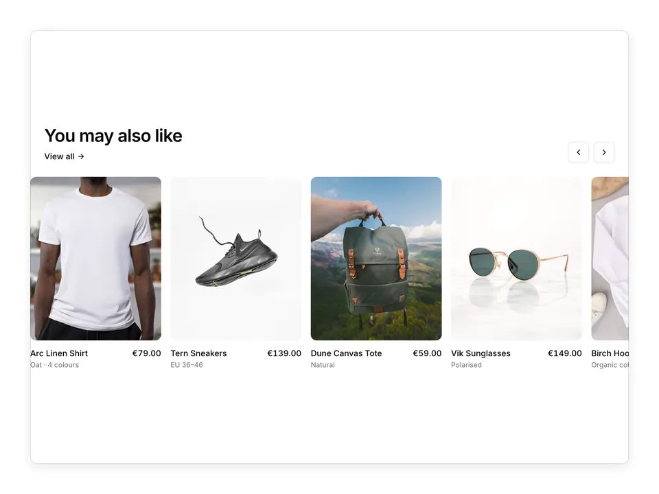
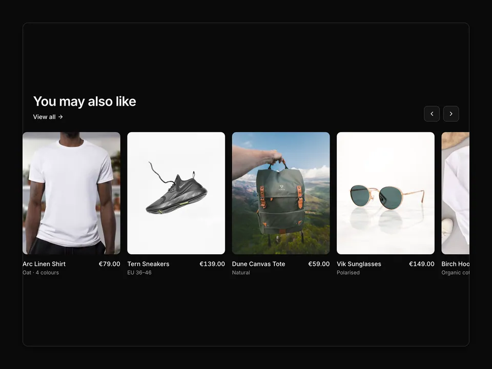
    name: 'Arc Linen Shirt',
    price: '€79.00',
    image: photo('1521572163474-6864f9cf17ab'),
    colors: ['#f3efe6', '#9db3c7'],
  },
  {
    name: 'Dune Canvas Tote',
    price: '€59.00',
    image: photo('1491637639811-60e2756cc1c7'),
    colors: ['#e8dcc4', '#2d2d2d'],
  },
  {
    name: 'Tern Sneakers',
    price: '€139.00',
    image: photo('1560343090-f0409e92791a'),
    colors: ['#f5f5f5', '#d9c7a7', '#111111'],
  },
  {
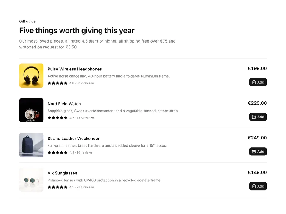
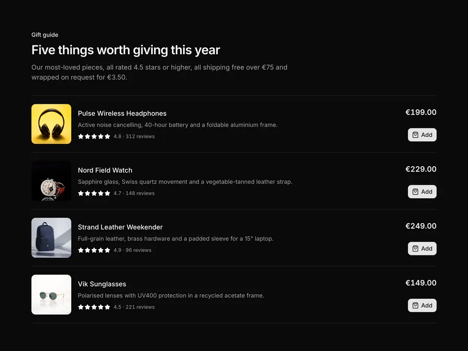
    name: 'Strand Leather Weekender',
    price: '€249.00',
    image: photo('1553062407-98eeb64c6a62'),
    colors: ['#7a4a2a', '#1f1f1f'],
  },
  {
    name: 'Stilla Knit Sweater',
    price: '€119.00',
    image: photo('1434389677669-e08b4cac3105'),
    colors: ['#e9e4da', '#8a6f5a', '#4b5563'],
  },
  {
    name: 'Nord Field Watch',
    price: '€229.00',
    image: photo('1524805444758-089113d48a6d'),
    colors: ['#c0c0c0', '#2b2b2b'],
  },
  {
    name: 'Birch Hoodie',
    price: '€89.00',
    image: photo('1620799140408-edc6dcb6d633'),
    colors: ['#d4d4d4', '#3b4a3a', '#1c1c1c'],
  },
];

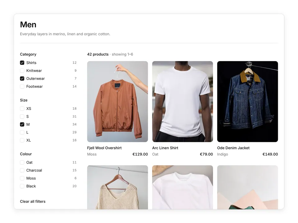
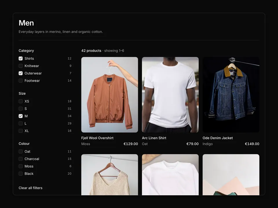
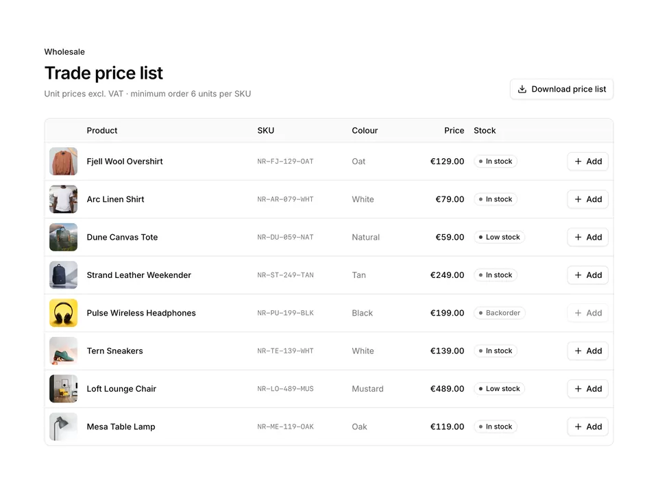
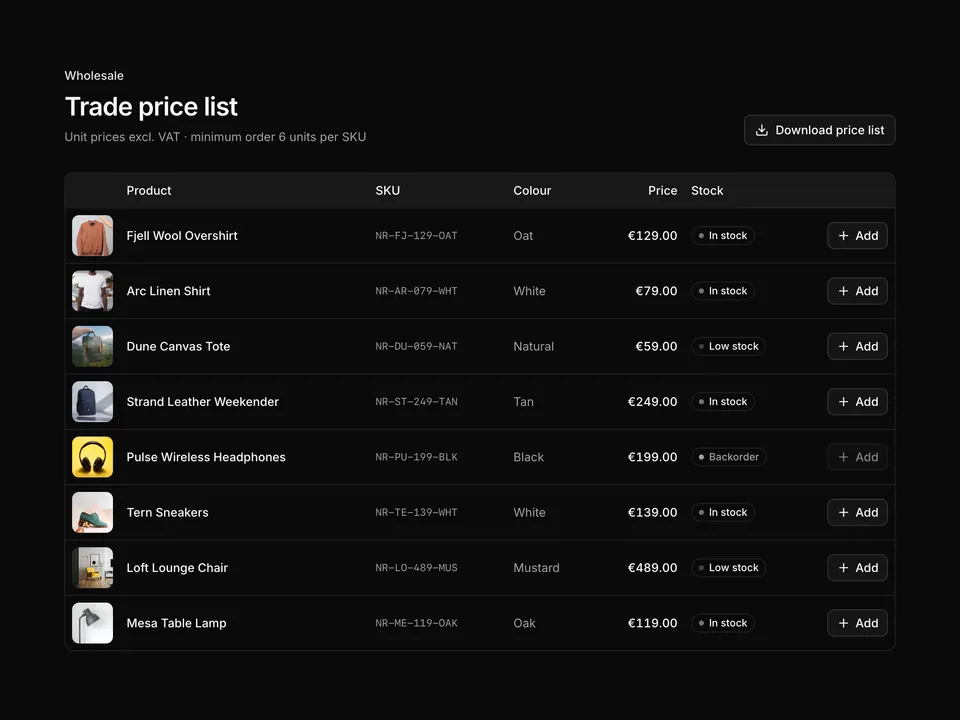
/**
 * Classic four-column product grid: heading with result count and a Sort Select on the right, then eight 3:4 image cards with name, price, colour dots and a "Quick add" Button that slides in on hover.
 */
export default function ProductList01() {
  return (
    <section className="w-full py-8 sm:py-12">
      <div className="mx-auto w-full max-w-6xl px-6">
        <div className="flex flex-col gap-4 sm:flex-row sm:items-end sm:justify-between">
          <div>
            <h2 className="text-balance font-semibold text-3xl text-foreground tracking-tight">
              New in
            </h2>
            <p className="mt-2 text-muted-foreground text-sm">
              Showing 8 of 46 products
            </p>
          </div>
          <Select aria-label="Sort by" defaultValue="featured" placeholder="Sort by">
            <SelectTrigger className="w-48">
              <SelectValue />
            </SelectTrigger>
            <SelectContent>
              <SelectItem id="featured">Featured</SelectItem>
              <SelectItem id="newest">Newest</SelectItem>
              <SelectItem id="price-asc">Price: low to high</SelectItem>
              <SelectItem id="price-desc">Price: high to low</SelectItem>
              <SelectItem id="rating">Top rated</SelectItem>
            </SelectContent>
          </Select>
        </div>

        <ul className="mt-8 grid grid-cols-2 gap-x-4 gap-y-10 md:grid-cols-4">
          {products.map((product) => (
            <li className="group flex flex-col" key={product.name}>
              <div className="relative overflow-hidden rounded-lg bg-muted">
                <img
                  alt={product.name}
                  className="aspect-[3/4] w-full object-cover transition-transform duration-500 group-hover:scale-105"
                  loading="lazy"
                  src={product.image}
                />
                <Button
                  className="absolute inset-x-3 bottom-3 translate-y-2 opacity-0 shadow-md transition-all duration-200 focus-visible:translate-y-0 focus-visible:opacity-100 group-hover:translate-y-0 group-hover:opacity-100 dark:bg-foreground dark:text-background dark:hover:bg-foreground/90"
                  size="sm"
                  type="button"
                  variant="secondary"
                >
                  <PlusIcon aria-hidden="true" />
                  Quick add
                </Button>
              </div>
              <div className="mt-3 flex items-start justify-between gap-3">
                <h3 className="font-medium text-foreground text-sm">
                  <a className="hover:underline" href="#">
                    {product.name}
                  </a>
                </h3>
                <p className="shrink-0 font-medium text-foreground text-sm tabular-nums">
                  {product.price}
                </p>
              </div>
              <div className="mt-2 flex items-center gap-1.5">
                {product.colors.map((color) => (
                  <span
                    aria-hidden="true"
                    className="size-3 rounded-full border border-border"
                    key={color}
                    style={{ backgroundColor: color }}
                  />
                ))}
                <span className="sr-only">
                  {product.colors.length} colours available
                </span>
              </div>
            </li>
          ))}
        </ul>
      </div>
    </section>
  );
}