'use client';

import { CheckIcon, MinusIcon, XIcon } from 'lucide-react';

import {
  Table,
  TableBody,
  TableCell,
  TableHead,
  TableHeader,
  TableRow,
} from '@/components/ui/table';

type CellValue = boolean | 'partial' | string;

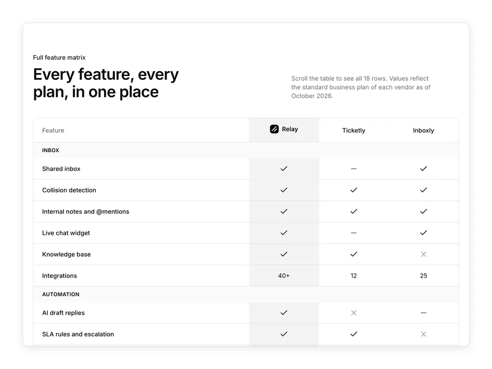
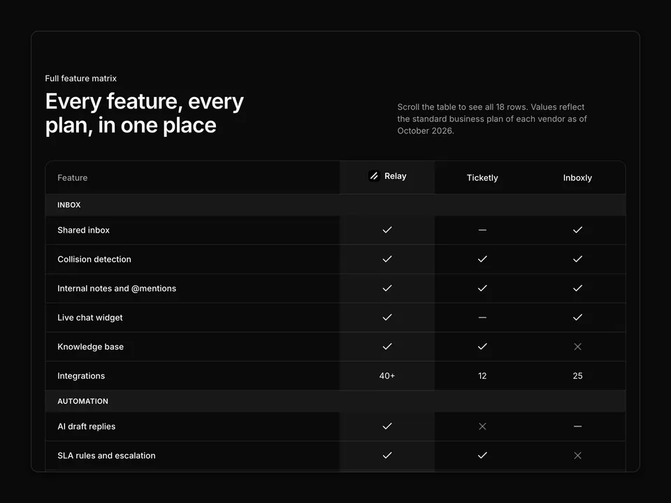
const rows: { feature: string; relay: CellValue; ticketly: CellValue; inboxly: CellValue }[] = [
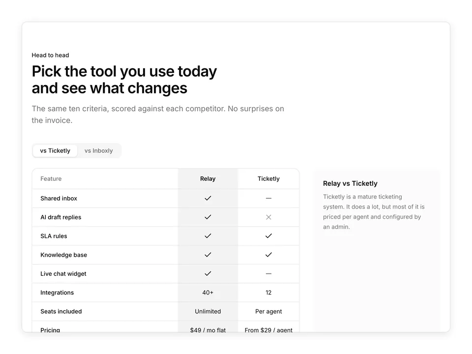
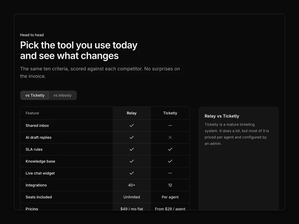
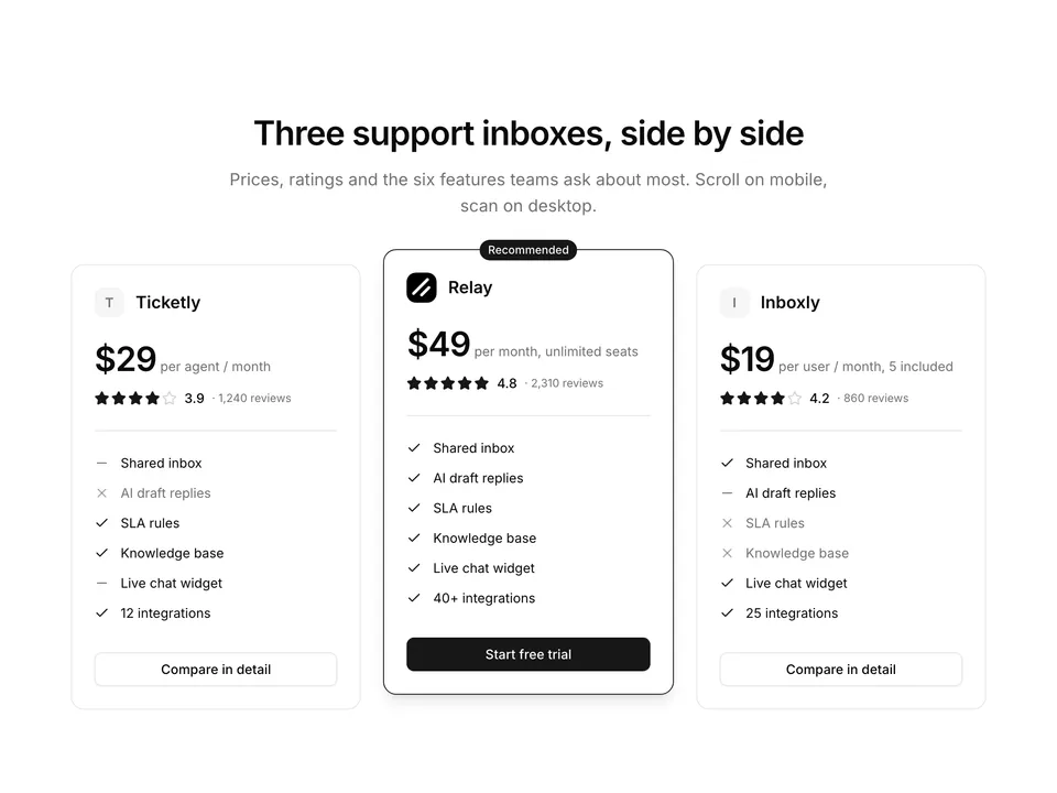
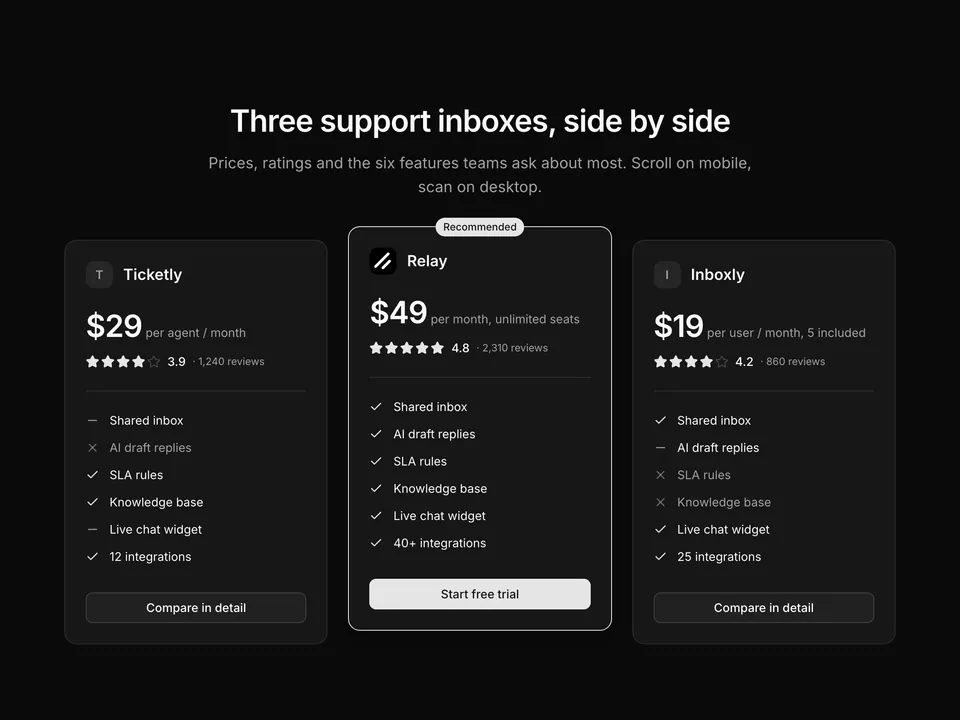
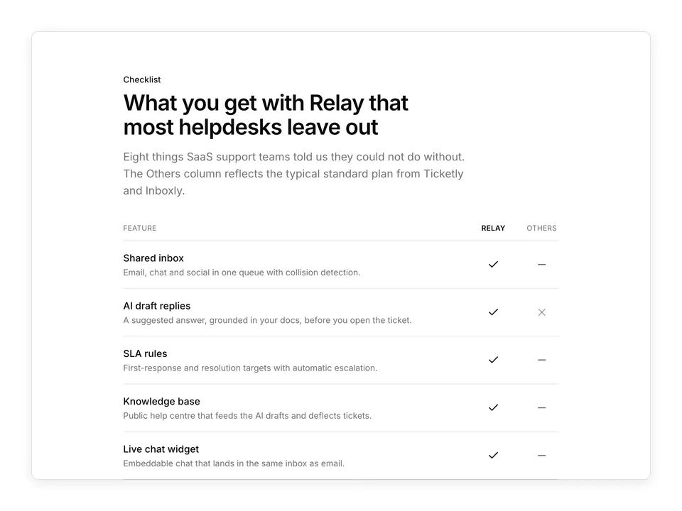
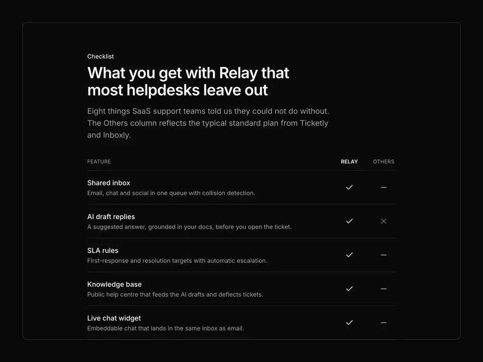
  { feature: 'Shared inbox', relay: true, ticketly: 'partial', inboxly: true },
  { feature: 'AI draft replies', relay: true, ticketly: false, inboxly: 'partial' },
  { feature: 'SLA rules', relay: true, ticketly: true, inboxly: false },
  { feature: 'Knowledge base', relay: true, ticketly: true, inboxly: false },
  { feature: 'Live chat widget', relay: true, ticketly: 'partial', inboxly: true },
  { feature: 'Integrations', relay: '40+', ticketly: '12', inboxly: '25' },
  { feature: 'Seats included', relay: 'Unlimited', ticketly: 'Per agent', inboxly: '5' },
  { feature: 'Data residency', relay: 'EU / US', ticketly: 'US', inboxly: 'US' },
  { feature: 'SOC 2 Type II', relay: true, ticketly: true, inboxly: false },
  { feature: 'Support hours', relay: '24/7', ticketly: 'Mon–Fri, 9–5 ET', inboxly: 'Business hours' },
];

function Cell({ value }: { value: CellValue }) {
  if (value === true) {
    return (
      <span className="inline-flex items-center justify-center">
        <CheckIcon aria-hidden="true" className="size-5 text-primary" />
        <span className="sr-only">Included</span>
      </span>
    );
  }
  if (value === false) {
    return (
      <span className="inline-flex items-center justify-center">
        <XIcon aria-hidden="true" className="size-5 text-muted-foreground/60" />
        <span className="sr-only">Not included</span>
      </span>
    );
  }
  if (value === 'partial') {
    return (
      <span className="inline-flex items-center justify-center">
        <MinusIcon aria-hidden="true" className="size-5 text-muted-foreground" />
        <span className="sr-only">Partial or paid add-on</span>
      </span>
    );
  }
  return <span className="text-foreground text-sm">{value}</span>;
}

/**
 * Classic three-column feature comparison table built with the shadcn Table; the Relay column is tinted and rows use Check, X and Minus icons.
 */
export default function Comparison01() {
  return (
    <section className="w-full py-16 sm:py-24">
      <div className="mx-auto w-full max-w-6xl px-6">
        <div className="mx-auto max-w-2xl text-center">
          <p className="font-medium text-primary text-sm">Compare</p>
          <h2 className="mt-2 text-balance font-semibold text-3xl text-foreground tracking-tight sm:text-4xl">
            How Relay compares to Ticketly and Inboxly
          </h2>
          <p className="mt-4 text-pretty text-lg text-muted-foreground">
            A side-by-side look at what each support inbox includes out of the
            box. Checked against public plan pages in October 2026.
          </p>
        </div>

        <div className="mt-12 overflow-hidden rounded-xl border">
          <Table aria-label="Relay compared to Ticketly and Inboxly">
            <TableHeader>
              <TableHead
                className="h-14 px-4 text-muted-foreground sm:px-6"
                isRowHeader
              >
                Feature
              </TableHead>
              <TableHead
                className="h-14 bg-primary/5 px-4 text-center font-semibold text-foreground sm:w-44"
                textValue="Relay"
              >
                <span className="inline-flex items-center gap-2">
                  <img
                    alt=""
                    className="size-5 rounded-sm object-cover"
                    src="/logo.png"
                  />
                  Relay
                </span>
              </TableHead>
              <TableHead className="h-14 px-4 text-center font-medium sm:w-44">
                Ticketly
              </TableHead>
              <TableHead className="h-14 px-4 text-center font-medium sm:w-44">
                Inboxly
              </TableHead>
            </TableHeader>
            <TableBody>
              {rows.map((row) => (
                <TableRow key={row.feature}>
                  <TableCell className="px-4 py-3.5 font-medium text-foreground sm:px-6">
                    {row.feature}
                  </TableCell>
                  <TableCell className="bg-primary/5 px-4 py-3.5 text-center">
                    <Cell value={row.relay} />
                  </TableCell>
                  <TableCell className="px-4 py-3.5 text-center">
                    <Cell value={row.ticketly} />
                  </TableCell>
                  <TableCell className="px-4 py-3.5 text-center">
                    <Cell value={row.inboxly} />
                  </TableCell>
                </TableRow>
              ))}
            </TableBody>
          </Table>
        </div>

        <p className="mt-4 text-center text-muted-foreground text-xs">
          <MinusIcon aria-hidden="true" className="mr-1 inline size-3.5" />
          indicates a partial feature or paid add-on.
        </p>
      </div>
    </section>
  );
}