'use client';

import {
  BotIcon,
  HistoryIcon,
  LockKeyholeIcon,
  PlugIcon,
  UsersIcon,
  WifiOffIcon,
} from 'lucide-react';

const features = [
  {
    icon: UsersIcon,
    title: 'Real-time co-editing',
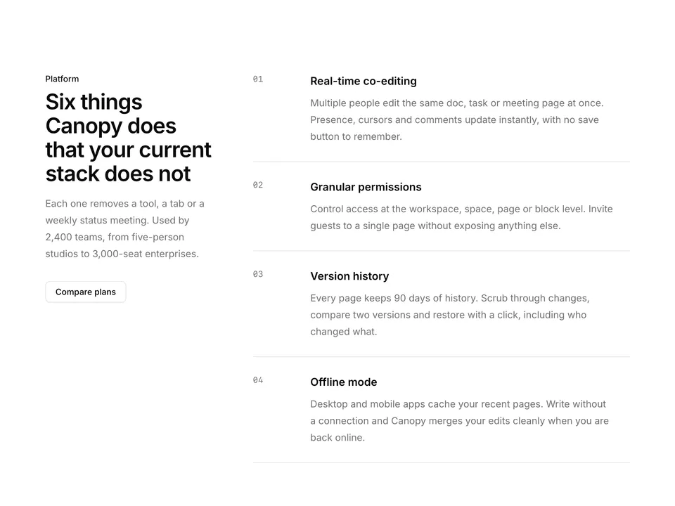
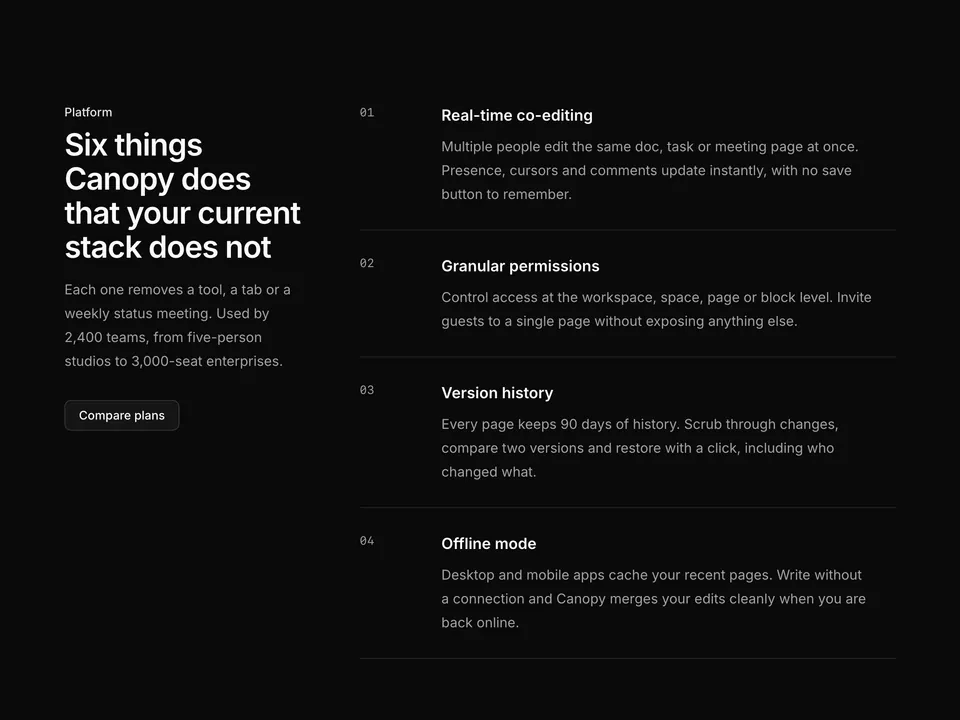
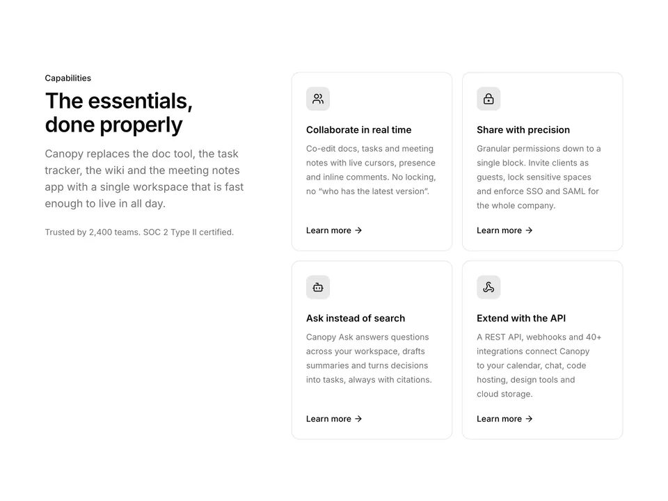
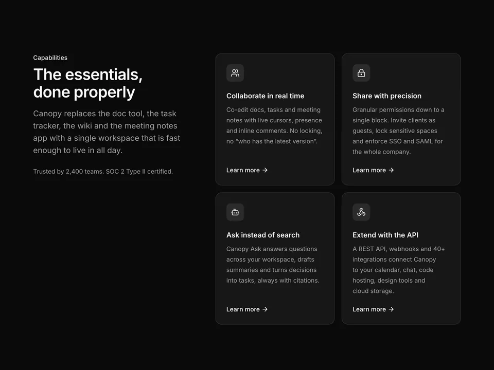
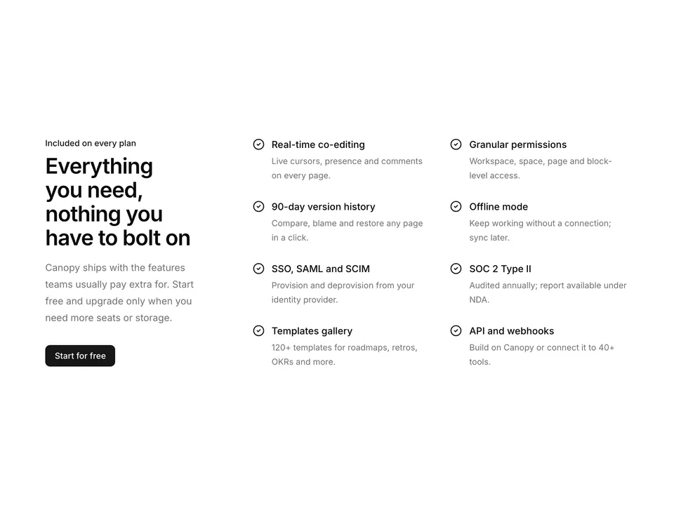
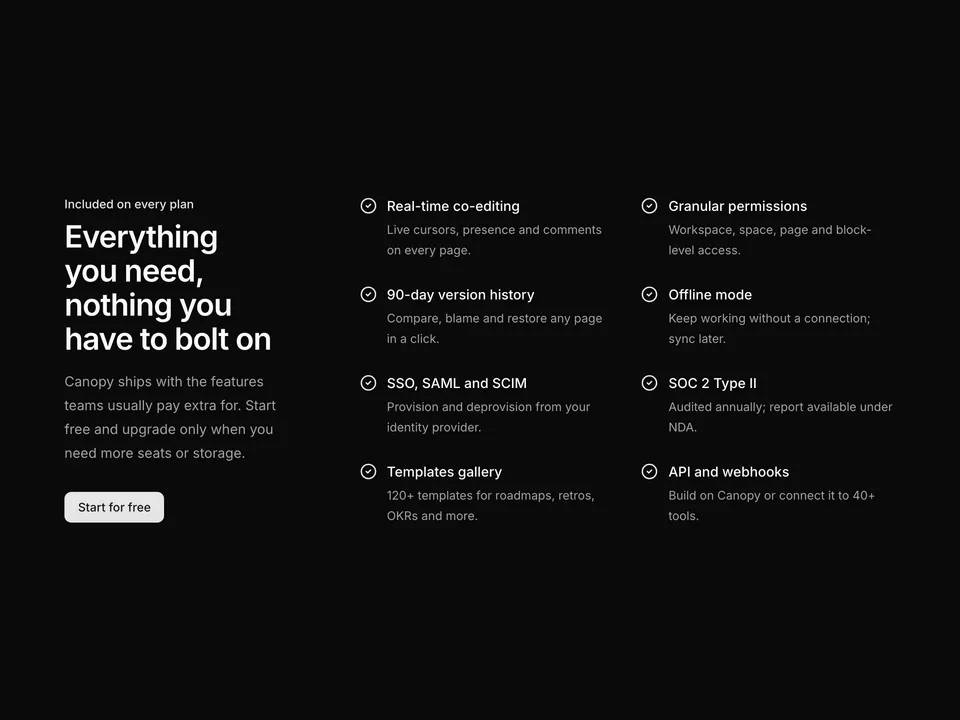
    text: 'Write docs, plan tasks and take meeting notes together. Every cursor, comment and change shows up instantly for the whole team.',
  },
  {
    icon: LockKeyholeIcon,
    title: 'Granular permissions',
    text: 'Share a single page, a wiki space or the whole workspace. Set view, comment or edit access per person, group or guest.',
  },
  {
    icon: HistoryIcon,
    title: '90 days of version history',
    text: 'Every edit is kept for 90 days. Compare versions side by side, see who changed what and restore any page in one click.',
  },
  {
    icon: WifiOffIcon,
    title: 'Works offline',
    text: 'Keep writing on the train or in the air. Canopy stores your pages locally and syncs the moment you are back online.',
  },
  {
    icon: BotIcon,
    title: 'Canopy Ask',
    text: 'Ask questions across docs, tasks and notes in plain language. Answers cite the exact pages they came from.',
  },
  {
    icon: PlugIcon,
    title: '40+ integrations',
    text: 'Connect your calendar, chat, code hosting, design tools and cloud storage. Automate the rest with the API and webhooks.',
  },
];

/**
 * Centred heading above a three-column grid of six icon features with tinted icon squares.
 */
export default function Features01() {
  return (
    <section className="w-full py-16 sm:py-24">
      <div className="mx-auto w-full max-w-6xl px-6">
        <div className="mx-auto max-w-2xl text-center">
          <p className="font-medium text-primary text-sm">
            Everything in one place
          </p>
          <h2 className="mt-2 text-balance font-semibold text-3xl text-foreground tracking-tight sm:text-4xl">
            One connected workspace for how your team actually works
          </h2>
          <p className="mt-4 text-pretty text-lg text-muted-foreground">
            Docs, tasks, wikis and meeting notes live side by side in Canopy,
            so context never gets lost between tools.
          </p>
        </div>

        <div className="mt-14 grid grid-cols-1 gap-x-8 gap-y-12 sm:grid-cols-2 md:grid-cols-3">
          {features.map((feature) => (
            <div key={feature.title}>
              <span className="flex size-11 items-center justify-center rounded-lg bg-primary/10 text-primary">
                <feature.icon aria-hidden="true" className="size-5" />
              </span>
              <h3 className="mt-5 font-semibold text-foreground">
                {feature.title}
              </h3>
              <p className="mt-2 text-pretty text-muted-foreground text-sm leading-6">
                {feature.text}
              </p>
            </div>
          ))}
        </div>
      </div>
    </section>
  );
}