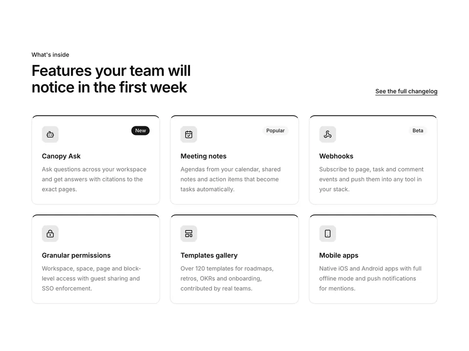
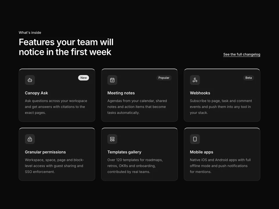
Feature cards with status badges
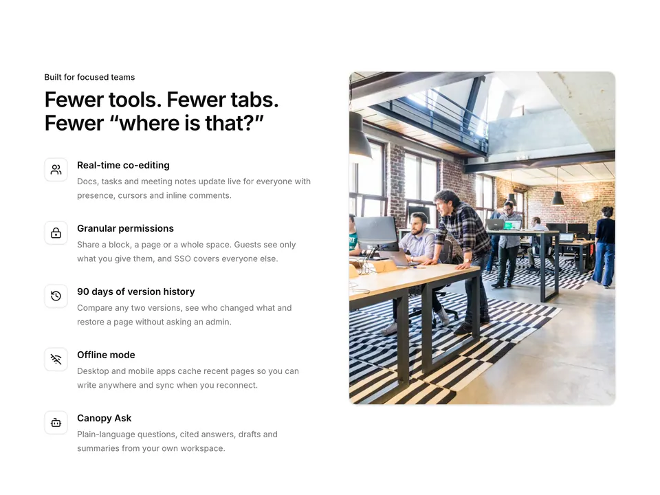
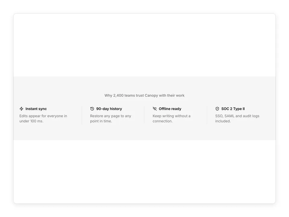
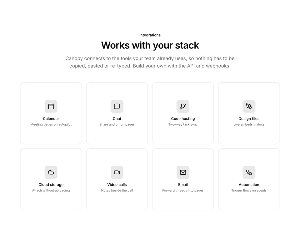
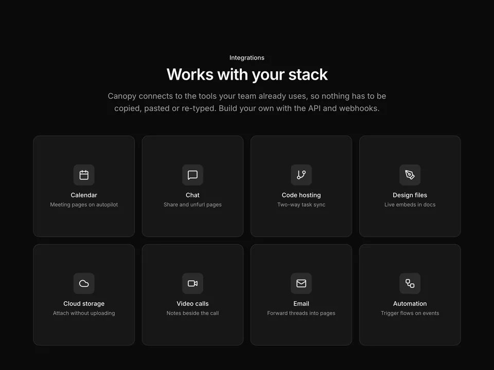
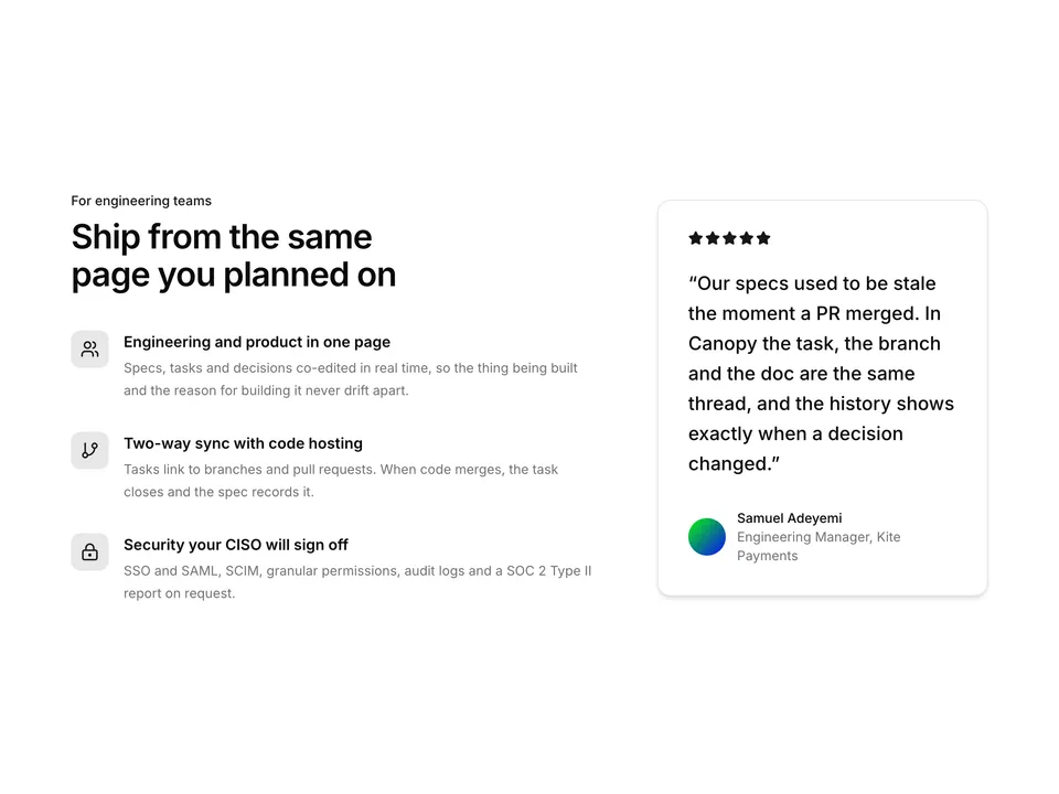
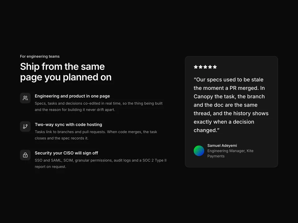
A three-column grid of shadcn/ui Cards with a two-pixel primary top border, each holding a tinted lucide icon, an optional New, Beta or Popular Badge, a title and description. The header pairs a heading with a changelog link. Built with the shadcn/ui Card and Badge components; useful for release-oriented feature pages.