'use client';

import { GithubIcon, LinkedinIcon, YoutubeIcon } from 'lucide-react';

import { LinkButton } from '@/components/ui/button';

const columns = [
  {
    title: 'Product',
    links: ['Payments API', 'Identity', 'Messaging', 'Webhooks', 'Pricing'],
  },
  {
    title: 'Developers',
    links: ['Documentation', 'API reference', 'SDKs', 'CLI', 'Status'],
  },
  {
    title: 'Company',
    links: ['About', 'Customers', 'Careers', 'Press', 'Contact'],
  },
  {
    title: 'Legal',
    links: ['Privacy', 'Terms', 'Cookie policy', 'DPA'],
  },
];

const socials = [
  { label: 'X', icon: null },
  { label: 'GitHub', icon: GithubIcon },
  { label: 'LinkedIn', icon: LinkedinIcon },
  { label: 'YouTube', icon: YoutubeIcon },
];

/**
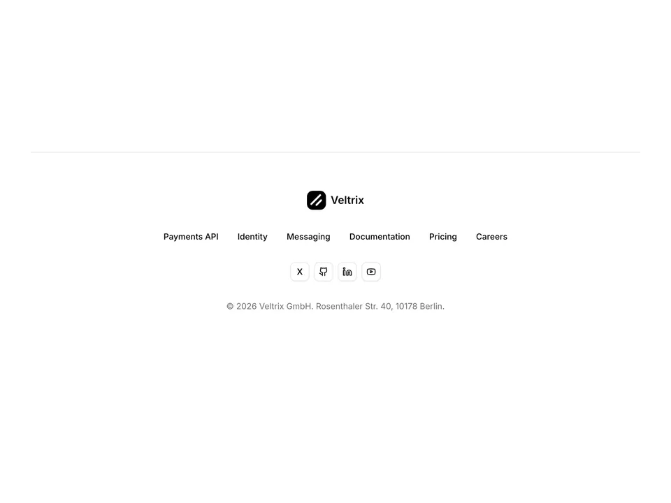
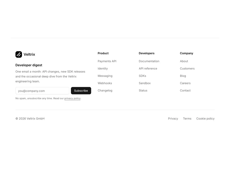
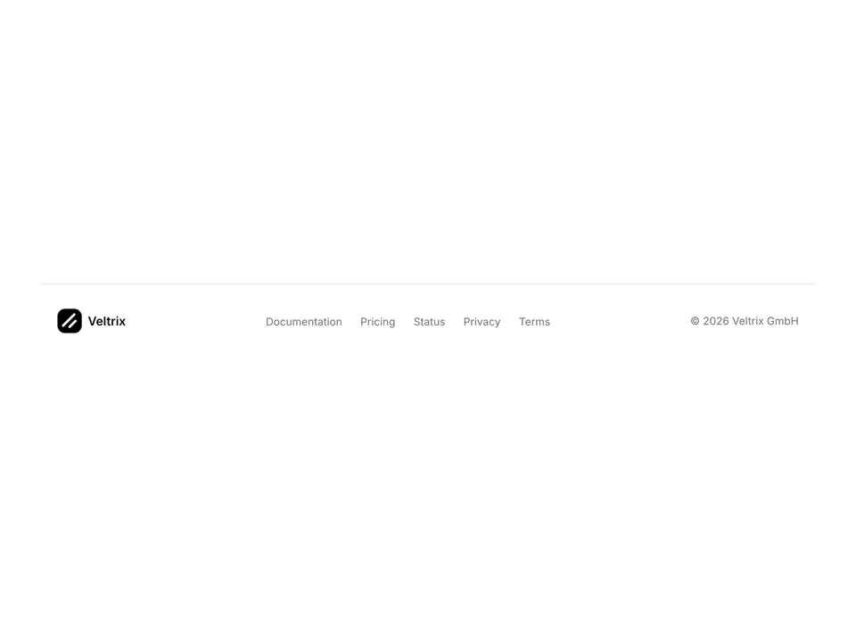
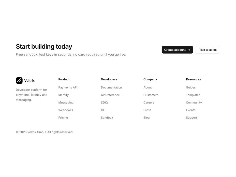
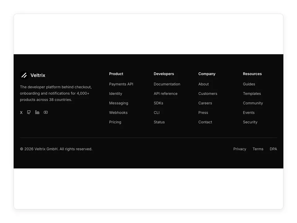
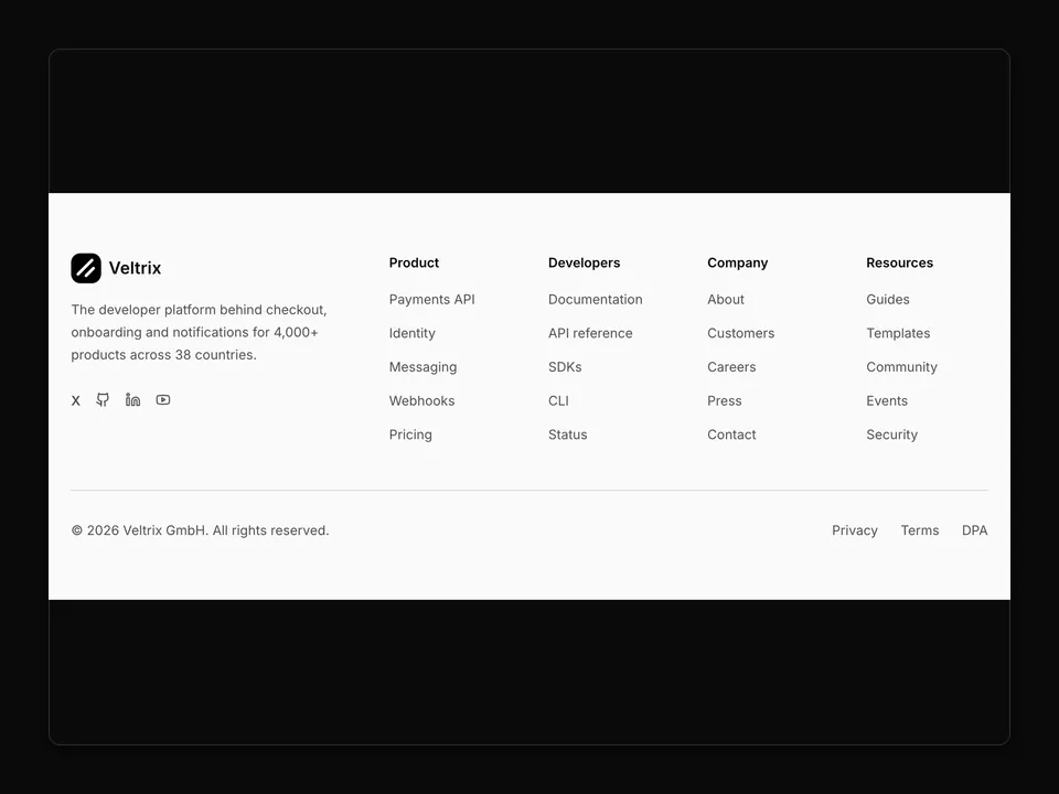
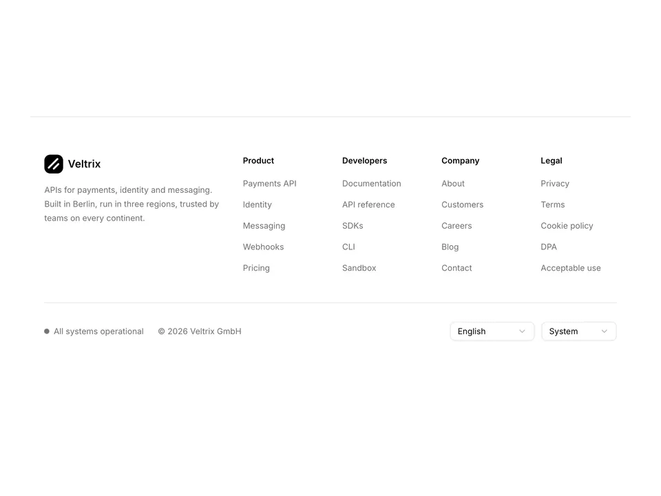
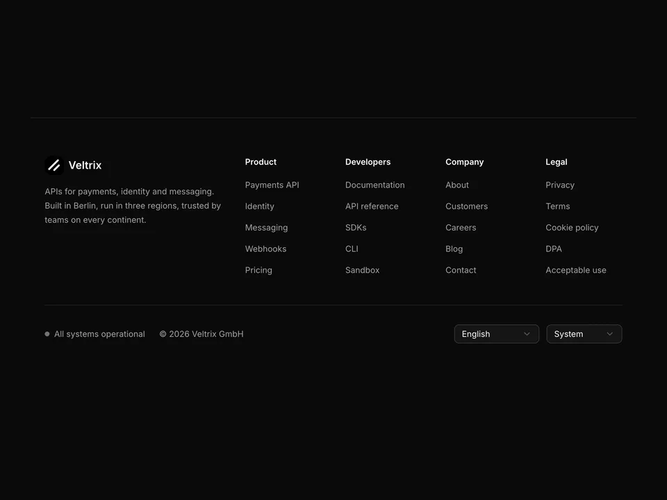
 * Classic sitemap footer: brand column spanning two tracks, four link columns and a bottom bar with copyright and social icon buttons.
 */
export default function Footer01() {
  return (
    <footer className="w-full border-t bg-background">
      <div className="mx-auto w-full max-w-6xl px-6 py-12 sm:py-16">
        <div className="grid grid-cols-2 gap-10 md:grid-cols-6">
          <div className="col-span-2">
            <a className="flex items-center gap-2" href="#">
              <img
                alt=""
                className="size-8 rounded-lg object-cover"
                src="/logo.png"
              />
              <span className="font-semibold text-foreground text-lg">
                Veltrix
              </span>
            </a>
            <p className="mt-4 max-w-xs text-pretty text-muted-foreground text-sm leading-6">
              Payments, identity and messaging APIs for teams that ship. One
              SDK, one dashboard, every market you sell in.
            </p>
          </div>

          {columns.map((column) => (
            <div key={column.title}>
              <h3 className="font-semibold text-foreground text-sm">
                {column.title}
              </h3>
              <ul className="mt-4 space-y-3">
                {column.links.map((link) => (
                  <li key={link}>
                    <a
                      className="text-muted-foreground text-sm transition-colors hover:text-foreground"
                      href="#"
                    >
                      {link}
                    </a>
                  </li>
                ))}
              </ul>
            </div>
          ))}
        </div>

        <div className="mt-12 flex flex-col gap-4 border-t pt-8 sm:flex-row sm:items-center sm:justify-between">
          <p className="text-muted-foreground text-sm">
            © 2026 Veltrix GmbH. All rights reserved.
          </p>
          <div className="flex items-center gap-1">
            {socials.map((social) => (
              <LinkButton
                aria-label={social.label}
                href="#"
                key={social.label}
                size="icon-sm"
                variant="ghost"
              >
                {social.icon ? (
                  <social.icon aria-hidden="true" className="size-4" />
                ) : (
                  <span
                    aria-hidden="true"
                    className="font-semibold text-sm leading-none"
                  >
                    X
                  </span>
                )}
              </LinkButton>
            ))}
          </div>
        </div>
      </div>
    </footer>
  );
}