'use client';

const photo = (id: string, w = 800) =>
  `https://images.unsplash.com/photo-${id}?auto=format&fit=crop&w=${w}&q=80`;

const projects = [
  {
    id: '1600585154340-be6161a56a0c',
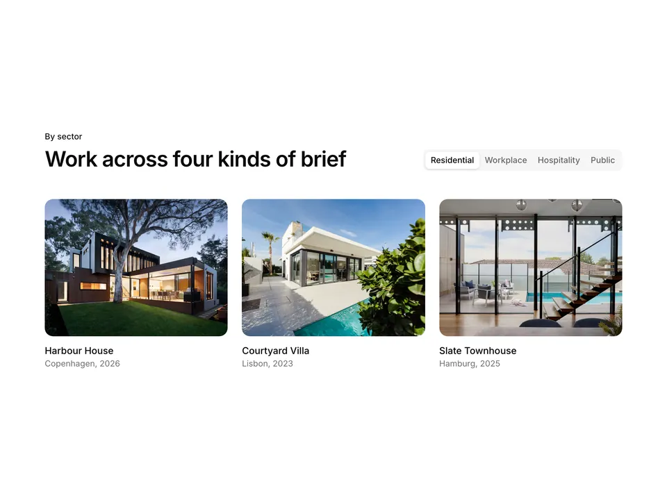
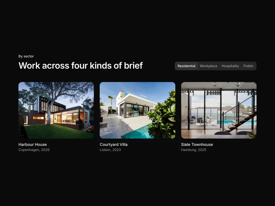
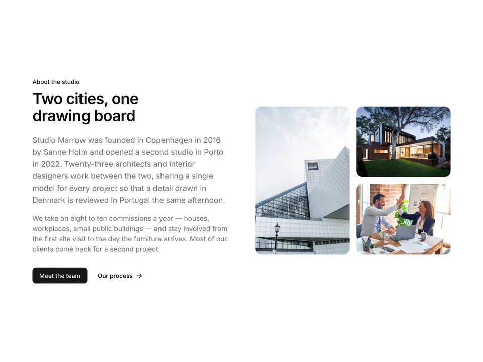
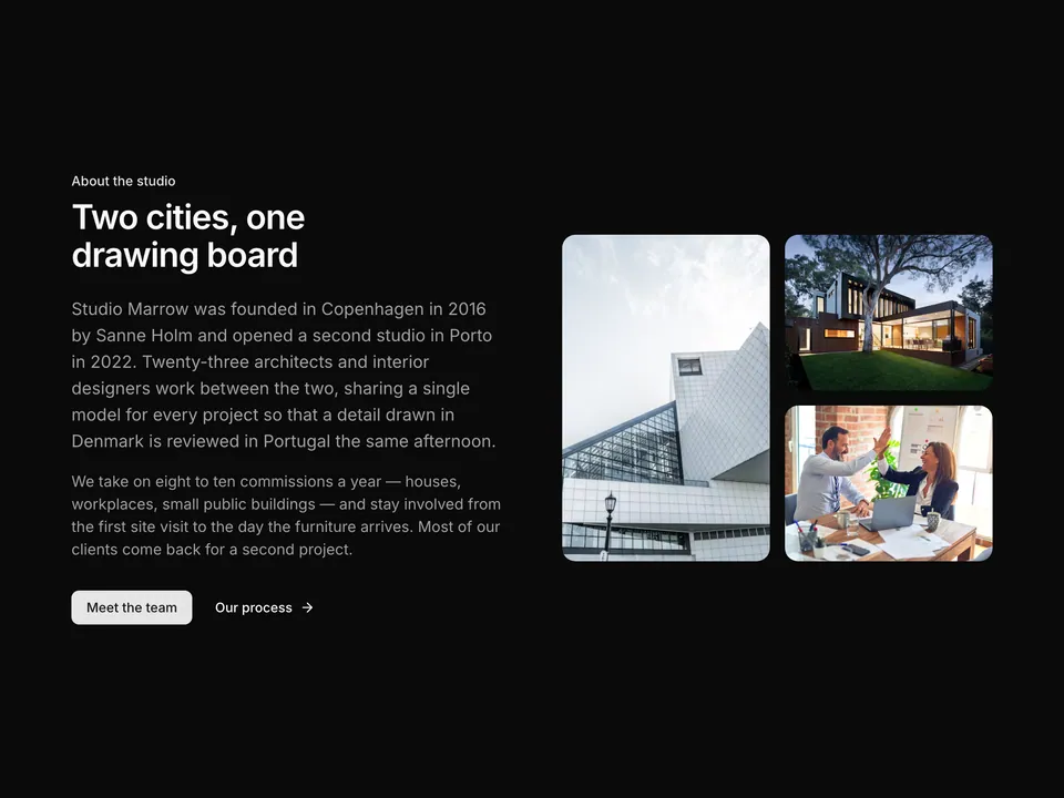
    name: 'Harbour House',
    year: 2026,
    alt: 'Bright living room with harbour light',
    aspect: 'aspect-[4/5]',
  },
  {
    id: '1487958449943-2429e8be8625',
    name: 'Atrium Offices',
    year: 2025,
    alt: 'Concrete atrium with skylight',
    aspect: 'aspect-[4/3]',
  },
  {
    id: '1600607687939-ce8a6c25118c',
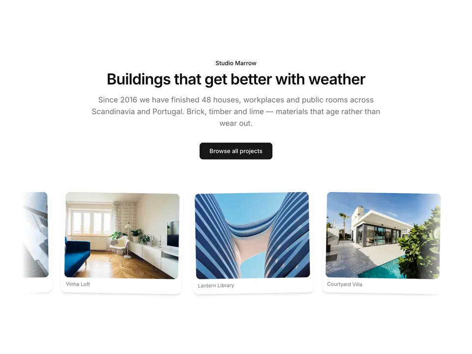
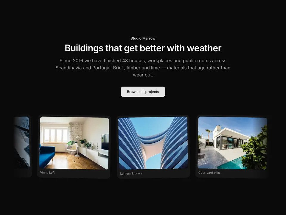
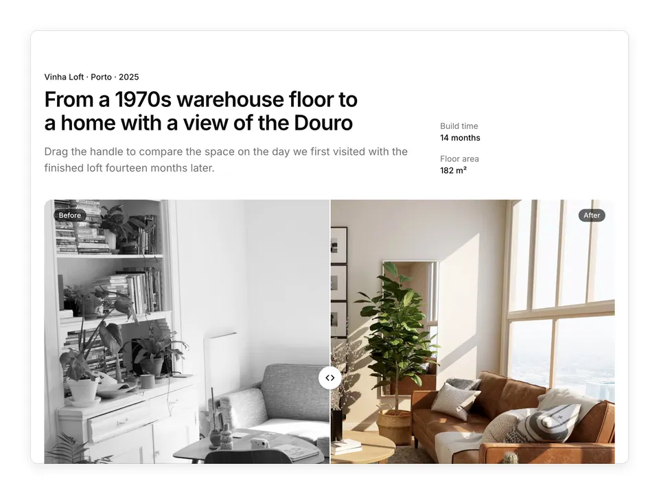
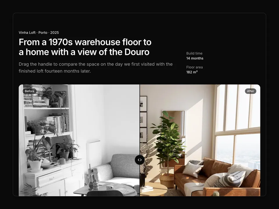
    name: 'Vinha Loft',
    year: 2025,
    alt: 'Loft interior in oak and plaster',
    aspect: 'aspect-square',
  },
  {
    id: '1600047509807-ba8f99d2cdde',
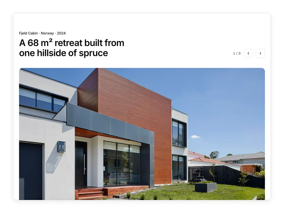
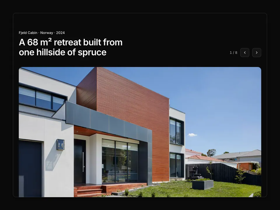
    name: 'Fjeld Cabin',
    year: 2024,
    alt: 'Cabin exterior at dusk',
    aspect: 'aspect-[3/4]',
  },
  {
    id: '1518005020951-eccb494ad742',
    name: 'Lantern Library',
    year: 2024,
    alt: 'Curved reading room facade',
    aspect: 'aspect-[4/3]',
  },
  {
    id: '1512917774080-9991f1c4c750',
    name: 'Courtyard Villa',
    year: 2023,
    alt: 'Villa with courtyard pool',
    aspect: 'aspect-[4/5]',
  },
  {
    id: '1600573472550-8090b5e0745e',
    name: 'Slate Townhouse',
    year: 2025,
    alt: 'Townhouse kitchen in dark stone',
    aspect: 'aspect-square',
  },
  {
    id: '1505691938895-1758d7feb511',
    name: 'Tidewater Spa',
    year: 2026,
    alt: 'Spa suite in soft morning light',
    aspect: 'aspect-[4/3]',
  },
  {
    id: '1511818966892-d7d671e672a2',
    name: 'Atrium Offices',
    year: 2025,
    alt: 'Geometric facade detail',
    aspect: 'aspect-[3/4]',
  },
];

/**
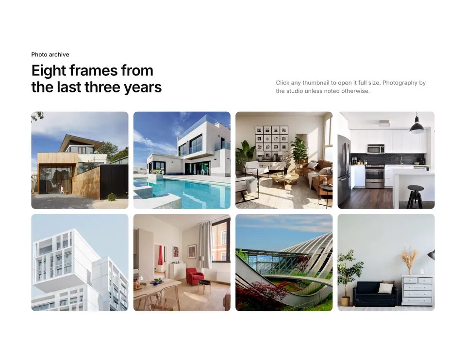
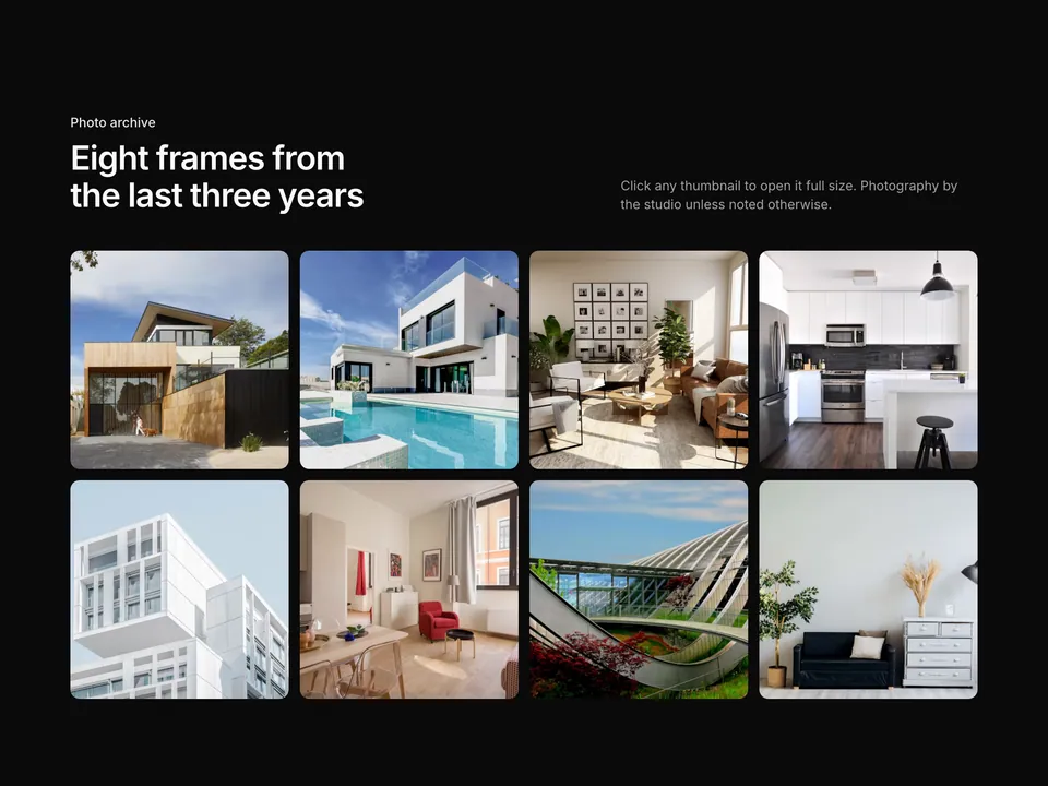
 * Centred heading over a three-column CSS masonry of nine project photos; each tile reveals the project name and year on hover.
 */
export default function Gallery01() {
  return (
    <section className="w-full py-16 sm:py-24">
      <div className="mx-auto w-full max-w-6xl px-6">
        <div className="mx-auto max-w-2xl text-center">
          <p className="font-medium text-primary text-sm">Selected work</p>
          <h2 className="mt-2 text-balance font-semibold text-3xl text-foreground tracking-tight sm:text-4xl">
            Nine rooms, eight cities, one way of working
          </h2>
          <p className="mt-4 text-pretty text-lg text-muted-foreground">
            A cross-section of Studio Marrow projects from Copenhagen to the
            Algarve. Hover any image for the project and year.
          </p>
        </div>

        <div className="mt-12 columns-2 gap-4 md:columns-3">
          {projects.map((project) => (
            <a
              className="group relative mb-4 block break-inside-avoid overflow-hidden rounded-xl bg-muted"
              href="#"
              key={project.id}
            >
              <img
                alt={project.alt}
                className={`${project.aspect} w-full object-cover transition-transform duration-500 group-hover:scale-[1.03]`}
                loading="lazy"
                src={photo(project.id)}
              />
              <div className="absolute inset-0 flex items-end bg-gradient-to-t from-black/70 via-black/20 to-transparent p-4 opacity-0 transition-opacity duration-300 group-hover:opacity-100 group-focus-visible:opacity-100">
                <div className="text-white">
                  <p className="font-semibold">{project.name}</p>
                  <p className="text-sm text-white/80">{project.year}</p>
                </div>
              </div>
            </a>
          ))}
        </div>
      </div>
    </section>
  );
}