'use client';

import {
  BookOpenIcon,
  ChartColumnIcon,
  CheckIcon,
  CloudIcon,
  GitBranchIcon,
  KeyRoundIcon,
  ListTodoIcon,
  MessageSquareIcon,
  PenToolIcon,
  SearchIcon,
  WorkflowIcon,
} from 'lucide-react';
import { useState } from 'react';

import { Badge } from '@/components/ui/badge';
import { Button } from '@/components/ui/button';
import { Card, CardContent } from '@/components/ui/card';
import { Input } from '@/components/ui/input';

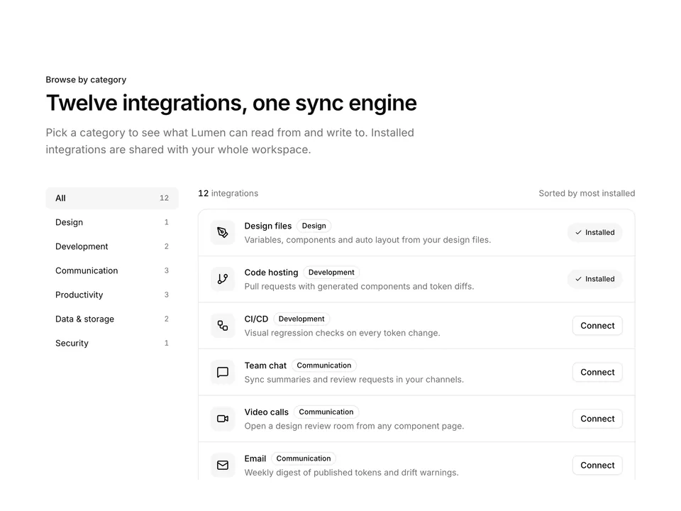
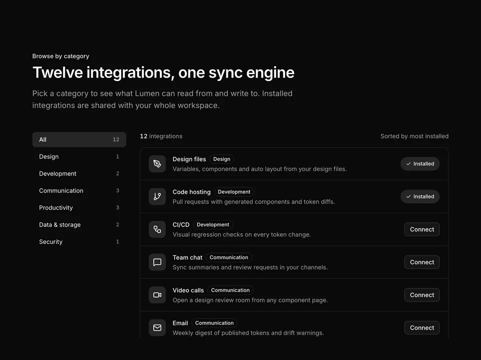
const integrations = [
  {
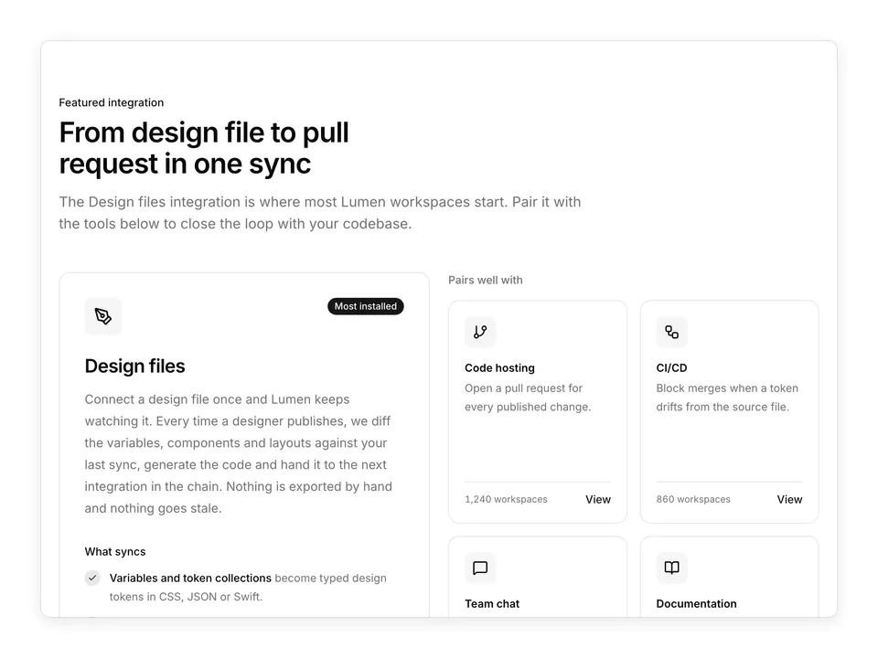
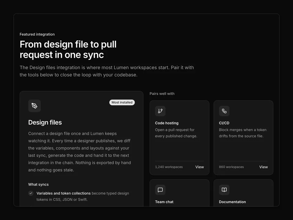
    name: 'Design files',
    category: 'Design',
    description:
      'Pull frames, variables and styles straight from your design files.',
    icon: PenToolIcon,
    installed: true,
  },
  {
    name: 'Code hosting',
    category: 'Development',
    description:
      'Open pull requests with generated components and token diffs.',
    icon: GitBranchIcon,
    installed: true,
  },
  {
    name: 'CI/CD',
    category: 'Development',
    description:
      'Run visual regression checks on every token change before merge.',
    icon: WorkflowIcon,
    installed: false,
  },
  {
    name: 'Team chat',
    category: 'Communication',
    description:
      'Post sync summaries and review requests to the right channel.',
    icon: MessageSquareIcon,
    installed: false,
  },
  {
    name: 'Issue tracking',
    category: 'Planning',
    description:
      'Link every generated component to the ticket that asked for it.',
    icon: ListTodoIcon,
    installed: false,
  },
  {
    name: 'Documentation',
    category: 'Knowledge',
    description:
      'Publish component docs and usage notes to your wiki automatically.',
    icon: BookOpenIcon,
    installed: false,
  },
  {
    name: 'Cloud storage',
    category: 'Storage',
    description:
      'Archive exported assets and token snapshots to a shared bucket.',
    icon: CloudIcon,
    installed: false,
  },
  {
    name: 'Analytics',
    category: 'Insights',
    description:
      'Track which components ship and how often they get reused.',
    icon: ChartColumnIcon,
    installed: false,
  },
  {
    name: 'SSO / Identity',
    category: 'Security',
    description:
      'Provision seats and enforce single sign-on across every workspace.',
    icon: KeyRoundIcon,
    installed: false,
  },
];

/**
 * Searchable integration directory: heading with a live search Input, then a three-column grid of Cards with an icon tile, category Badge, one-line description and a Connect Button or Installed Badge; a dashed empty state appears when nothing matches.
 */
export default function Integrations01() {
  const [query, setQuery] = useState('');
  const normalised = query.trim().toLowerCase();
  const visible = integrations.filter(
    (item) =>
      normalised.length === 0 ||
      item.name.toLowerCase().includes(normalised) ||
      item.category.toLowerCase().includes(normalised) ||
      item.description.toLowerCase().includes(normalised)
  );

  return (
    <section className="w-full py-16 sm:py-24">
      <div className="mx-auto w-full max-w-6xl px-6">
        <div className="flex flex-col gap-6 md:flex-row md:items-end md:justify-between">
          <div className="max-w-2xl">
            <p className="font-medium text-primary text-sm">Integrations</p>
            <h2 className="mt-2 text-balance font-semibold text-3xl text-foreground tracking-tight sm:text-4xl">
              Connect Lumen to the tools you already use
            </h2>
            <p className="mt-4 text-pretty text-lg text-muted-foreground">
              Every integration is built and maintained by the Lumen team.
              Setup takes under five minutes and never requires a plugin.
            </p>
          </div>
          <div className="relative w-full md:w-72">
            <SearchIcon
              aria-hidden="true"
              className="-translate-y-1/2 pointer-events-none absolute top-1/2 left-3 size-4 text-muted-foreground"
            />
            <Input
              aria-label="Search integrations"
              autoComplete="off"
              className="pl-9"
              name="query"
              onChange={(e) => setQuery(e.target.value)}
              placeholder="Search integrations"
              type="search"
              value={query}
            />
          </div>
        </div>

        {visible.length > 0 ? (
          <div className="mt-12 grid grid-cols-1 gap-4 sm:grid-cols-2 md:grid-cols-3">
            {visible.map((item) => (
              <Card className="py-0 shadow-none" key={item.name}>
                <CardContent className="flex h-full flex-col p-6">
                  <div className="flex items-start justify-between gap-4">
                    <span className="flex size-10 shrink-0 items-center justify-center rounded-lg bg-muted text-foreground">
                      <item.icon aria-hidden="true" className="size-5" />
                    </span>
                    <Badge variant="outline">{item.category}</Badge>
                  </div>
                  <h3 className="mt-4 font-semibold text-foreground">
                    {item.name}
                  </h3>
                  <p className="mt-1 text-pretty text-muted-foreground text-sm leading-6">
                    {item.description}
                  </p>
                  <div className="mt-6 flex flex-1 items-end">
                    {item.installed ? (
                      <Badge className="h-8 gap-1.5 px-3" variant="secondary">
                        <CheckIcon aria-hidden="true" />
                        Installed
                      </Badge>
                    ) : (
                      <Button size="sm" type="button" variant="outline">
                        Connect
                      </Button>
                    )}
                  </div>
                </CardContent>
              </Card>
            ))}
          </div>
        ) : (
          <div className="mt-12 rounded-xl border border-dashed p-12 text-center">
            <p className="font-medium text-foreground">
              No integrations match “{query}”
            </p>
            <p className="mt-1 text-muted-foreground text-sm">
              Try a category like “Development” or request a new integration.
            </p>
            <Button
              className="mt-4"
              onPress={() => setQuery('')}
              type="button"
              variant="outline"
            >
              Clear search
            </Button>
          </div>
        )}
      </div>
    </section>
  );
}