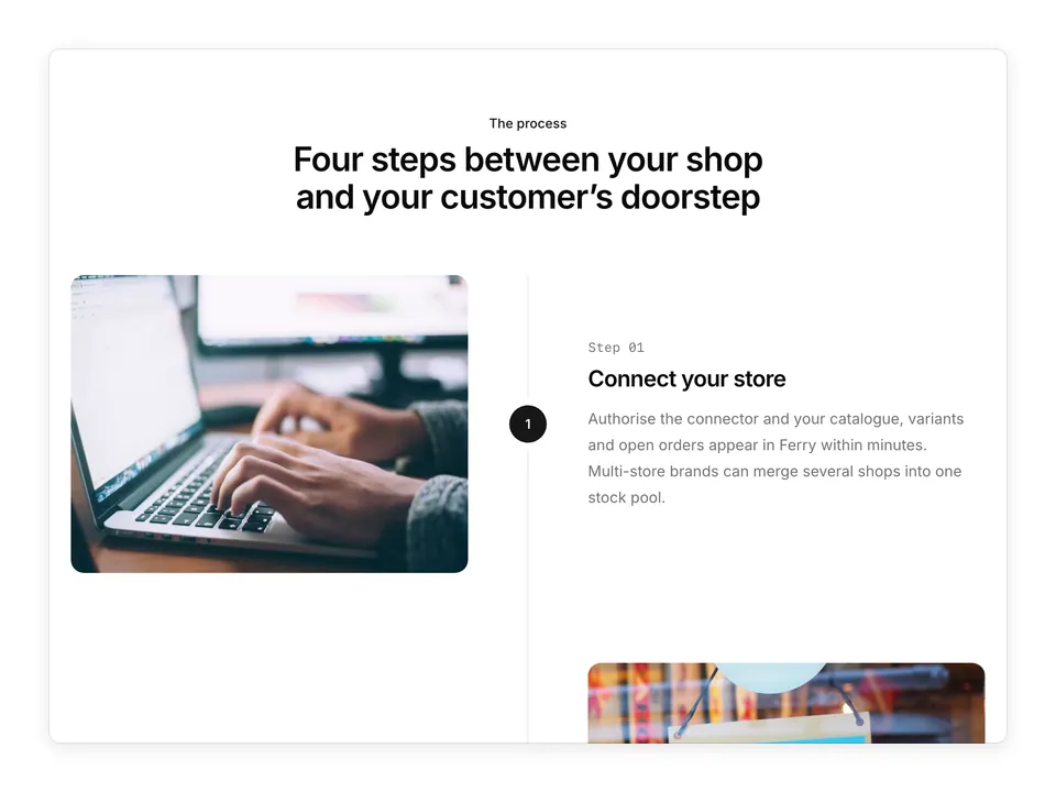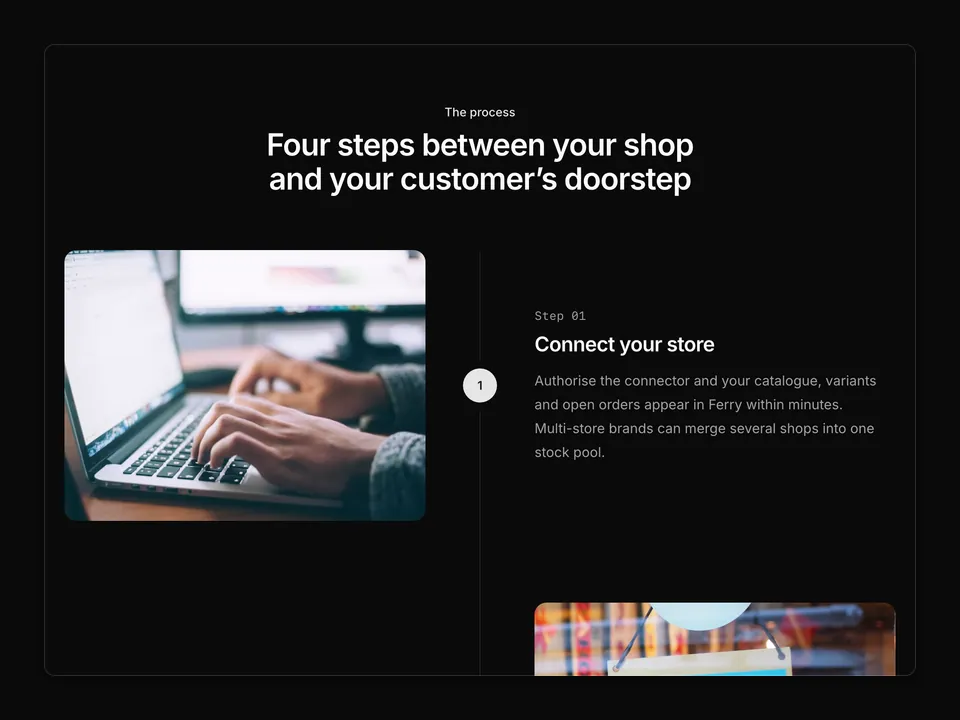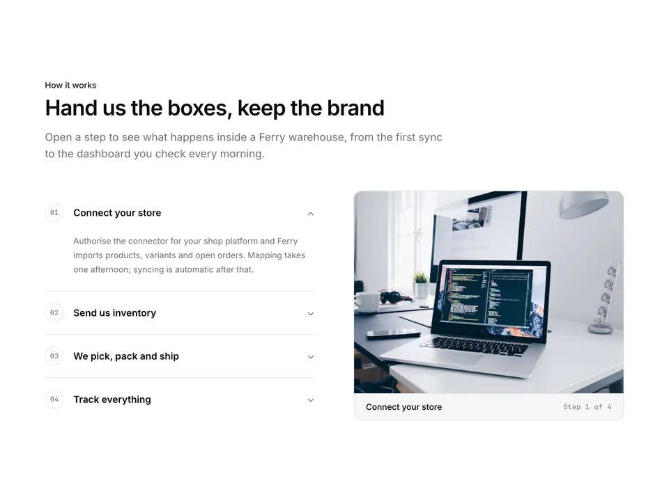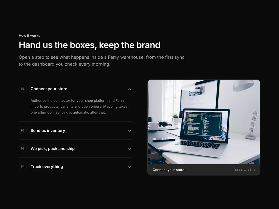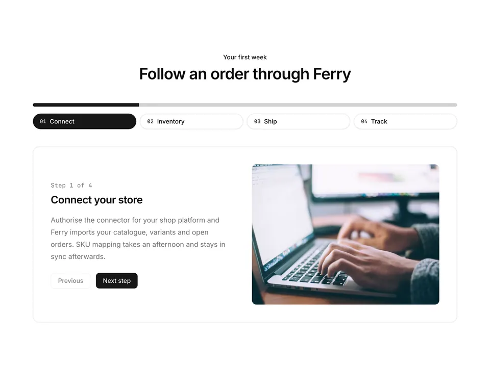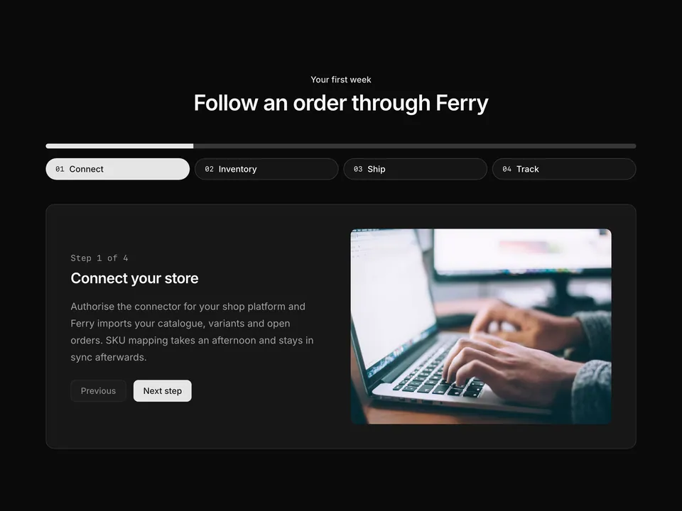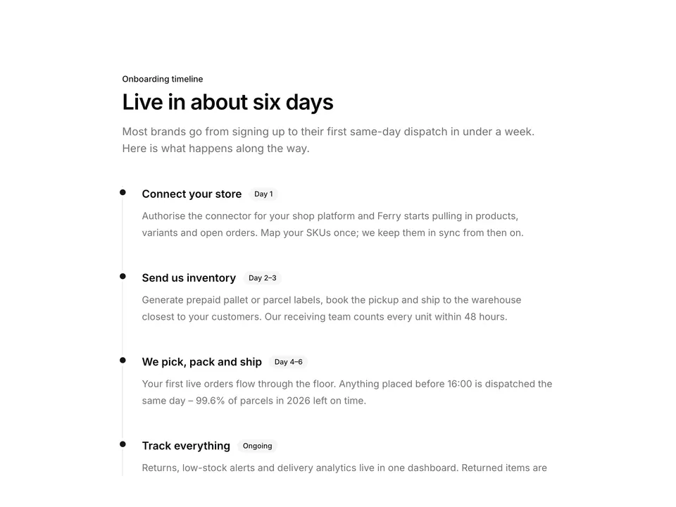
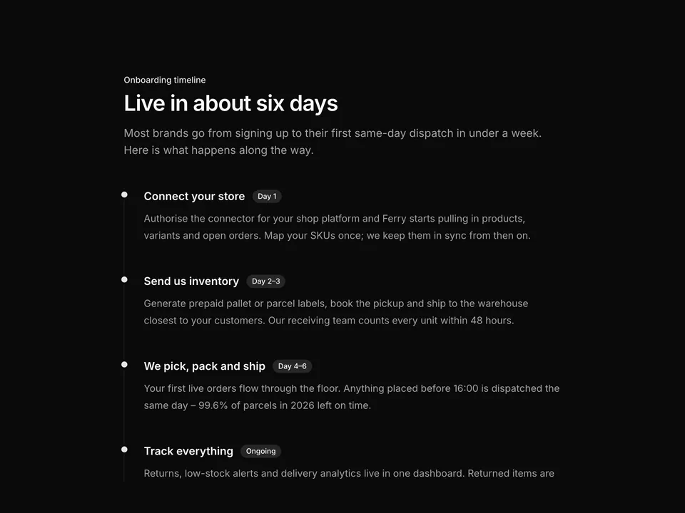
BlocksStepsThree-step cards with dashed connector

shadcn/ui Steps block for React AriaThree-step cards with dashed connector

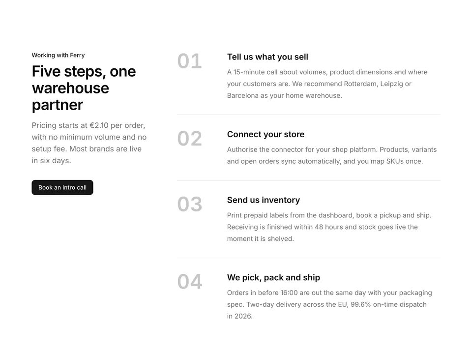
Centred heading over three horizontal step cards built with shadcn/ui. Each step has a numbered primary circle, title and text, the circles are joined by a dashed connector line on desktop, and a single Button sits below. A classic "how it works" opener for a landing page.

Free@shadcnpro/aria/steps-01

Preview

Installation

npx shadcn@latest add @shadcnpro/aria/steps-01

First time? Add the @shadcnpro registry to components.json as shown in Installation. Free blocks install without a license key.

Let your AI editor install it

The shadcn/ui Pro MCP server lets Cursor, Claude Code and VS Code find and install blocks like Three-step cards with dashed connector from one prompt. It is included in every Pro plan.

Add the shadcn/ui components

Three-step cards with dashed connector uses Button, from the React Aria components set up in your components.json.

npx shadcn@latest add button

Install the npm packages

npm install lucide-react

Copy the code

Paste it into components/blocks/steps-01.tsx.

components/blocks/steps-01.tsx
'use client';

import { ArrowRightIcon } from 'lucide-react';

import { Button, LinkButton } from '@/components/ui/button';

const steps = [
  {
    title: 'Connect your store',
    text: 'Link your shop in a few clicks. Our connectors sync orders, SKUs and customer addresses from the platforms small brands already sell on – no developer needed.',
  },
  {
    title: 'Send us inventory',
    text: 'Print prepaid labels from your dashboard and ship stock to Rotterdam, Leipzig or Barcelona. Everything is counted and shelved within 48 hours of arrival.',
  },
  {
    title: 'We pick, pack and ship',
    text: 'Orders placed before 16:00 leave the warehouse the same day, packed with your inserts and branded tape, and reach most EU addresses in two days.',
  },
];

/**
 * Centred heading over three horizontal step cards with numbered primary circles joined by a dashed connector line, and a single call-to-action Button below.
 */
export default function Steps01() {
  return (
    <section className="w-full py-16 sm:py-24">
      <div className="mx-auto w-full max-w-6xl px-6">
        <div className="mx-auto max-w-2xl text-center">
          <p className="font-medium text-primary text-sm">How Ferry works</p>
          <h2 className="mt-2 text-balance font-semibold text-3xl text-foreground tracking-tight sm:text-4xl">
            From your first order to 1,200 parcels a week in three steps
          </h2>
          <p className="mt-4 text-pretty text-lg text-muted-foreground">
            Ferry runs fulfilment for 1,900 small brands. The average store is
            live in six days, and from then on you never touch a box again.
          </p>
        </div>

        <ol className="relative mt-16 grid grid-cols-1 gap-12 md:grid-cols-3 md:gap-8">
          <div
            aria-hidden="true"
            className="absolute top-5 right-[16.666%] left-[16.666%] hidden border-border border-t border-dashed md:block"
          />
          {steps.map((step, index) => (
            <li className="relative flex flex-col items-center text-center" key={step.title}>
              <span className="relative z-10 flex size-10 items-center justify-center rounded-full bg-primary font-semibold text-primary-foreground text-sm ring-8 ring-background">
                {index + 1}
              </span>
              <h3 className="mt-6 font-semibold text-foreground text-lg">
                {step.title}
              </h3>
              <p className="mt-2 text-pretty text-muted-foreground text-sm leading-6">
                {step.text}
              </p>
            </li>
          ))}
        </ol>

        <div className="mt-14 flex justify-center">
          <LinkButton href="#" size="lg">
            Start shipping with Ferry
            <ArrowRightIcon aria-hidden="true" />
          </LinkButton>
        </div>
      </div>
    </section>
  );
}

Use it

Import it where you need it and update the import path to match your project.

Usage
import Steps01 from '@/components/blocks/steps-01';

export default function Page() {
  return <Steps01 />;
}

Overview

Three-step cards with dashed connector is a free steps block for shadcn/ui and React Aria. It is built from the Button component with lucide-react, and installs as a single file you own and can edit.

It only uses semantic tokens such as bg-background, text-muted-foreground and border-border, so it follows your theme, radius and fonts and switches with dark mode. It is responsive from desktop to mobile; the width controls above the preview show each size. The same layout is in the shadcn/ui Pro Figma kit, so design and code start from one source.

Category
Steps
Component library
React Aria (react-aria-components)
Also available for
Radix UI, Base UI
Built with
Button
npm packages
lucide-react
Files
components/blocks/steps-01.tsx
Access
Free, installs without a license key

Frequently asked questions

Pricing, installation and React Aria details for Three-step cards with dashed connector.