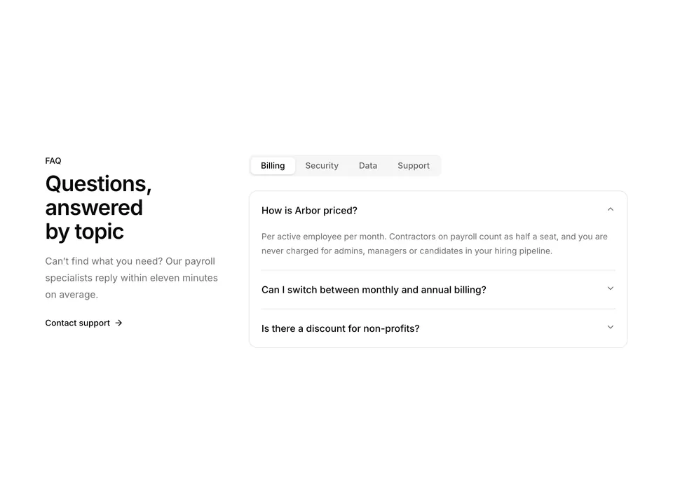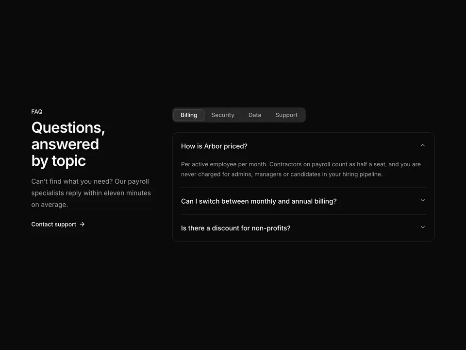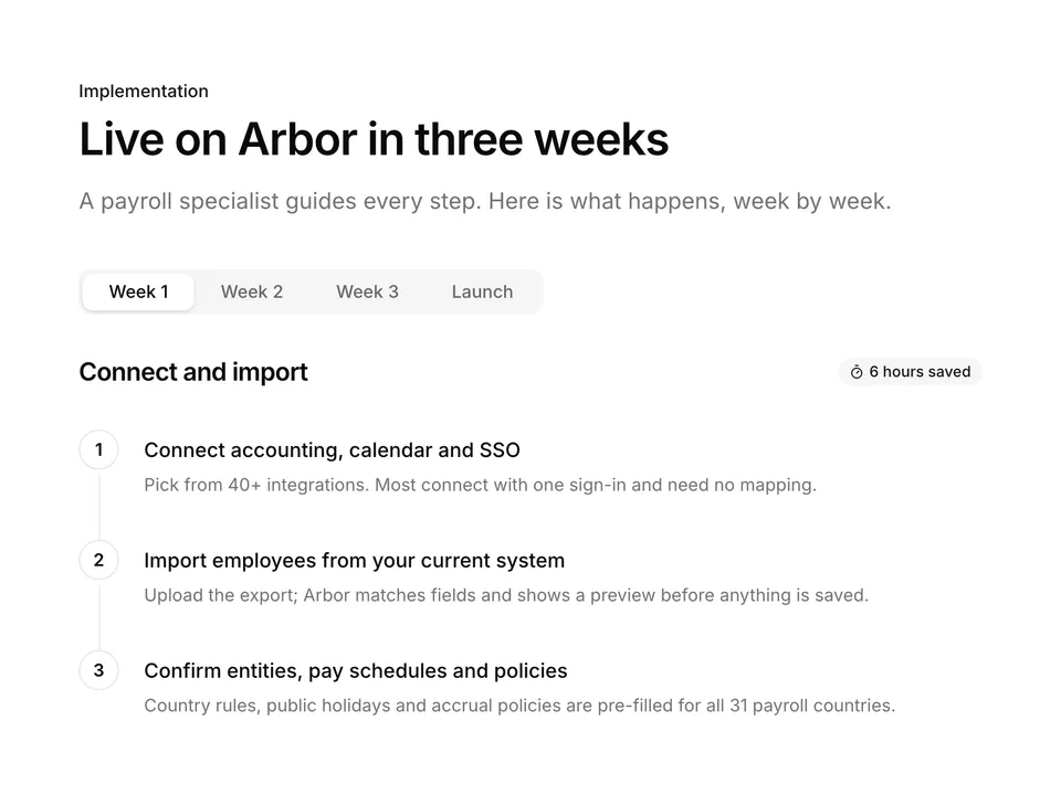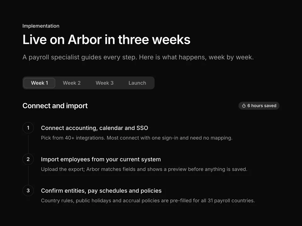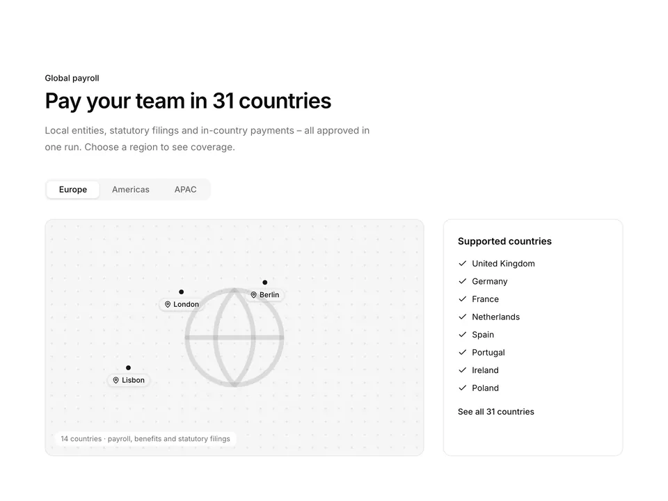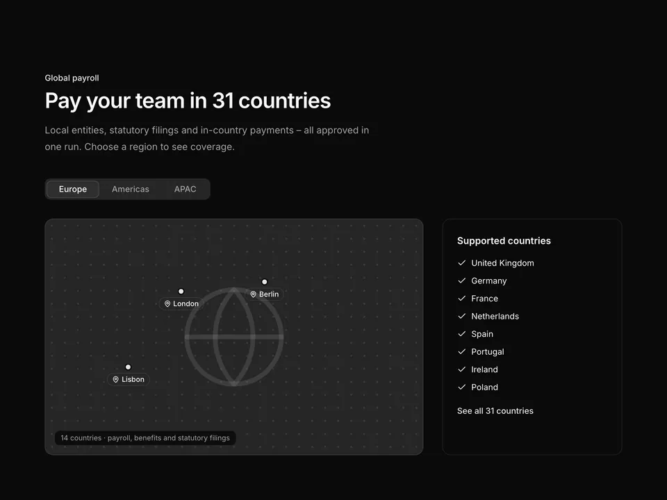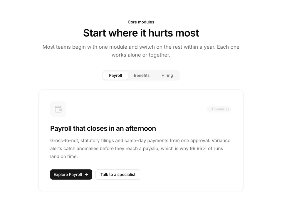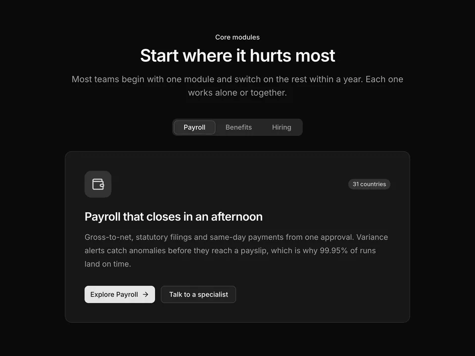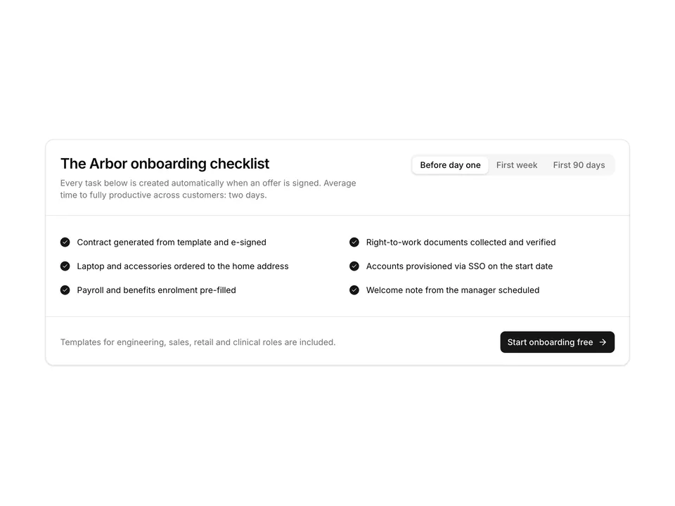
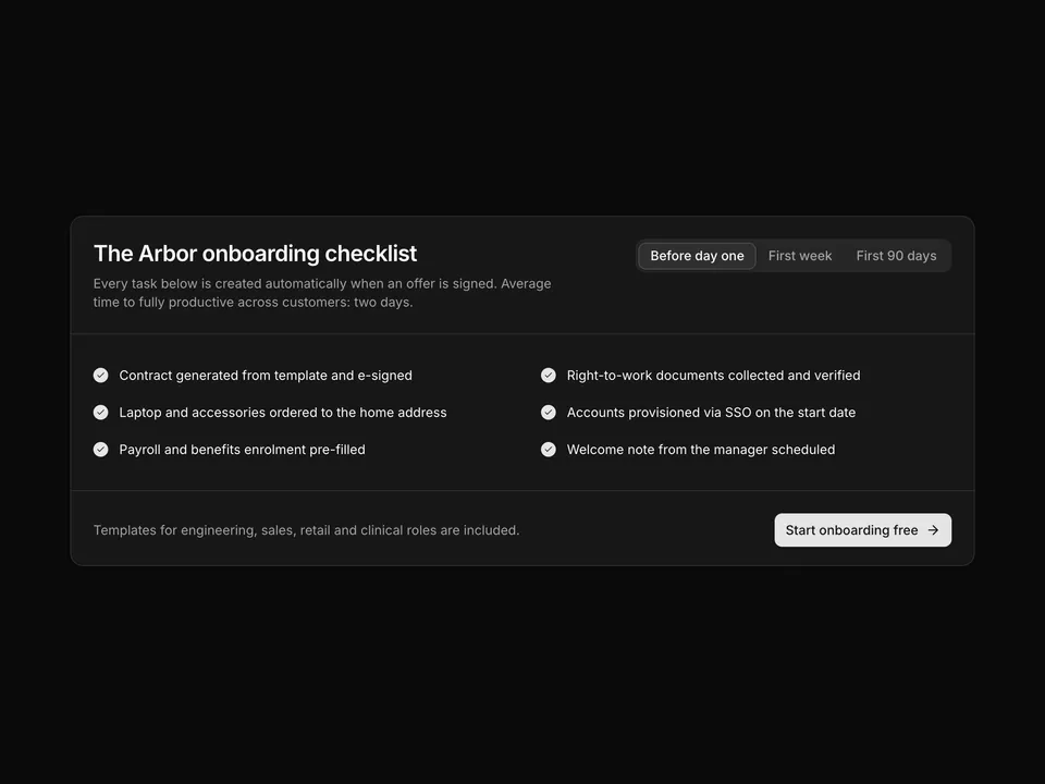
Tabbed checklist inside a bordered card
One large shadcn/ui Card hosts the Tabs: CardHeader with title and description beside the TabsList (stacked on mobile), CardContent with a two-column checklist of filled Check markers for each onboarding stage, and a CardFooter with a note and call-to-action Button. Compact and self-contained.