'use client';

import { GithubIcon, LinkedinIcon } from 'lucide-react';

const portrait = (id: string) =>
  `https://images.unsplash.com/photo-${id}?auto=format&fit=crop&w=400&q=80`;

const members = [
  {
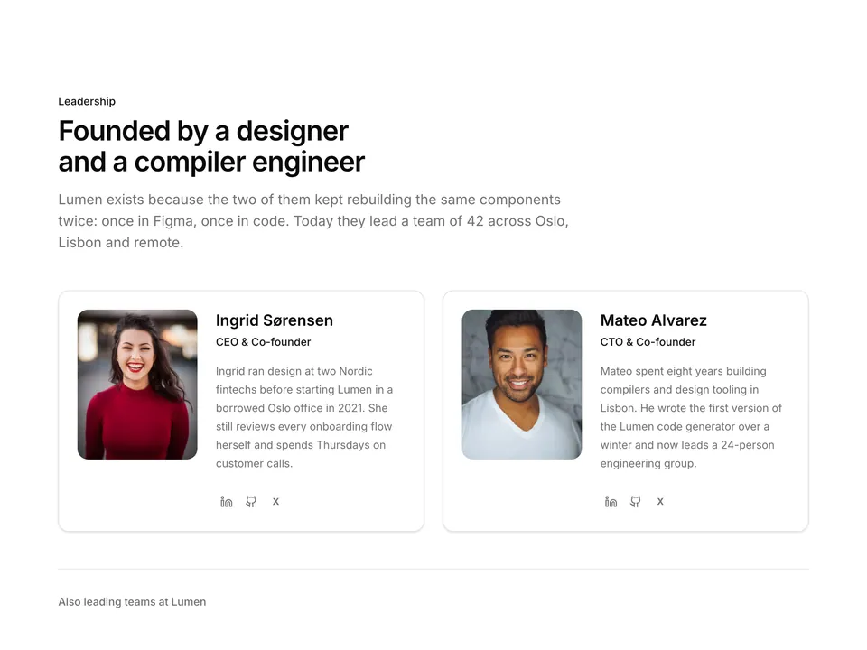
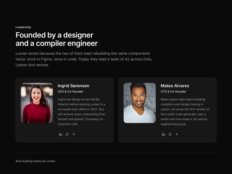
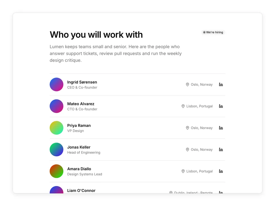
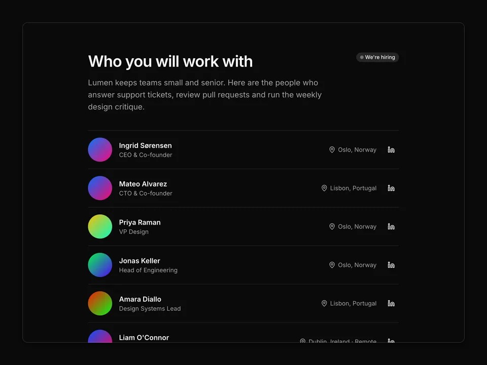
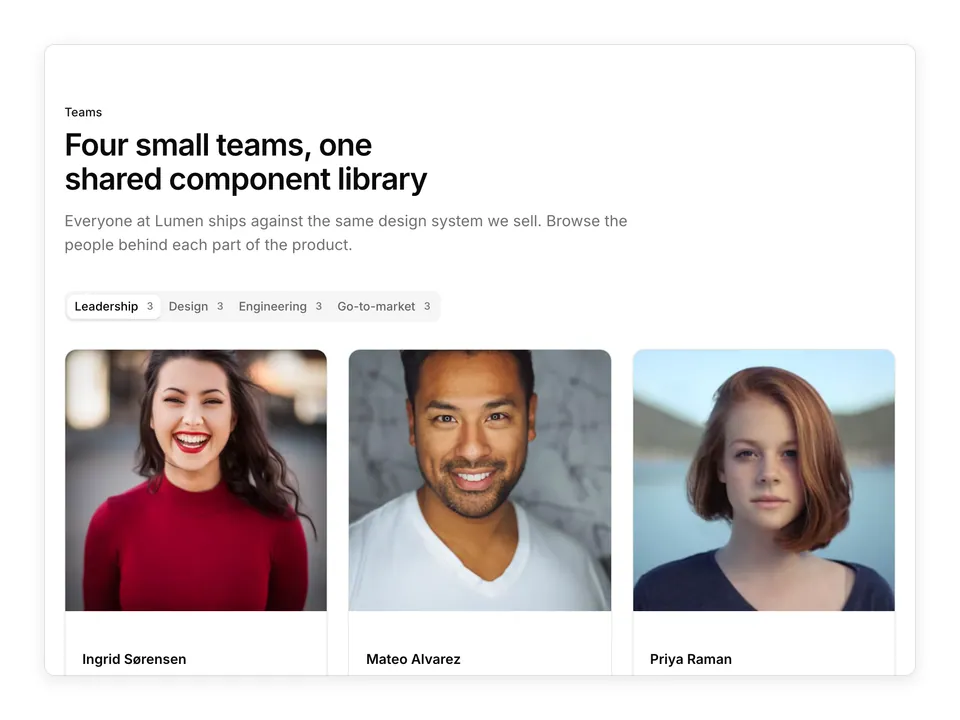
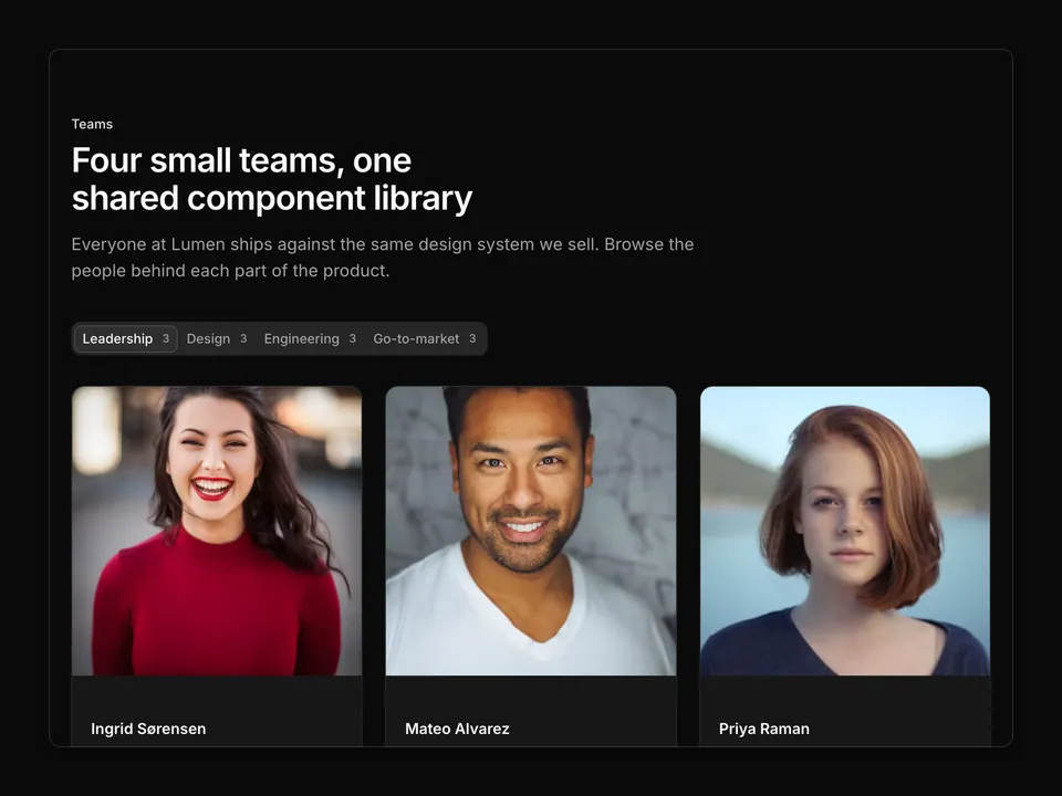
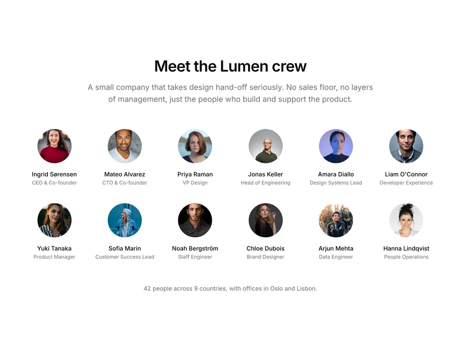
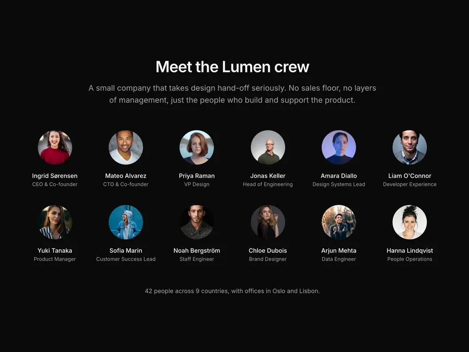
    name: 'Ingrid Sørensen',
    role: 'CEO & Co-founder',
    photo: portrait('1494790108377-be9c29b29330'),
  },
  {
    name: 'Mateo Alvarez',
    role: 'CTO & Co-founder',
    photo: portrait('1507003211169-0a1dd7228f2d'),
  },
  {
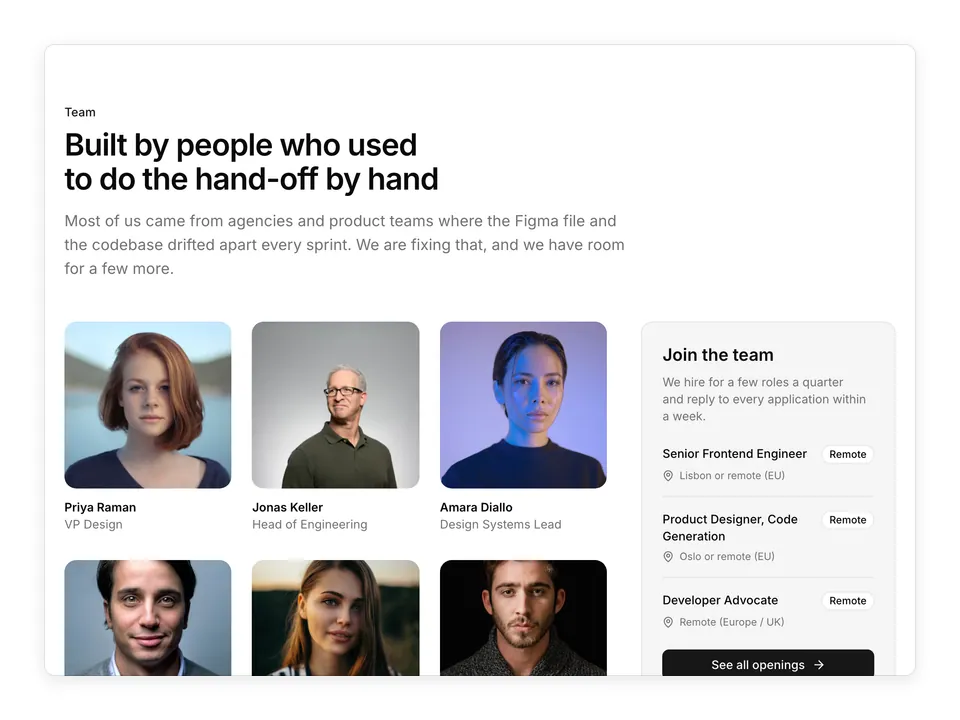
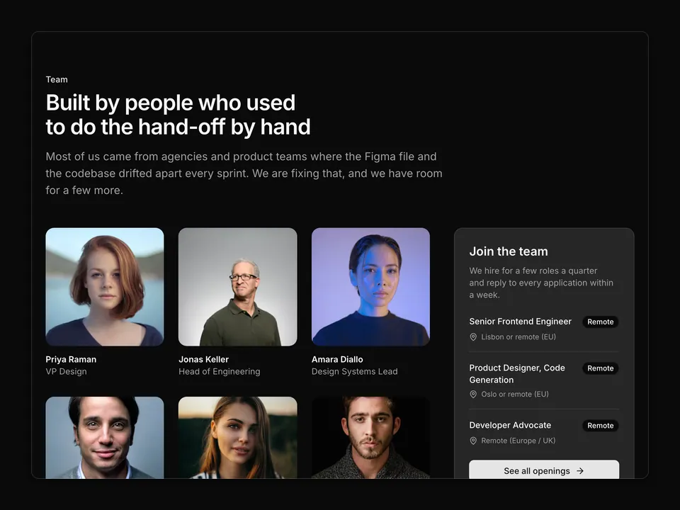
    name: 'Priya Raman',
    role: 'VP Design',
    photo: portrait('1438761681033-6461ffad8d80'),
  },
  {
    name: 'Jonas Keller',
    role: 'Head of Engineering',
    photo: portrait('1472099645785-5658abf4ff4e'),
  },
  {
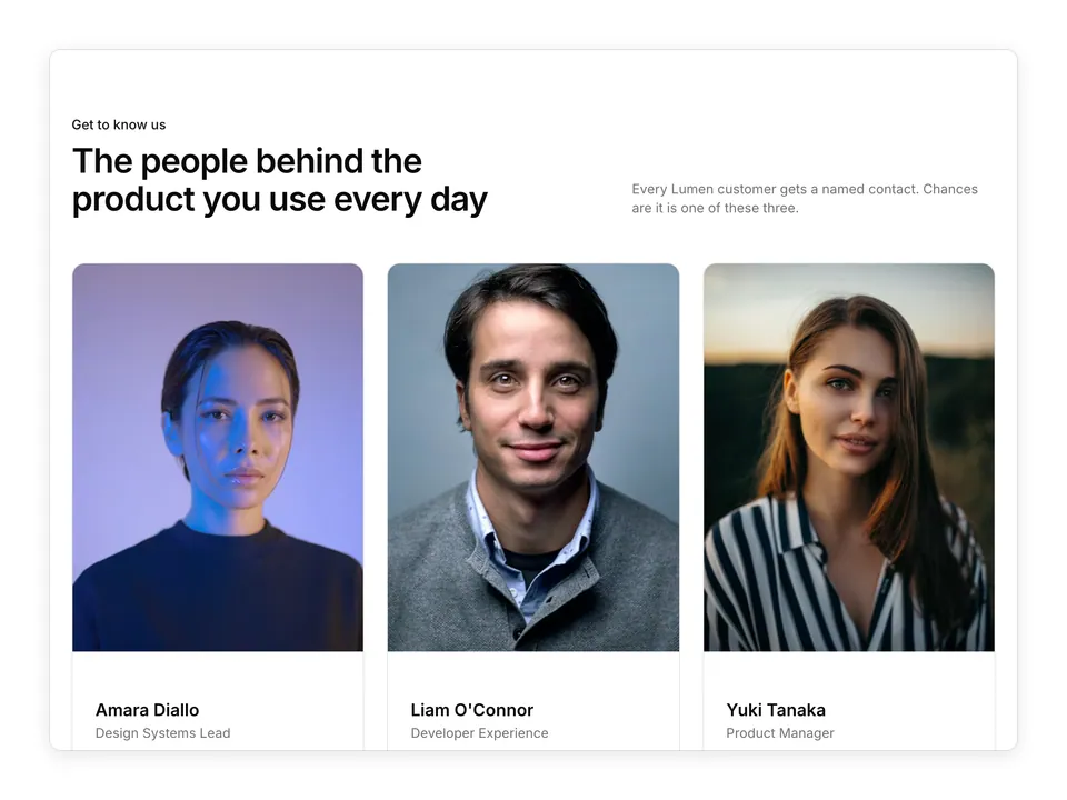
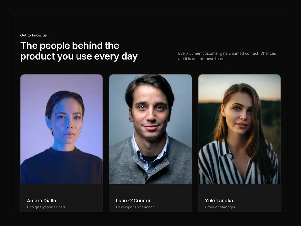
    name: 'Amara Diallo',
    role: 'Design Systems Lead',
    photo: portrait('1534528741775-53994a69daeb'),
  },
  {
    name: "Liam O'Connor",
    role: 'Developer Experience',
    photo: portrait('1500648767791-00dcc994a43e'),
  },
  {
    name: 'Yuki Tanaka',
    role: 'Product Manager',
    photo: portrait('1544005313-94ddf0286df2'),
  },
  {
    name: 'Sofia Marin',
    role: 'Customer Success Lead',
    photo: portrait('1517841905240-472988babdf9'),
  },
];

/**
 * Centred heading and lead above a four-column grid of eight square portraits with name, role and LinkedIn / GitHub icon links.
 */
export default function Team01() {
  return (
    <section className="w-full py-16 sm:py-24">
      <div className="mx-auto w-full max-w-6xl px-6">
        <div className="mx-auto max-w-2xl text-center">
          <p className="font-medium text-primary text-sm">The team</p>
          <h2 className="mt-2 text-balance font-semibold text-3xl text-foreground tracking-tight sm:text-4xl">
            The people turning Figma frames into shipped code
          </h2>
          <p className="mt-4 text-pretty text-lg text-muted-foreground">
            Lumen is 42 designers, engineers and ex-agency folks split between
            Oslo, Lisbon and a dozen home offices. These are the people you
            will meet first.
          </p>
        </div>

        <ul className="mt-14 grid grid-cols-1 gap-x-6 gap-y-10 sm:grid-cols-2 md:grid-cols-4">
          {members.map((member) => (
            <li className="flex flex-col" key={member.name}>
              <img
                alt={`Portrait of ${member.name}`}
                className="aspect-square w-full rounded-xl object-cover"
                loading="lazy"
                src={member.photo}
              />
              <h3 className="mt-4 font-semibold text-foreground">
                {member.name}
              </h3>
              <p className="text-muted-foreground text-sm">{member.role}</p>
              <div className="mt-3 flex items-center gap-1">
                <a
                  aria-label={`${member.name} on LinkedIn`}
                  className="rounded-md p-1.5 text-muted-foreground transition-colors hover:bg-accent hover:text-foreground"
                  href="#"
                >
                  <LinkedinIcon aria-hidden="true" className="size-4" />
                </a>
                <a
                  aria-label={`${member.name} on GitHub`}
                  className="rounded-md p-1.5 text-muted-foreground transition-colors hover:bg-accent hover:text-foreground"
                  href="#"
                >
                  <GithubIcon aria-hidden="true" className="size-4" />
                </a>
              </div>
            </li>
          ))}
        </ul>
      </div>
    </section>
  );
}