shadcn/ui Buttons block for Base UIButtons

Production-ready button variant blocks for shadcn/ui. Primary, secondary, ghost, and icon button styles from the shadcn figma design kit — install via CLI or customize in Figma.

Free@shadcnpro/base/application-buttons

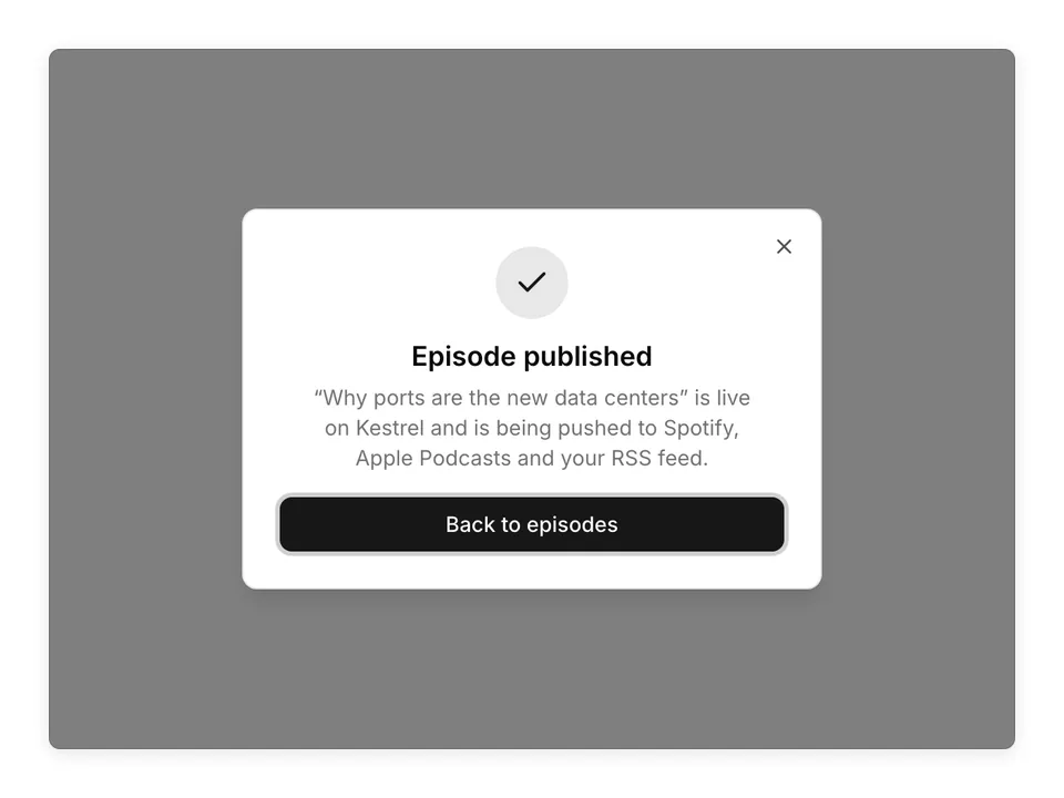
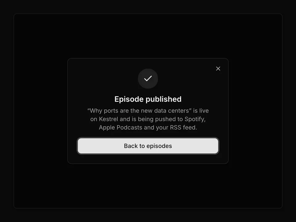
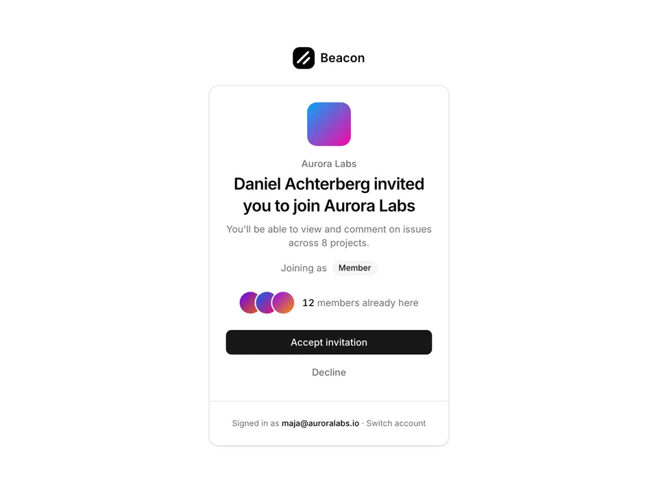
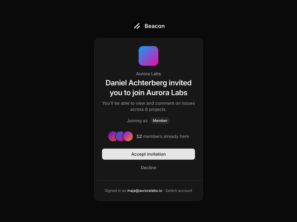
Preview

Installation

npx shadcn@latest add @shadcnpro/base/application-buttons

First time? Add the @shadcnpro registry to components.json as shown in Installation. Free blocks install without a license key.

Let your AI editor install it

The shadcn/ui Pro MCP server lets Cursor, Claude Code and VS Code find and install blocks like Buttons from one prompt. It is included in every Pro plan.

Add the shadcn/ui components

Buttons uses Button, from the Base UI components set up in your components.json.

npx shadcn@latest add button

Install the npm packages

npm install lucide-react

Copy the code

Paste it into components/blocks/application-buttons.tsx.

components/blocks/application-buttons.tsx
'use client';

import React from 'react';
import { Button } from '@/components/ui/button';
import { Download, Mail, Trash2, Plus } from 'lucide-react';

export default function ApplicationButtons() {
  return (
    <div className="p-8 space-y-8">
      <div className="space-y-4">
        <h3 className="text-lg font-semibold">Button Variants</h3>
        <div className="flex flex-wrap gap-4">
          <Button>Default</Button>
          <Button variant="secondary">Secondary</Button>
          <Button variant="outline">Outline</Button>
          <Button variant="ghost">Ghost</Button>
          <Button variant="destructive">Destructive</Button>
        </div>
      </div>
      
      <div className="space-y-4">
        <h3 className="text-lg font-semibold">Button Sizes</h3>
        <div className="flex flex-wrap items-center gap-4">
          <Button size="sm">Small</Button>
          <Button size="default">Default</Button>
          <Button size="lg">Large</Button>
        </div>
      </div>

      <div className="space-y-4">
        <h3 className="text-lg font-semibold">Buttons with Icons</h3>
        <div className="flex flex-wrap gap-4">
          <Button>
            <Mail className="mr-2 h-4 w-4" />
            Email
          </Button>
          <Button variant="outline">
            <Download className="mr-2 h-4 w-4" />
            Download
          </Button>
          <Button variant="destructive">
            <Trash2 className="mr-2 h-4 w-4" />
            Delete
          </Button>
          <Button size="icon">
            <Plus className="h-4 w-4" />
          </Button>
        </div>
      </div>
    </div>
  );
}

Use it

Import it where you need it and update the import path to match your project.

Usage
import ApplicationButtons from '@/components/blocks/application-buttons';

export default function Page() {
  return <ApplicationButtons />;
}

Overview

Buttons is a free buttons block for shadcn/ui and Base UI. It is built from the Button component with lucide-react, and installs as a single file you own and can edit.

It only uses semantic tokens such as bg-background, text-muted-foreground and border-border, so it follows your theme, radius and fonts and switches with dark mode. It is a full-page layout that fills the viewport and adapts from desktop to mobile. The same layout is in the shadcn/ui Pro Figma kit, so design and code start from one source.

Category
Buttons
Component library
Base UI (@base-ui/react)
Also available for
Radix UI, React Aria
Built with
Button
npm packages
lucide-react
Files
components/blocks/application-buttons.tsx
Access
Free, installs without a license key

Frequently asked questions

Pricing, installation and Base UI details for Buttons.