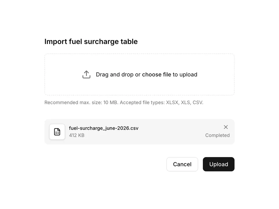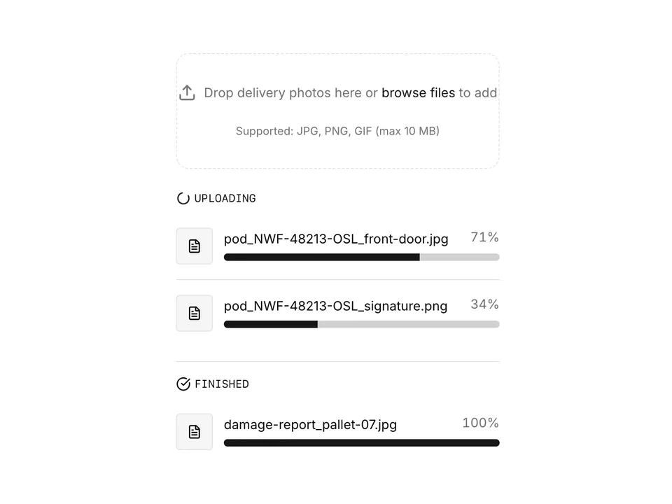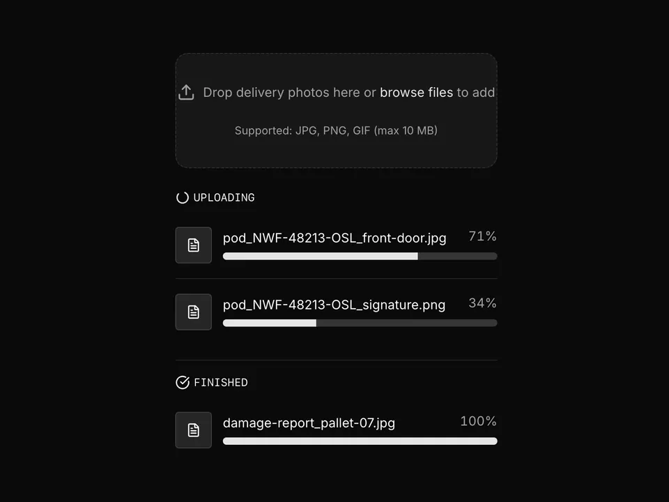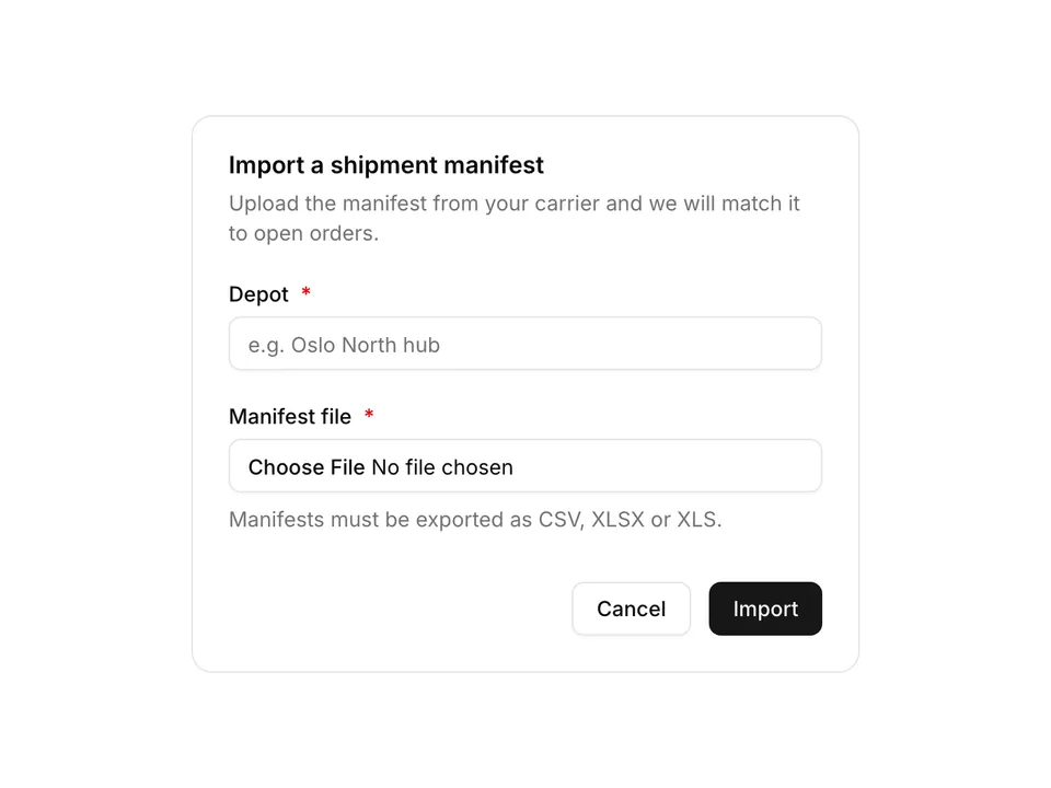
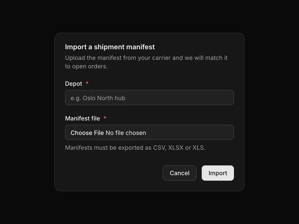
BlocksFile UploadDelivery record card with photo dropzone and upload previews

shadcn/ui File Upload block for Base UIDelivery record card with photo dropzone and upload previews

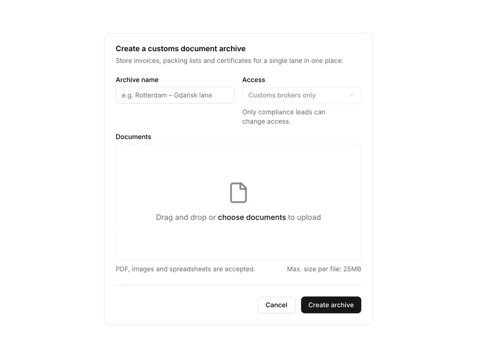
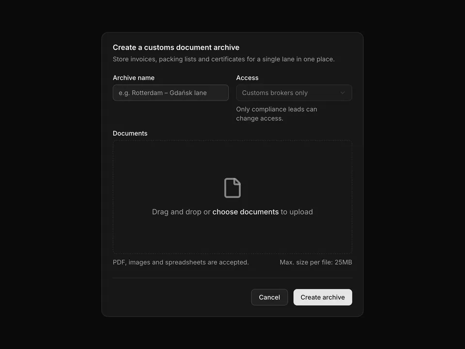
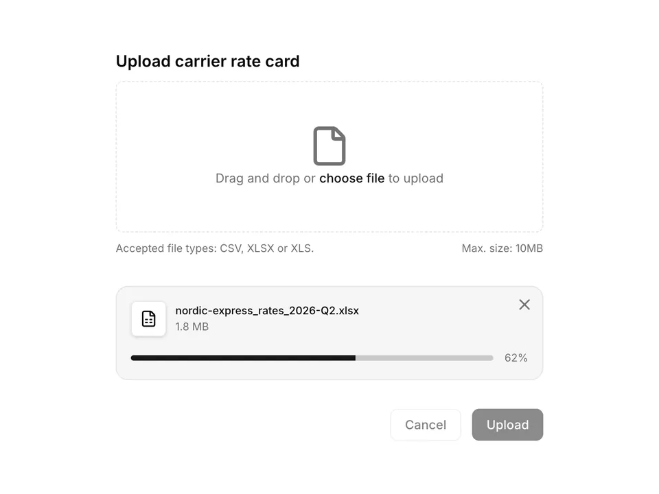
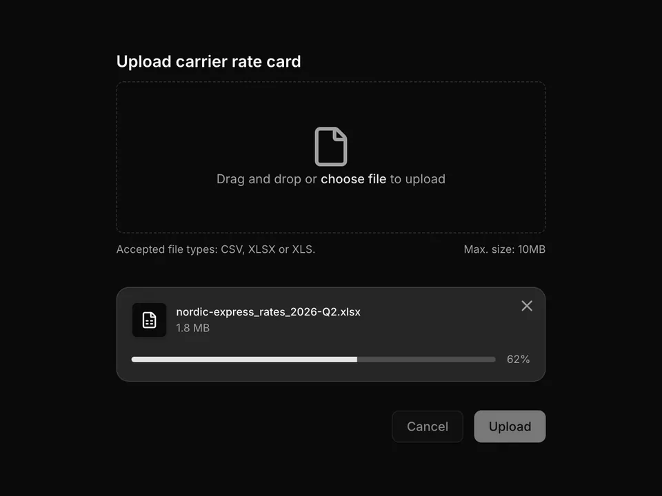
A multi-file shadcn/ui upload block built as a Card with a details form, an image dropzone and a live list of uploaded files showing thumbnails, sizes and per-file progress bars. Uses shadcn/ui Card, Input, Label, Select, Button and Tooltip, and is split into dropzone, file list and form components. Ideal for closing out a shipment with proof-of-delivery photos or any record that needs attached images.

Free@shadcnpro/base/file-upload-01

Preview

Installation

npx shadcn@latest add @shadcnpro/base/file-upload-01

First time? Add the @shadcnpro registry to components.json as shown in Installation. Free blocks install without a license key.

Let your AI editor install it

The shadcn/ui Pro MCP server lets Cursor, Claude Code and VS Code find and install blocks like Delivery record card with photo dropzone and upload previews from one prompt. It is included in every Pro plan.

Add the shadcn/ui components

Delivery record card with photo dropzone and upload previews uses Button, Card, Input, Label, Select and Tooltip, from the Base UI components set up in your components.json.

npx shadcn@latest add button card input label select tooltip

Install the npm packages

npm install lucide-react

Copy the code

Paste it into components/file-upload-01/index.tsx.

'use client';

import { UploadIcon } from 'lucide-react';
import type React from 'react';
import type { RefObject } from 'react';

interface FileDropzoneProps {
  fileInputRef: RefObject<HTMLInputElement>;
  handleBoxClick: () => void;
  handleDragOver: (e: React.DragEvent) => void;
  handleDrop: (e: React.DragEvent) => void;
  handleFileSelect: (files: FileList | null) => void;
}

export function FileDropzone({
  fileInputRef,
  handleBoxClick,
  handleDragOver,
  handleDrop,
  handleFileSelect,
}: FileDropzoneProps) {
  return (
    <div className="px-6">
      <div
        className="flex cursor-pointer flex-col items-center justify-center rounded-md border-2 border-border border-dashed p-8 text-center"
        onClick={handleBoxClick}
        onDragOver={handleDragOver}
        onDrop={handleDrop}
      >
        <div className="mb-2 rounded-full bg-muted p-3">
          <UploadIcon className="size-5 text-muted-foreground" />
        </div>
        <p className="font-medium text-foreground text-sm">Add proof-of-delivery photos</p>
        <p className="mt-1 text-muted-foreground text-sm">
          or,{' '}
          <label
            className="cursor-pointer font-medium text-primary hover:text-primary/90"
            htmlFor="delivery-photo-upload"
            onClick={(e) => e.stopPropagation()}
          >
            click to browse
          </label>{' '}
          (6MB max)
        </p>
        <input
          accept="image/*"
          className="hidden"
          id="delivery-photo-upload"
          multiple
          onChange={(e) => handleFileSelect(e.target.files)}
          ref={fileInputRef}
          type="file"
        />
      </div>
    </div>
  );
}

Use it

Multi-file block: 5 files are installed under components/file-upload-01/.

Usage
import FileUpload01 from '@/components/file-upload-01';
<FileUpload01 />

Overview

Delivery record card with photo dropzone and upload previews is a free file upload block for shadcn/ui and Base UI. It is built from the Button, Card, Input, Label, Select and Tooltip components with lucide-react, and installs as 5 files you own and can edit.

It only uses semantic tokens such as bg-background, text-muted-foreground and border-border, so it follows your theme, radius and fonts and switches with dark mode. It is responsive from desktop to mobile; the width controls above the preview show each size. The same layout is in the shadcn/ui Pro Figma kit, so design and code start from one source.

Category
File Upload
Component library
Base UI (@base-ui/react)
Also available for
Radix UI, React Aria
Built with
Button, Card, Input, Label, Select and Tooltip
npm packages
lucide-react
Files
5 files in components/file-upload-01/
Access
Free, installs without a license key

Frequently asked questions

Pricing, installation and Base UI details for Delivery record card with photo dropzone and upload previews.