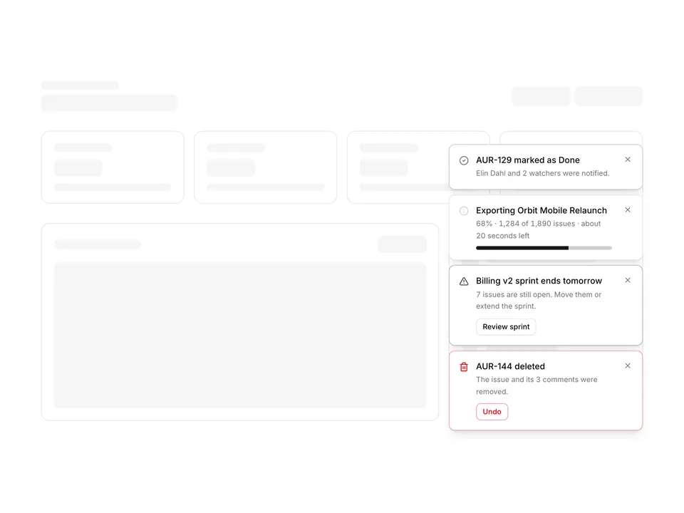
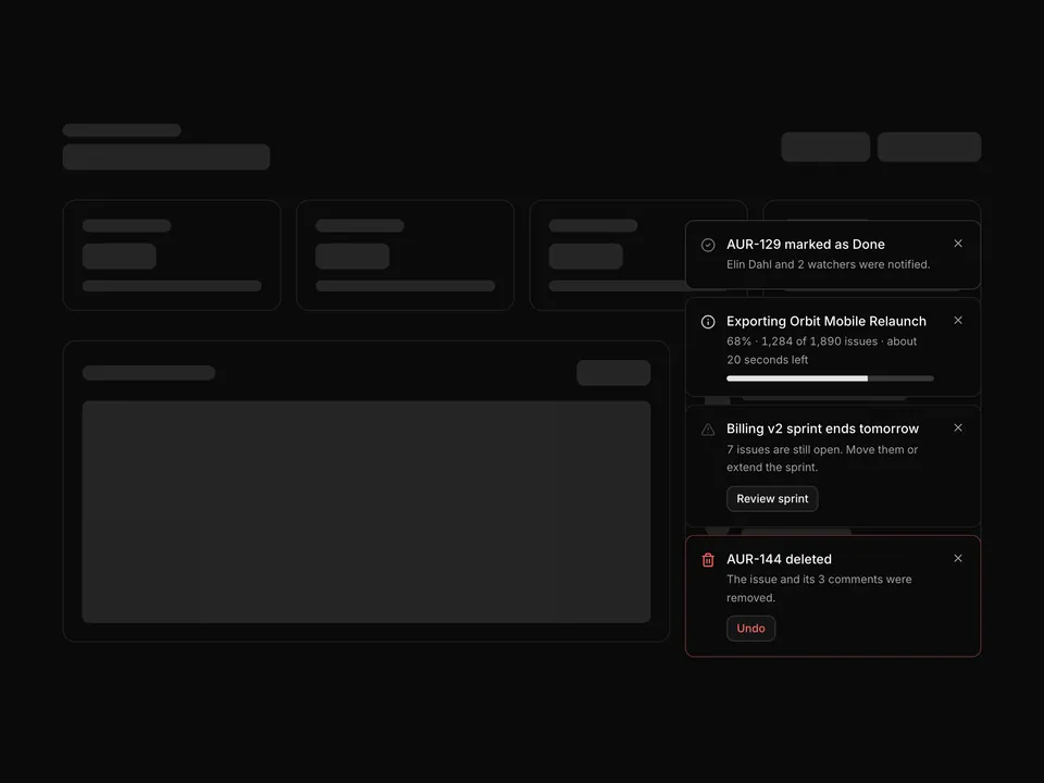
BlocksNotificationsActivity feed timeline with filters

shadcn/ui Notifications block for Base UIActivity feed timeline with filters

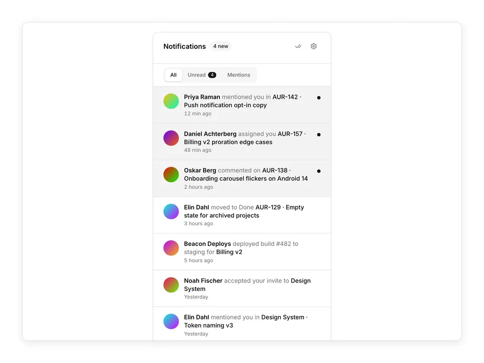
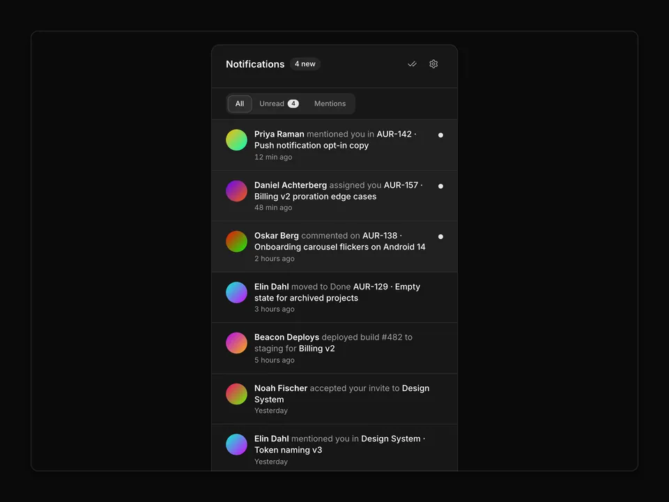
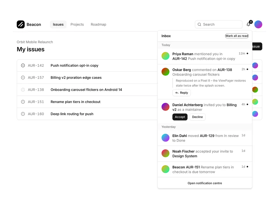
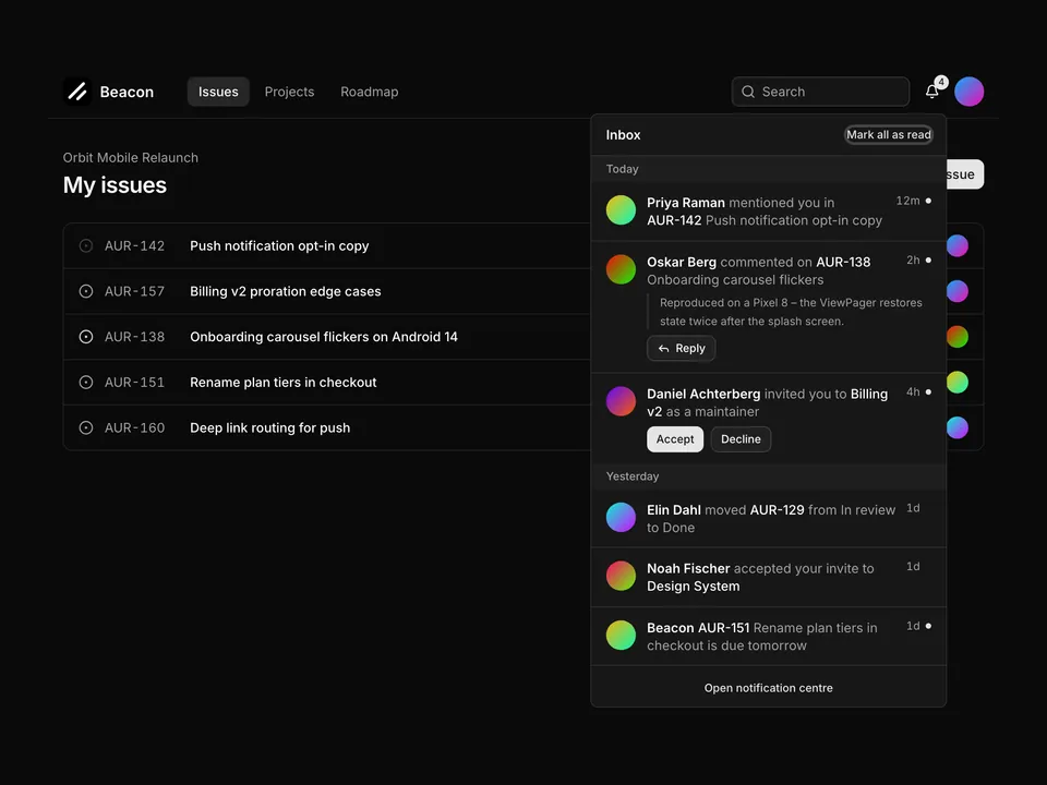
Full-page activity feed (max-w-3xl) for shadcn/ui: a header with unread count, pill-shaped filter chips for All, Mentions, Assigned and System with counts, date separators for Today and This week, and a vertical timeline whose rows use tinted chart-colour icon circles per event type with a small Avatar overlay. Comment events expand through a Collapsible preview with Reply and Open issue actions, and a "Load older activity" Button closes the list.

Pro@shadcnpro/base/notifications-03

Preview

Installation

Part of shadcn/ui Pro

Pro unlocks the source code and one-command install of all 439 blocks, plus the Figma kit, themes and the MCP server for your AI editor.

Let your AI editor install it

The shadcn/ui Pro MCP server lets Cursor, Claude Code and VS Code find and install blocks like Activity feed timeline with filters from one prompt. It is included in every Pro plan.

Add the shadcn/ui components

Activity feed timeline with filters uses Avatar, Badge, Button and Collapsible, from the Base UI components set up in your components.json.

npx shadcn@latest add avatar badge button collapsible

Install the npm packages

npm install lucide-react

Copy the code

Paste it into components/blocks/notifications-03.tsx.

components/blocks/notifications-03.tsx

Part of shadcn/ui Pro

Pro unlocks the source code and one-command install of all 439 blocks, plus the Figma kit, themes and the MCP server for your AI editor.

Use it

Import it where you need it and update the import path to match your project.

Usage
import Notifications03 from '@/components/blocks/notifications-03';

export default function Page() {
  return <Notifications03 />;
}

Overview

Activity feed timeline with filters is a Pro notifications block for shadcn/ui and Base UI. It is built from the Avatar, Badge, Button and Collapsible components with lucide-react, and installs as a single file you own and can edit.

It only uses semantic tokens such as bg-background, text-muted-foreground and border-border, so it follows your theme, radius and fonts and switches with dark mode. It is responsive from desktop to mobile; the width controls above the preview show each size. The same layout is in the shadcn/ui Pro Figma kit, so design and code start from one source.

Component library
Base UI (@base-ui/react)
Also available for
Radix UI, React Aria
Built with
Avatar, Badge, Button and Collapsible
npm packages
lucide-react
Files
components/blocks/notifications-03.tsx
Access
Included in every plan

Frequently asked questions

Pricing, installation and Base UI details for Activity feed timeline with filters.