'use client';
import { CheckIcon, StarIcon } from 'lucide-react';
import { useState } from 'react';
import { Checkbox } from '@/components/ui/checkbox';
import { Input } from '@/components/ui/input';
import { Label } from '@/components/ui/label';
import { RadioGroup, RadioGroupItem } from '@/components/ui/radio-group';
import { Separator } from '@/components/ui/separator';
import { Skeleton } from '@/components/ui/skeleton';
import { ToggleGroup, ToggleGroupItem } from '@/components/ui/toggle-group';
const categories = [
{ id: 'new', label: 'New in', count: 24 },
{ id: 'women', label: 'Women', count: 86 },
{ id: 'men', label: 'Men', count: 72 },
{ id: 'bags', label: 'Bags & Accessories', count: 41 },
{ id: 'home', label: 'Home', count: 58 },
{ id: 'tech', label: 'Tech', count: 19 },
];
const sizes = ['XS', 'S', 'M', 'L', 'XL'];
const colours = [
{ id: 'oat', label: 'Oat', hex: '#d9cbb3' },
{ id: 'charcoal', label: 'Charcoal', hex: '#3a3a3a' },
{ id: 'moss', label: 'Moss', hex: '#5d6b4a' },
{ id: 'sand', label: 'Sand', hex: '#c9b899' },
{ id: 'white', label: 'White', hex: '#f3f1ec' },
{ id: 'black', label: 'Black', hex: '#111111' },
{ id: 'navy', label: 'Navy', hex: '#273554' },
{ id: 'rust', label: 'Rust', hex: '#a2543a' },
];
const PRICE_MAX = 500;
/**
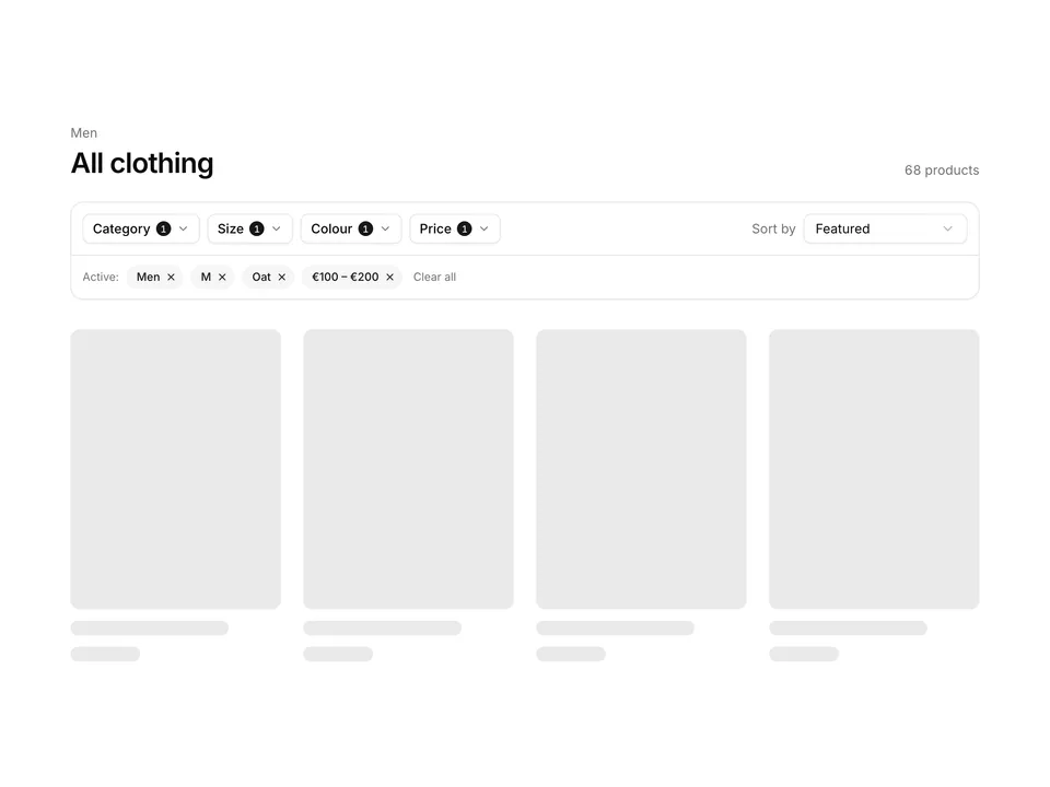
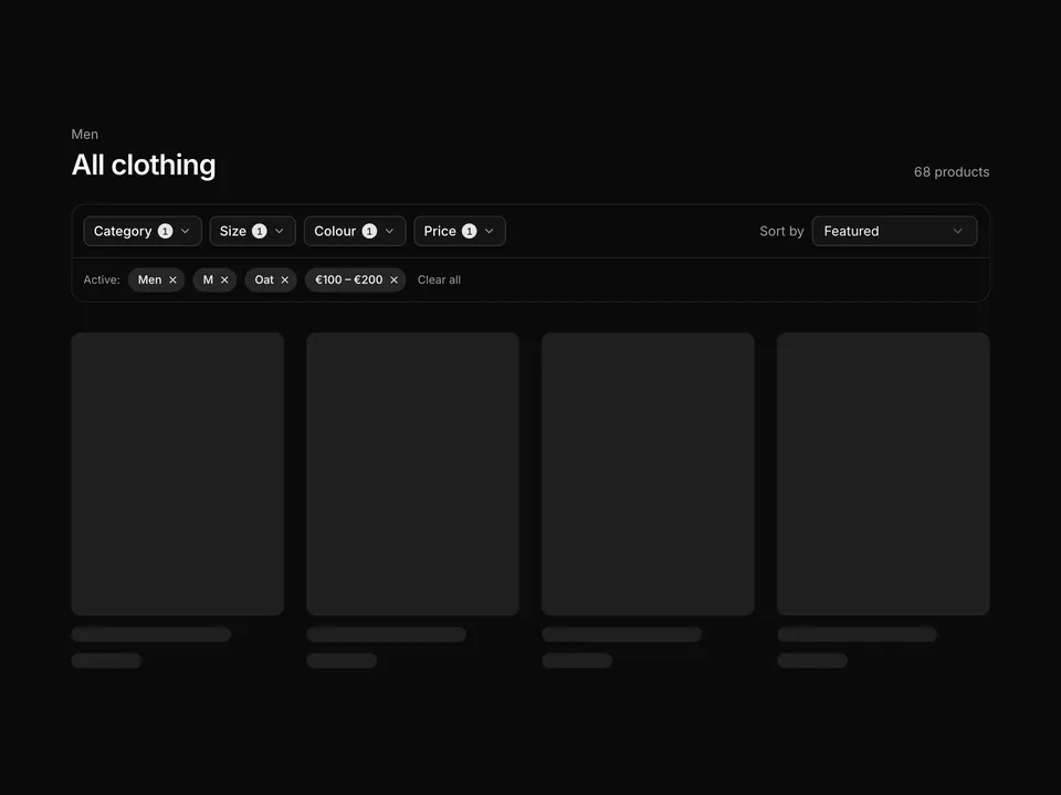
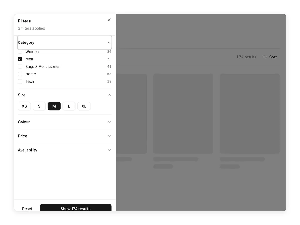
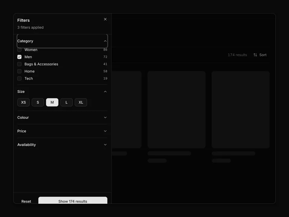
* Sidebar filter panel: Category Checkboxes with counts, Size ToggleGroup pills, colour swatch dots, a price range input with min/max Inputs and a Rating RadioGroup, rendered next to a Skeleton product grid for context.
*/
export default function Filters01() {
const [selectedCategories, setSelectedCategories] = useState<string[]>(['men']);
const [selectedSizes, setSelectedSizes] = useState<string[]>(['M']);
const [selectedColours, setSelectedColours] = useState<string[]>(['oat']);
const [maxPrice, setMaxPrice] = useState(250);
const [rating, setRating] = useState('4');
const activeCount =
selectedCategories.length +
selectedSizes.length +
selectedColours.length +
(maxPrice < PRICE_MAX ? 1 : 0) +
(rating ? 1 : 0);
const clearAll = () => {
setSelectedCategories([]);
setSelectedSizes([]);
setSelectedColours([]);
setMaxPrice(PRICE_MAX);
setRating('');
};
const toggleCategory = (id: string, checked: boolean) =>
setSelectedCategories((prev) =>
checked ? [...prev, id] : prev.filter((c) => c !== id)
);
const toggleColour = (id: string) =>
setSelectedColours((prev) =>
prev.includes(id) ? prev.filter((c) => c !== id) : [...prev, id]
);
return (
<section className="w-full py-8 sm:py-12">
<div className="mx-auto w-full max-w-6xl px-6">
<div className="grid grid-cols-1 gap-8 md:grid-cols-4 md:gap-10">
<aside className="w-full max-w-xs">
<form className="flex flex-col gap-6" onSubmit={(e) => e.preventDefault()}>
<div className="flex items-center justify-between">
<h2 className="font-semibold text-foreground">
Filters{' '}
{activeCount > 0 ? (
<span className="font-normal text-muted-foreground">({activeCount})</span>
) : null}
</h2>
<button
className="text-muted-foreground text-sm underline-offset-4 hover:text-foreground hover:underline"
onClick={clearAll}
type="button"
>
Clear all
</button>
</div>
<fieldset className="flex flex-col gap-3">
<legend className="mb-3 font-medium text-foreground text-sm">Category</legend>
{categories.map((category) => (
<div className="flex items-center gap-3" key={category.id}>
<Checkbox
checked={selectedCategories.includes(category.id)}
id={`filter-cat-${category.id}`}
name="category"
onCheckedChange={(checked) =>
toggleCategory(category.id, checked === true)
}
value={category.id}
/>
<Label
className="flex flex-1 items-center justify-between font-normal"
htmlFor={`filter-cat-${category.id}`}
>
<span>{category.label}</span>
<span className="text-muted-foreground text-xs tabular-nums">
{category.count}
</span>
</Label>
</div>
))}
</fieldset>
<Separator />
<div>
<p className="font-medium text-foreground text-sm">Size</p>
<ToggleGroup
aria-label="Size"
className="mt-3 flex-wrap justify-start"
multiple
onValueChange={setSelectedSizes}
spacing={1.5}
value={selectedSizes}
variant="outline"
>
{sizes.map((size) => (
<ToggleGroupItem
className="min-w-9 rounded-md px-2 data-pressed:border-primary data-pressed:bg-primary data-pressed:text-primary-foreground"
key={size}
value={size}
>
{size}
</ToggleGroupItem>
))}
</ToggleGroup>
</div>
<Separator />
<div>
<p className="font-medium text-foreground text-sm">Colour</p>
<div className="mt-3 flex flex-wrap gap-2">
{colours.map((colour) => {
const active = selectedColours.includes(colour.id);
return (
<button
aria-label={colour.label}
aria-pressed={active}
className={
active
? 'flex size-8 items-center justify-center rounded-full border-2 border-primary ring-2 ring-background ring-offset-0'
: 'flex size-8 items-center justify-center rounded-full border border-border hover:border-foreground/40'
}
key={colour.id}
onClick={() => toggleColour(colour.id)}
title={colour.label}
type="button"
>
<span
className="flex size-6 items-center justify-center rounded-full"
style={{ backgroundColor: colour.hex }}
>
{active ? (
<CheckIcon
aria-hidden="true"
className="size-3.5 text-white mix-blend-difference"
/>
) : null}
</span>
</button>
);
})}
</div>
</div>
<Separator />
<div>
<div className="flex items-center justify-between">
<Label className="font-medium" htmlFor="filter-price-range">
Price
</Label>
<span className="text-muted-foreground text-xs tabular-nums">
€0 – €{maxPrice}
</span>
</div>
<input
aria-label="Maximum price"
className="mt-3 w-full accent-primary"
id="filter-price-range"
max={PRICE_MAX}
min={0}
name="priceMax"
onChange={(e) => setMaxPrice(Number(e.target.value))}
step={10}
type="range"
value={maxPrice}
/>
<div className="mt-3 grid grid-cols-2 gap-2">
<div className="grid gap-1">
<Label className="text-muted-foreground text-xs" htmlFor="filter-price-min">
Min
</Label>
<Input
autoComplete="off"
className="tabular-nums"
defaultValue={0}
id="filter-price-min"
inputMode="numeric"
name="priceMinInput"
type="number"
/>
</div>
<div className="grid gap-1">
<Label className="text-muted-foreground text-xs" htmlFor="filter-price-max">
Max
</Label>
<Input
autoComplete="off"
className="tabular-nums"
id="filter-price-max"
inputMode="numeric"
name="priceMaxInput"
onChange={(e) =>
setMaxPrice(Math.min(PRICE_MAX, Math.max(0, Number(e.target.value) || 0)))
}
type="number"
value={maxPrice}
/>
</div>
</div>
</div>
<Separator />
<div>
<p className="font-medium text-foreground text-sm">Rating</p>
<RadioGroup
className="mt-3 gap-2.5"
name="rating"
onValueChange={setRating}
value={rating}
>
{[4, 3, 2].map((stars) => (
<div className="flex items-center gap-3" key={stars}>
<RadioGroupItem
aria-label={`${stars} stars and up`}
id={`filter-rating-${stars}`}
value={String(stars)}
/>
<Label
className="flex items-center gap-1.5 font-normal"
htmlFor={`filter-rating-${stars}`}
>
<span className="flex items-center">
{Array.from({ length: 5 }).map((_, i) => (
<StarIcon
aria-hidden="true"
className={
i < stars
? 'size-3.5 fill-current text-foreground'
: 'size-3.5 text-muted-foreground/40'
}
key={i}
/>
))}
</span>
<span className="text-muted-foreground text-xs">& up</span>
</Label>
</div>
))}
</RadioGroup>
</div>
</form>
</aside>
<div className="md:col-span-3">
<div className="flex items-center justify-between">
<Skeleton className="h-5 w-32 bg-muted-foreground/15" />
<Skeleton className="h-9 w-40 rounded-md bg-muted-foreground/15" />
</div>
<div className="mt-6 grid grid-cols-2 gap-6 sm:grid-cols-3">
{Array.from({ length: 6 }).map((_, i) => (
<div className="flex flex-col gap-3" key={i}>
<Skeleton className="aspect-[3/4] w-full rounded-lg bg-muted-foreground/15" />
<Skeleton className="h-4 w-3/4 bg-muted-foreground/15" />
<Skeleton className="h-4 w-1/3 bg-muted-foreground/15" />
</div>
))}
</div>
</div>
</div>
</div>
</section>
);
}