'use client';

import {
  HeartIcon,
  MenuIcon,
  SearchIcon,
  ShoppingBagIcon,
  UserIcon,
} from 'lucide-react';

import { Badge } from '@/components/ui/badge';
import { Button, buttonVariants } from '@/components/ui/button';
import {
  Sheet,
  SheetContent,
  SheetDescription,
  SheetFooter,
  SheetHeader,
  SheetTitle,
  SheetTrigger,
} from '@/components/ui/sheet';
import { Skeleton } from '@/components/ui/skeleton';
import { cn } from '@/lib/utils';

const categories = [
  { label: 'New in', sale: false },
  { label: 'Women', sale: false },
  { label: 'Men', sale: false },
  { label: 'Bags & Accessories', sale: false },
  { label: 'Home', sale: false },
  { label: 'Tech', sale: false },
  { label: 'Sale', sale: true },
];

/**
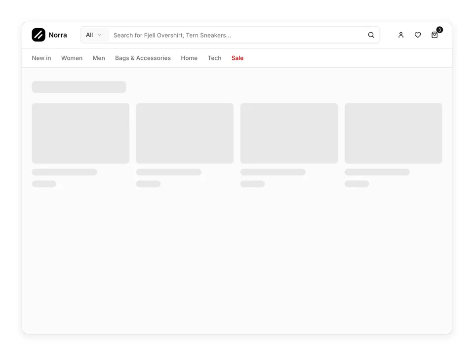
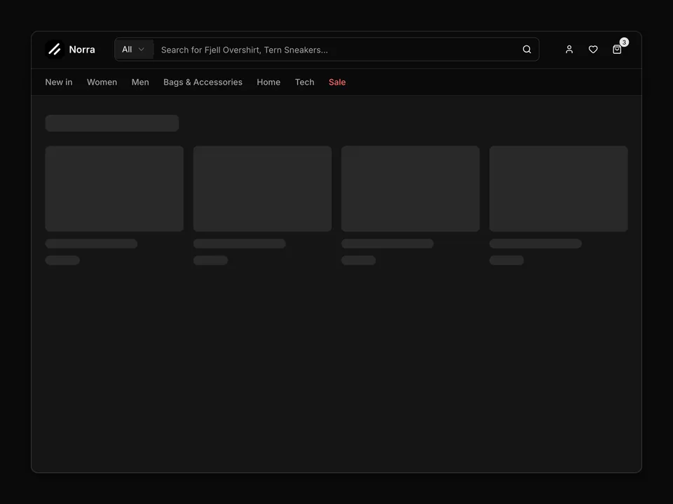
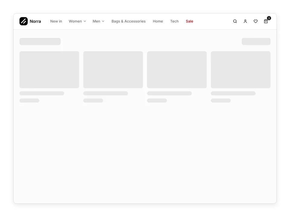
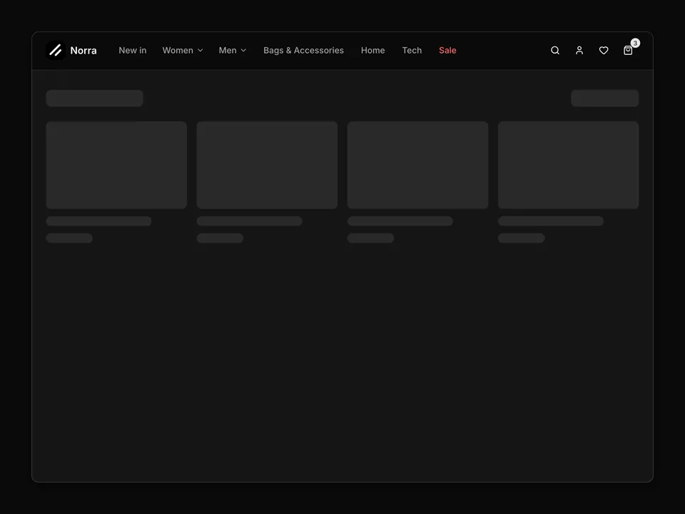
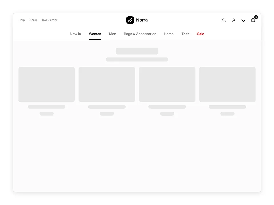
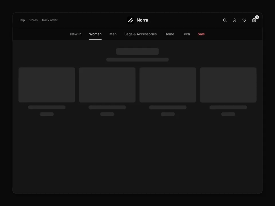
 * Store header with a slim primary promo bar above it: logo left, category links centred, Search / Account / Wishlist / Cart icon Buttons right with a count Badge on the bag.
 */
export default function ShopNavbar01() {
  return (
    <div className="flex min-h-dvh w-full flex-col" data-block>
      <header className="w-full border-b bg-background">
        <div className="bg-primary text-primary-foreground">
          <p className="mx-auto flex h-9 w-full max-w-6xl items-center justify-center px-6 text-center text-sm">
            Free shipping over €75 · 30-day returns
          </p>
        </div>

        <div className="mx-auto flex h-16 w-full max-w-6xl items-center justify-between gap-4 px-6">
          <a className="flex shrink-0 items-center gap-2" href="#">
            <img
              alt=""
              className="size-8 rounded-lg object-cover"
              src="/logo.png"
            />
            <span className="font-semibold text-foreground">Norra</span>
          </a>

          <nav
            aria-label="Shop categories"
            className="hidden items-center gap-1 md:flex"
          >
            {categories.map((category) => (
              <a
                className={cn(
                  buttonVariants({ size: 'sm', variant: 'ghost' }),
                  category.sale
                    ? 'text-destructive hover:text-destructive'
                    : 'text-muted-foreground'
                )}
                href="#"
                key={category.label}
              >
                {category.label}
              </a>
            ))}
          </nav>

          <div className="flex items-center gap-1">
            <Button
              aria-label="Search"
              className="hidden sm:inline-flex"
              size="icon"
              type="button"
              variant="ghost"
            >
              <SearchIcon aria-hidden="true" />
            </Button>
            <Button
              aria-label="Account"
              className="hidden sm:inline-flex"
              size="icon"
              type="button"
              variant="ghost"
            >
              <UserIcon aria-hidden="true" />
            </Button>
            <Button
              aria-label="Wishlist"
              className="hidden sm:inline-flex"
              size="icon"
              type="button"
              variant="ghost"
            >
              <HeartIcon aria-hidden="true" />
            </Button>
            <Button
              aria-label="Cart, 3 items"
              className="relative"
              size="icon"
              type="button"
              variant="ghost"
            >
              <ShoppingBagIcon aria-hidden="true" />
              <Badge className="absolute -top-0.5 -right-0.5 size-4 min-w-4 justify-center px-1 text-[10px] leading-none">
                3
              </Badge>
            </Button>

            <Sheet>
              <SheetTrigger
                render={
                  <Button
                    aria-label="Open menu"
                    className="md:hidden"
                    size="icon"
                    type="button"
                    variant="ghost"
                  />
                }
              >
                <MenuIcon aria-hidden="true" />
              </SheetTrigger>
              <SheetContent
                className="overflow-y-auto data-[side=left]:w-80"
                side="left"
              >
                <SheetHeader className="border-b">
                  <SheetTitle className="flex items-center gap-2">
                    <img
                      alt=""
                      className="size-8 rounded-lg object-cover"
                      src="/logo.png"
                    />
                    Norra
                  </SheetTitle>
                  <SheetDescription className="sr-only">
                    Shop navigation
                  </SheetDescription>
                </SheetHeader>
                <nav aria-label="Mobile" className="flex flex-col px-2">
                  {categories.map((category) => (
                    <a
                      className={
                        category.sale
                          ? 'rounded-md px-3 py-2 font-medium text-destructive text-sm transition-colors hover:bg-muted'
                          : 'rounded-md px-3 py-2 font-medium text-foreground text-sm transition-colors hover:bg-muted'
                      }
                      href="#"
                      key={category.label}
                    >
                      {category.label}
                    </a>
                  ))}
                </nav>
                <SheetFooter className="border-t">
                  <Button
                    className="justify-start"
                    type="button"
                    variant="ghost"
                  >
                    <SearchIcon aria-hidden="true" />
                    Search
                  </Button>
                  <Button
                    className="justify-start"
                    type="button"
                    variant="ghost"
                  >
                    <UserIcon aria-hidden="true" />
                    Account
                  </Button>
                  <Button
                    className="justify-start"
                    type="button"
                    variant="ghost"
                  >
                    <HeartIcon aria-hidden="true" />
                    Wishlist
                  </Button>
                </SheetFooter>
              </SheetContent>
            </Sheet>
          </div>
        </div>
      </header>

      <div className="flex-1 bg-muted/40 px-6 py-8">
        <div className="mx-auto w-full max-w-6xl">
          <Skeleton className="h-7 w-48 bg-muted-foreground/15" />
          <Skeleton className="mt-3 h-4 w-72 bg-muted-foreground/15" />
          <div className="mt-6 grid grid-cols-2 gap-4 md:grid-cols-4">
            {Array.from({ length: 4 }).map((_, i) => (
              <div
                className={
                  i > 1 ? 'hidden flex-col gap-3 md:flex' : 'flex flex-col gap-3'
                }
                key={i}
              >
                <Skeleton className="h-36 w-full bg-muted-foreground/15" />
                <Skeleton className="h-4 w-3/4 bg-muted-foreground/15" />
                <Skeleton className="h-4 w-1/3 bg-muted-foreground/15" />
              </div>
            ))}
          </div>
        </div>
      </div>
    </div>
  );
}