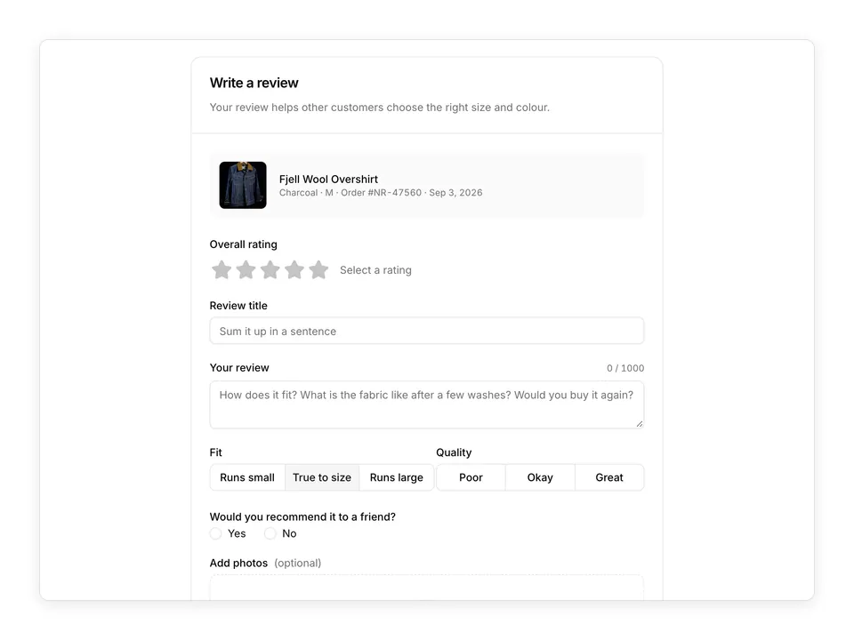
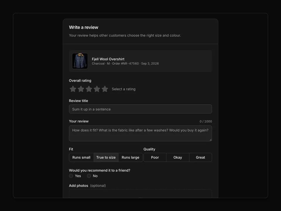
'use client';

import { PencilLineIcon, StarIcon } from 'lucide-react';
import { useState } from 'react';

import { Button } from '@/components/ui/button';
import { Progress } from '@/components/ui/progress';
import { cn } from '@/lib/utils';

const total = 284;

const distribution = [
  { stars: 5, count: 224 },
  { stars: 4, count: 38 },
  { stars: 3, count: 12 },
  { stars: 2, count: 5 },
  { stars: 1, count: 5 },
];

const highlights = [
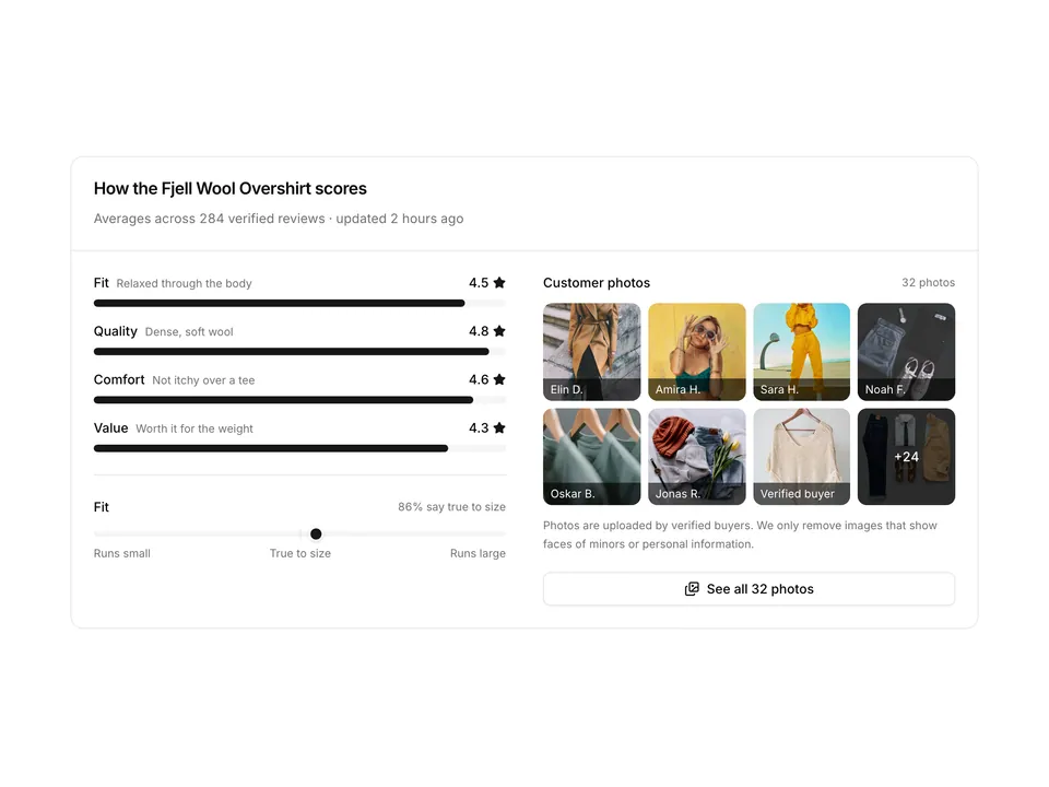
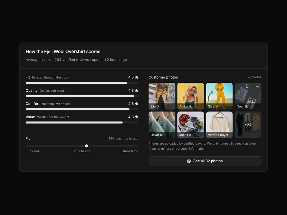
  { label: 'Fits true to size', value: '86%' },
  { label: 'Quality', value: '4.8' },
  { label: 'Comfort', value: '4.6' },
];

function Stars({ value, className }: { value: number; className?: string }) {
  return (
    <span
      aria-label={`${value} out of 5 stars`}
      className={cn('flex items-center text-primary', className)}
      role="img"
    >
      {Array.from({ length: 5 }).map((_, i) => (
        <StarIcon
          aria-hidden="true"
          className={cn(
            'size-5 fill-current',
            i + 1 > Math.round(value) && 'opacity-25'
          )}
          key={i}
        />
      ))}
    </span>
  );
}

/**
 * Rating summary for a product page built with shadcn/ui: a large 4.7 average with Stars and review count on the left, a two-column-wide list of clickable 5→1 distribution rows using Progress with counts and percentages, a Write a review Button and three highlight chips.
 */
export default function Reviews01() {
  const [active, setActive] = useState<number | null>(null);

  return (
    <section className="w-full py-8 sm:py-12">
      <div className="mx-auto w-full max-w-5xl px-6">
        <div className="grid gap-8 md:grid-cols-3 md:gap-12">
          <div className="flex flex-col">
            <h2 className="font-semibold text-foreground text-lg tracking-tight">
              Customer reviews
            </h2>
            <div className="mt-4 flex items-end gap-3">
              <p className="font-semibold text-6xl text-foreground tracking-tight tabular-nums">
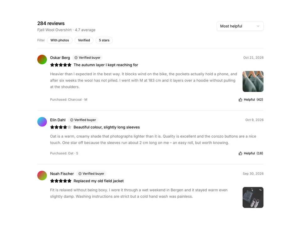
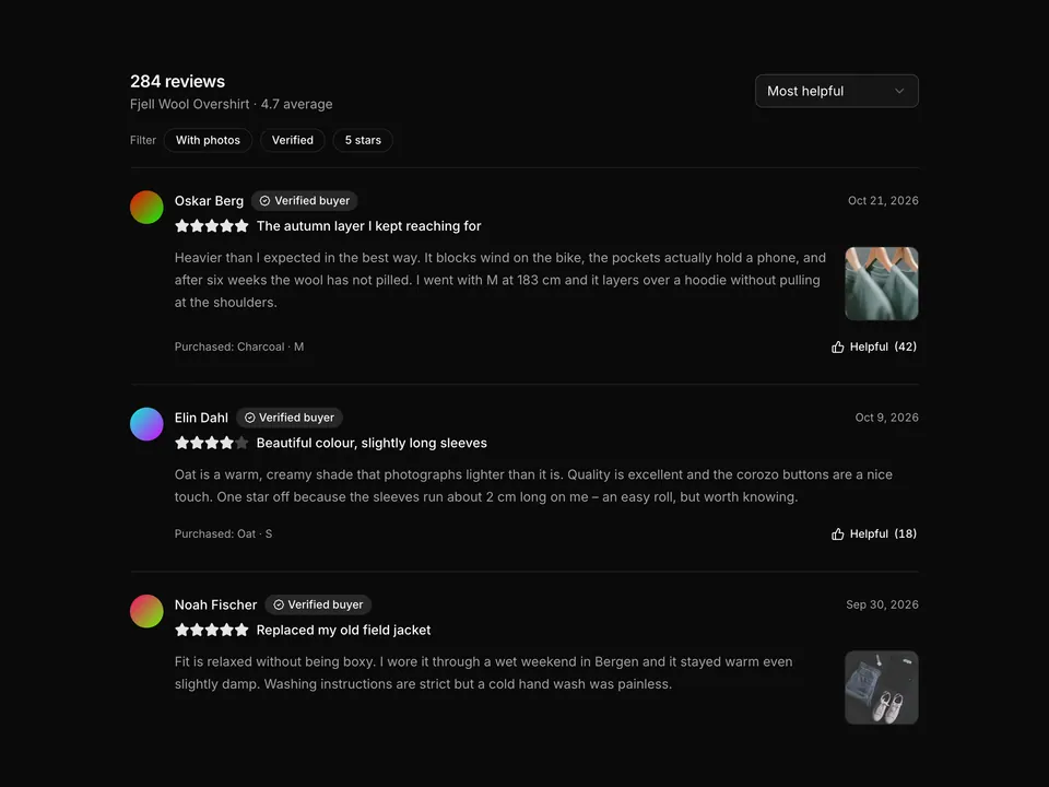
                4.7
              </p>
              <div className="pb-2">
                <Stars value={4.7} />
                <p className="mt-1 text-muted-foreground text-sm tabular-nums">
                  Based on {total} reviews
                </p>
              </div>
            </div>
            <p className="mt-4 text-pretty text-muted-foreground text-sm leading-6">
              92% of customers would recommend the Fjell Wool Overshirt to a
              friend.
            </p>
            <Button className="mt-6 w-full sm:w-auto" type="button">
              <PencilLineIcon aria-hidden="true" />
              Write a review
            </Button>
            <ul className="mt-6 flex flex-wrap gap-2">
              {highlights.map((chip) => (
                <li
                  className="inline-flex items-center gap-1.5 rounded-full border px-3 py-1 text-xs"
                  key={chip.label}
                >
                  <span className="text-muted-foreground">{chip.label}</span>
                  <span className="font-medium text-foreground tabular-nums">
                    {chip.value}
                  </span>
                </li>
              ))}
            </ul>
          </div>

          <div className="md:col-span-2">
            <div className="flex items-center justify-between">
              <p className="font-medium text-foreground text-sm">
                Rating breakdown
              </p>
              {active ? (
                <Button
                  className="h-auto p-0 text-muted-foreground text-xs"
                  onClick={() => setActive(null)}
                  type="button"
                  variant="link"
                >
                  Clear filter
                </Button>
              ) : (
                <p className="text-muted-foreground text-xs">
                  Select a row to filter
                </p>
              )}
            </div>
            <ul className="mt-3 flex flex-col gap-1">
              {distribution.map((row) => {
                const percent = Math.round((row.count / total) * 100);
                const selected = active === row.stars;
                return (
                  <li key={row.stars}>
                    <button
                      aria-pressed={selected}
                      className={cn(
                        '-mx-3 flex w-[calc(100%+1.5rem)] items-center gap-4 rounded-lg px-3 py-2.5 text-sm transition-colors hover:bg-muted/60',
                        selected && 'bg-muted ring-1 ring-border'
                      )}
                      onClick={() =>
                        setActive(selected ? null : row.stars)
                      }
                      type="button"
                    >
                      <span className="flex w-14 shrink-0 items-center gap-1 text-foreground tabular-nums">
                        {row.stars}
                        <StarIcon
                          aria-hidden="true"
                          className="size-3.5 fill-current text-primary"
                        />
                        <span className="sr-only">stars</span>
                      </span>
                      <Progress
                        aria-label={`${percent}% of reviews gave ${row.stars} stars`}
                        className="w-full *:data-[slot=progress-track]:h-2.5 flex-1"
                        value={percent}
                      />
                      <span className="w-10 shrink-0 text-right text-muted-foreground tabular-nums">
                        {row.count}
                      </span>
                      <span className="w-10 shrink-0 text-right font-medium text-foreground tabular-nums">
                        {percent}%
                      </span>
                    </button>
                  </li>
                );
              })}
            </ul>
            <p className="mt-4 text-muted-foreground text-xs">
              {active
                ? `Showing ${distribution.find((r) => r.stars === active)?.count} reviews with ${active} stars.`
                : 'Reviews are verified against a Norra order before they are published.'}
            </p>
          </div>
        </div>
      </div>
    </section>
  );
}