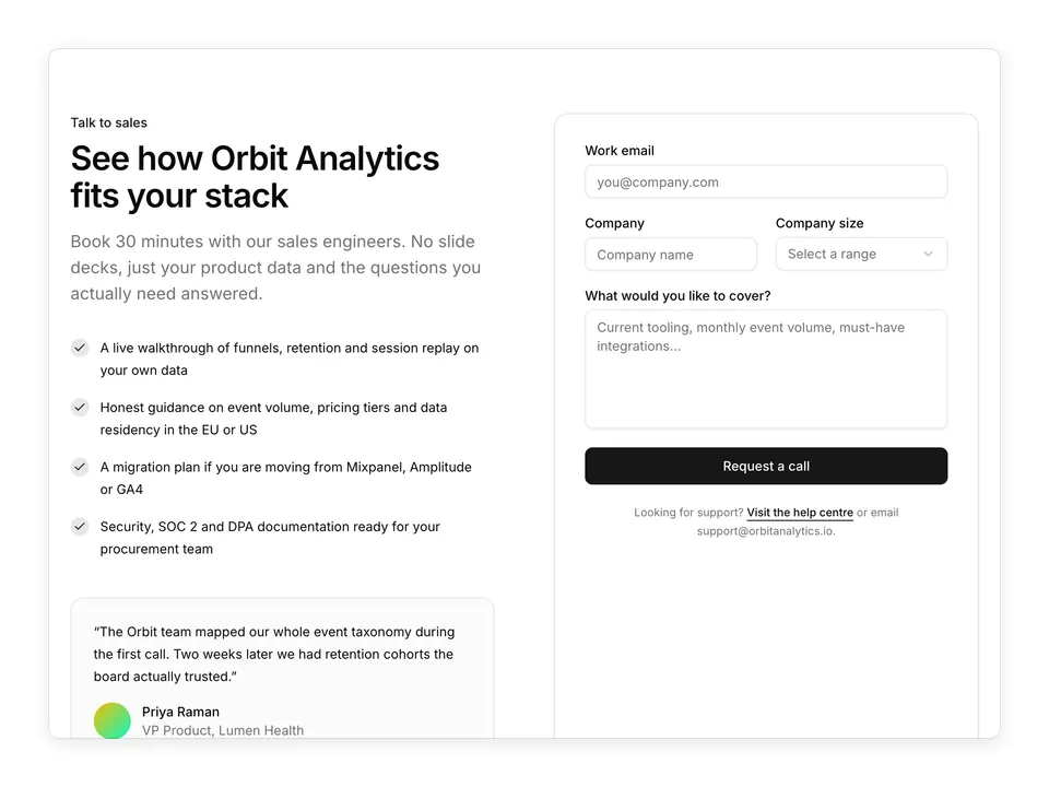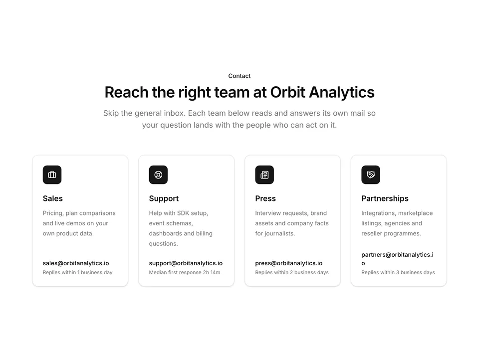
BlocksContactCentred contact card with privacy note

shadcn/ui Contact block for Base UICentred contact card with privacy note

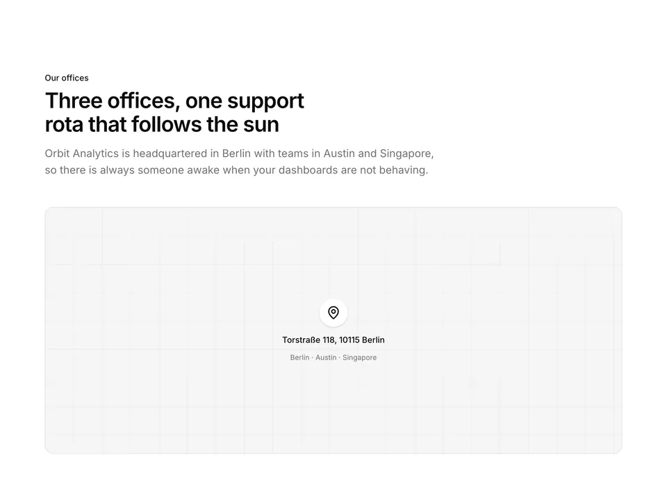
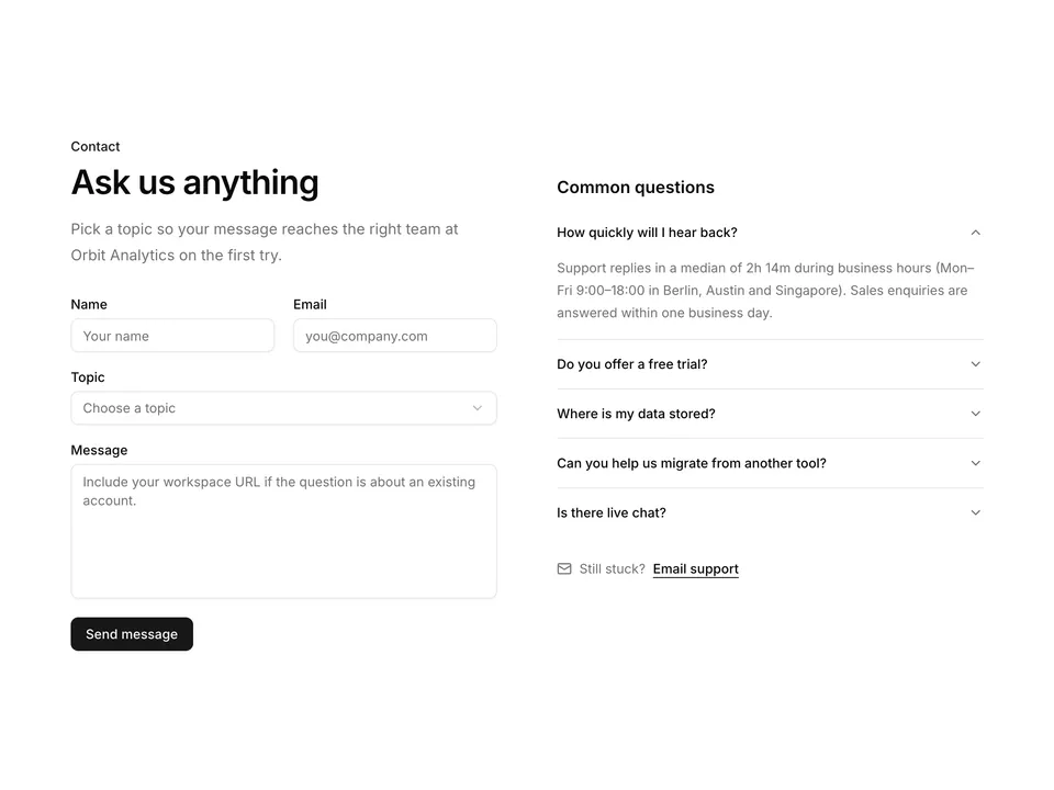
A centred contact section for shadcn/ui built from Card, Input, Textarea, Label and Button. A heading and lead sit above a max-w-xl card holding a two-column name row, email, message and a full-width submit with a privacy note underneath. The simplest drop-in contact form for a marketing site.

Free@shadcnpro/base/contact-01

Preview

Installation

npx shadcn@latest add @shadcnpro/base/contact-01

First time? Add the @shadcnpro registry to components.json as shown in Installation. Free blocks install without a license key.

Let your AI editor install it

The shadcn/ui Pro MCP server lets Cursor, Claude Code and VS Code find and install blocks like Centred contact card with privacy note from one prompt. It is included in every Pro plan.

Add the shadcn/ui components

Centred contact card with privacy note uses Button, Card, Input, Label and Textarea, from the Base UI components set up in your components.json.

npx shadcn@latest add button card input label textarea

Copy the code

Paste it into components/blocks/contact-01.tsx.

components/blocks/contact-01.tsx
'use client';

import { Button } from '@/components/ui/button';
import {
  Card,
  CardContent,
  CardDescription,
  CardHeader,
  CardTitle,
} from '@/components/ui/card';
import { Input } from '@/components/ui/input';
import { Label } from '@/components/ui/label';
import { Textarea } from '@/components/ui/textarea';

/**
 * Centred contact card with a short two-column name row, email, message and a full-width submit.
 */
export default function Contact01() {
  return (
    <section className="w-full py-16 sm:py-24">
      <div className="mx-auto w-full max-w-3xl px-6">
        <div className="mx-auto max-w-2xl text-center">
          <p className="font-medium text-primary text-sm">Contact</p>
          <h2 className="mt-2 text-balance font-semibold text-3xl text-foreground tracking-tight sm:text-4xl">
            Get in touch with Orbit Analytics
          </h2>
          <p className="mt-4 text-pretty text-lg text-muted-foreground">
            Questions about event tracking, pricing or migrating from another
            analytics tool? Send us a note and a real person from our Berlin or
            Austin office will reply within one business day.
          </p>
        </div>

        <Card className="mx-auto mt-12 w-full max-w-xl">
          <CardHeader>
            <CardTitle>Send us a message</CardTitle>
            <CardDescription>
              We answer every message. Median first response is 2h 14m during
              support hours.
            </CardDescription>
          </CardHeader>
          <CardContent>
            <form
              className="grid gap-5"
              onSubmit={(event) => event.preventDefault()}
            >
              <div className="grid gap-5 sm:grid-cols-2">
                <div className="grid gap-2">
                  <Label htmlFor="contact-01-first-name">First name</Label>
                  <Input
                    autoComplete="given-name"
                    id="contact-01-first-name"
                    name="firstName"
                    placeholder="Mara"
                    required
                  />
                </div>
                <div className="grid gap-2">
                  <Label htmlFor="contact-01-last-name">Last name</Label>
                  <Input
                    autoComplete="family-name"
                    id="contact-01-last-name"
                    name="lastName"
                    placeholder="Lindqvist"
                    required
                  />
                </div>
              </div>
              <div className="grid gap-2">
                <Label htmlFor="contact-01-email">Work email</Label>
                <Input
                  autoComplete="email"
                  id="contact-01-email"
                  name="email"
                  placeholder="you@company.com"
                  required
                  type="email"
                />
              </div>
              <div className="grid gap-2">
                <Label htmlFor="contact-01-message">Message</Label>
                <Textarea
                  className="min-h-32 resize-none"
                  id="contact-01-message"
                  name="message"
                  placeholder="Tell us what you are trying to measure and where you are stuck."
                  required
                />
              </div>
              <Button className="w-full" size="lg" type="submit">
                Send message
              </Button>
              <p className="text-center text-muted-foreground text-xs leading-5">
                By submitting this form you agree to our{' '}
                <a
                  className="underline underline-offset-4 hover:text-foreground"
                  href="#"
                >
                  privacy policy
                </a>
                . We never share your details with third parties.
              </p>
            </form>
          </CardContent>
        </Card>
      </div>
    </section>
  );
}

Use it

Import it where you need it and update the import path to match your project.

Usage
import Contact01 from '@/components/blocks/contact-01';

export default function Page() {
  return <Contact01 />;
}

Overview

Centred contact card with privacy note is a free contact block for shadcn/ui and Base UI. It is built from the Button, Card, Input, Label and Textarea components, and installs as a single file you own and can edit.

It only uses semantic tokens such as bg-background, text-muted-foreground and border-border, so it follows your theme, radius and fonts and switches with dark mode. It is responsive from desktop to mobile; the width controls above the preview show each size. The same layout is in the shadcn/ui Pro Figma kit, so design and code start from one source.

Category
Contact
Component library
Base UI (@base-ui/react)
Also available for
Radix UI, React Aria
Built with
Button, Card, Input, Label and Textarea
npm packages
None
Files
components/blocks/contact-01.tsx
Access
Free, installs without a license key

Frequently asked questions

Pricing, installation and Base UI details for Centred contact card with privacy note.