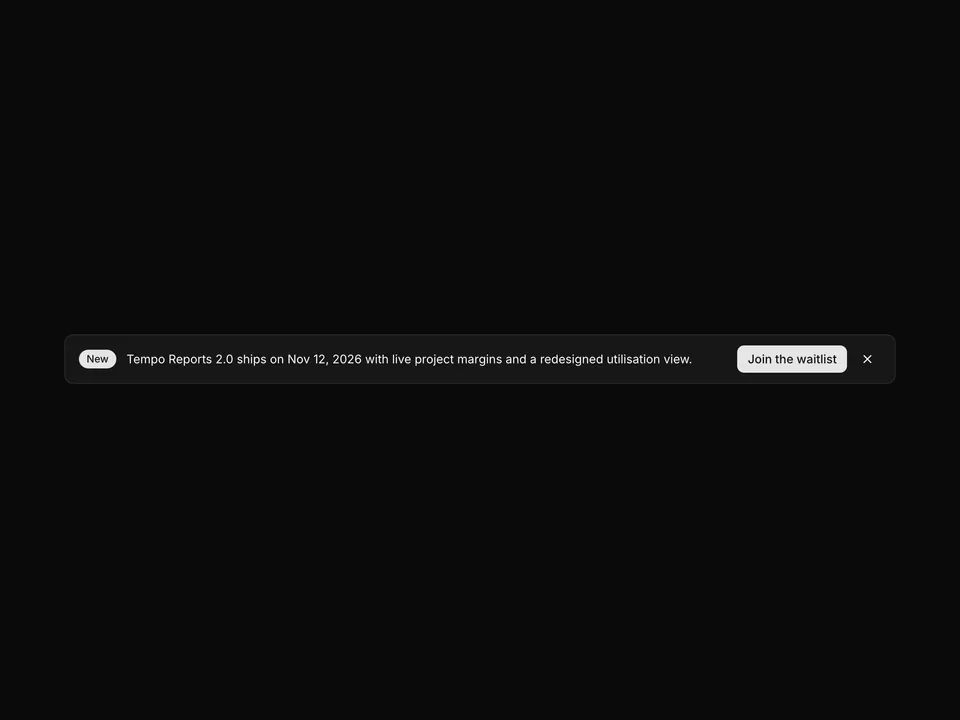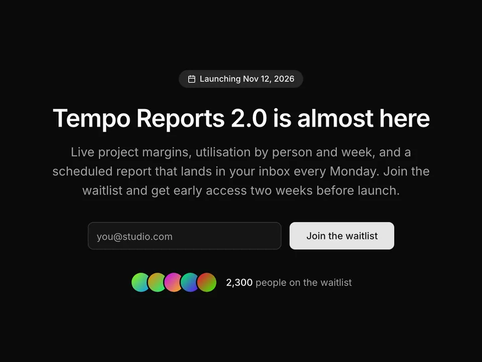

Photo background with dark overlay
A rounded shadcn/ui panel with a full-bleed team photo, a dark overlay and centred white heading, lead and two Buttons. Brings warmth and a human touch to the final call to action.
shadcn/ui
ProA bordered shadcn/ui split with a vertical divider: heading, starting price, primary Button and a compare-plans link on the left, and five included features with lucide Check icons on the right. Bridges a feature page to pricing.
@shadcnpro/base/cta-10Part of shadcn/ui Pro
Pro unlocks the source code and one-command install of all 439 blocks, plus the Figma kit, themes and the MCP server for your AI editor.
Let your AI editor install it
The shadcn/ui Pro MCP server lets Cursor, Claude Code and VS Code find and install blocks like Pricing hint with included features from one prompt. It is included in every Pro plan.
Pricing hint with included features uses Button, from the Base UI components set up in your components.json.
npx shadcn@latest add buttonnpm install lucide-reactPaste it into components/blocks/cta-10.tsx.
Part of shadcn/ui Pro
Pro unlocks the source code and one-command install of all 439 blocks, plus the Figma kit, themes and the MCP server for your AI editor.
Import it where you need it and update the import path to match your project.
import Cta10 from '@/components/blocks/cta-10';

export default function Page() {
  return <Cta10 />;
}Pricing hint with included features is a Pro cta block for shadcn/ui and Base UI. It is built from the Button component with lucide-react, and installs as a single file you own and can edit.
It only uses semantic tokens such as bg-background, text-muted-foreground and border-border, so it follows your theme, radius and fonts and switches with dark mode. It is responsive from desktop to mobile; the width controls above the preview show each size. The same layout is in the shadcn/ui Pro Figma kit, so design and code start from one source.
A rounded shadcn/ui panel with a full-bleed team photo, a dark overlay and centred white heading, lead and two Buttons. Brings warmth and a human touch to the final call to action.
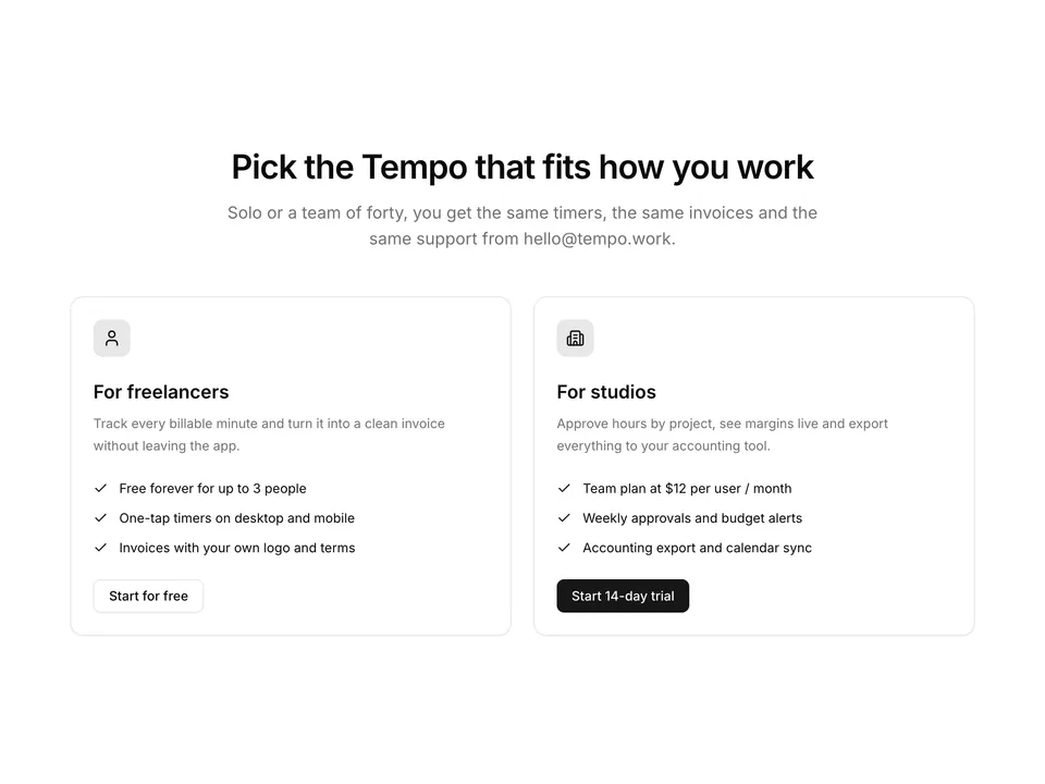
Two side-by-side shadcn/ui Cards, one per audience, each with a lucide icon, title, three bullet points and its own Button in a different variant. Lets visitors self-select the path that fits them.

An editorial, minimal CTA for shadcn/ui: an oversized headline, one paragraph and a single large underlined link with a lucide arrow, set in a narrow column with generous whitespace. No buttons, no boxes.
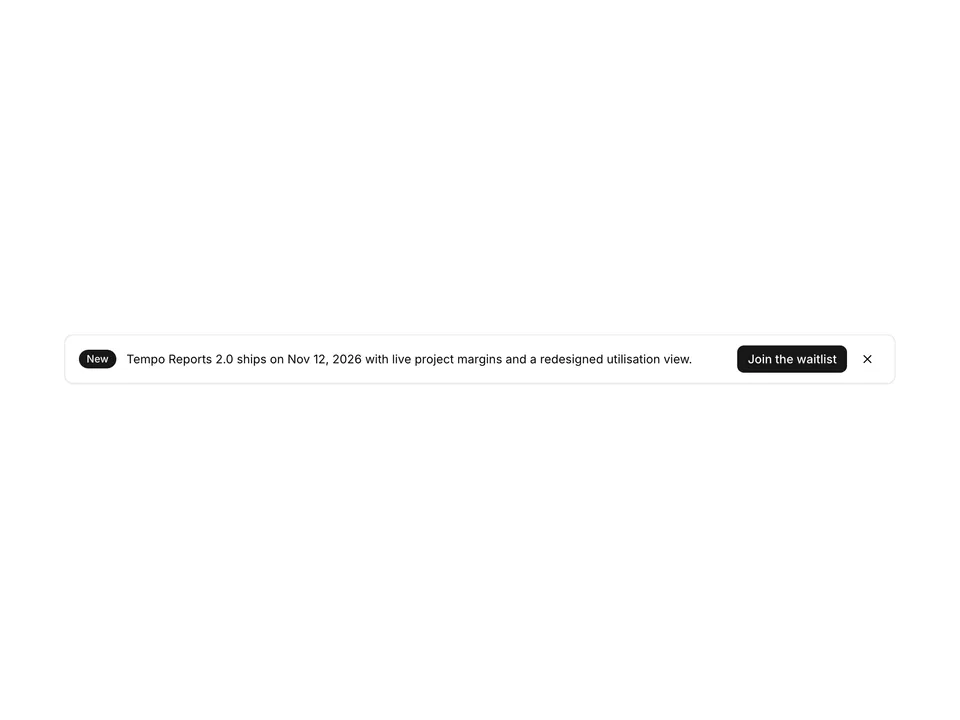
A compact announcement strip for shadcn/ui with a Badge, one sentence, a small Button and a ghost icon Button to dismiss. Visibility is handled with useState and a tiny restore link keeps the section usable after dismissal.
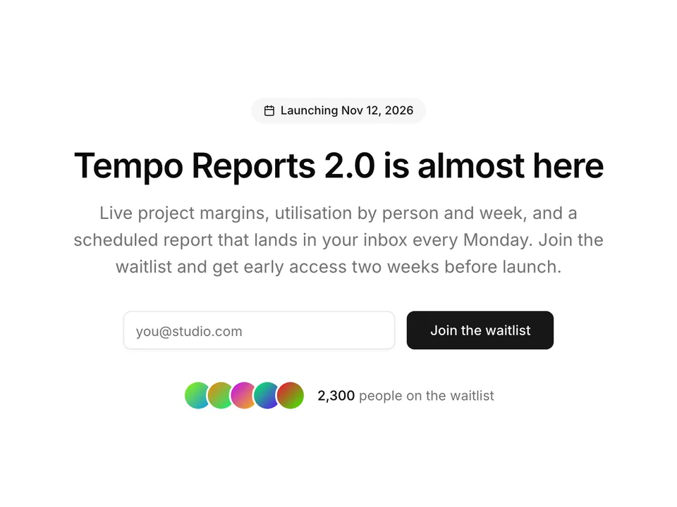
A centred launch CTA for shadcn/ui: a Badge with a lucide Calendar icon and the launch date, heading, lead, an inline email form with Input and Button, and an Avatar stack with the waitlist count. Built for pre-launch pages.
 Free
A centred call-to-action panel for shadcn/ui built on a rounded muted surface. Heading, lead paragraph, a primary and an outline Button side by side, and a small-print line for trial terms. A safe default CTA to close any landing page.
Pricing, installation and Base UI details for Pricing hint with included features.
Pricing hint with included features is part of shadcn/ui Pro, which includes all 439 blocks, the Figma kit, themes and the MCP server. Plans start with a 7-day free trial, and 62 other blocks are free.
Add the @shadcnpro registry to components.json once, as described in Installation, then run npx shadcn@latest add @shadcnpro/base/cta-10. The shadcn CLI writes components/blocks/cta-10.tsx and adds the Button component if your project does not have them yet.
Button from shadcn/ui, plus the npm package lucide-react. Colors, radius and fonts come from semantic tokens such as bg-background and text-muted-foreground, so it follows your theme.
The layout and copy are the same. The interactive parts are built on Base UI (@base-ui/react) through the shadcn/ui Base UI components instead of Radix UI. Install it with npx shadcn@latest add @shadcnpro/base/cta-10, or pick the Radix UI and React Aria version above the preview.
Yes. It uses semantic classes such as bg-background, text-foreground and border-border, so it picks up your colors, radius and fonts and switches with dark mode. The theme menu above the preview shows it in the shadcn/ui Pro themes.
Yes. Every block has a matching frame in the shadcn/ui Pro Figma kit, so designers and developers start from the same layout and component names.
Yes. With the shadcn/ui Pro MCP server connected to Cursor, Claude Code or VS Code, ask: "Use shadcnpro to add base/cta-10." The agent finds the block, shows its install command and runs it after you approve.