'use client';

import { Avatar, AvatarFallback, AvatarImage } from '@/components/ui/avatar';
import { Card, CardContent } from '@/components/ui/card';

const testimonials = [
  {
    quote:
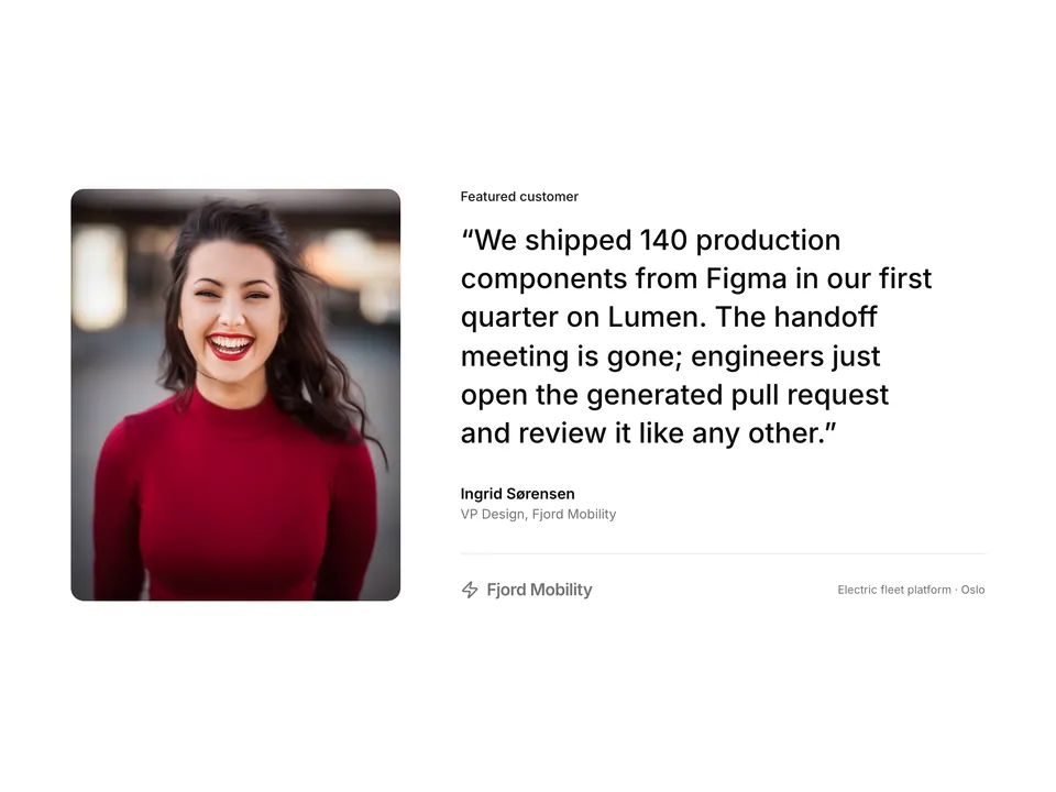
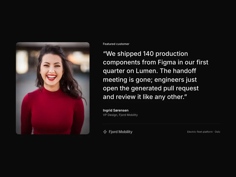
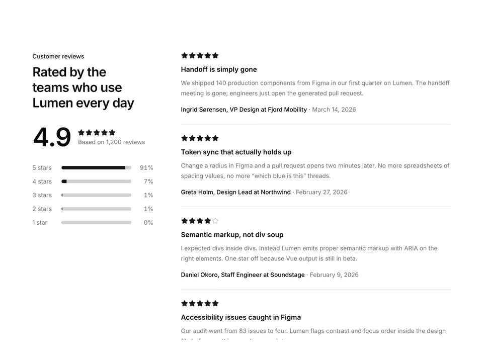
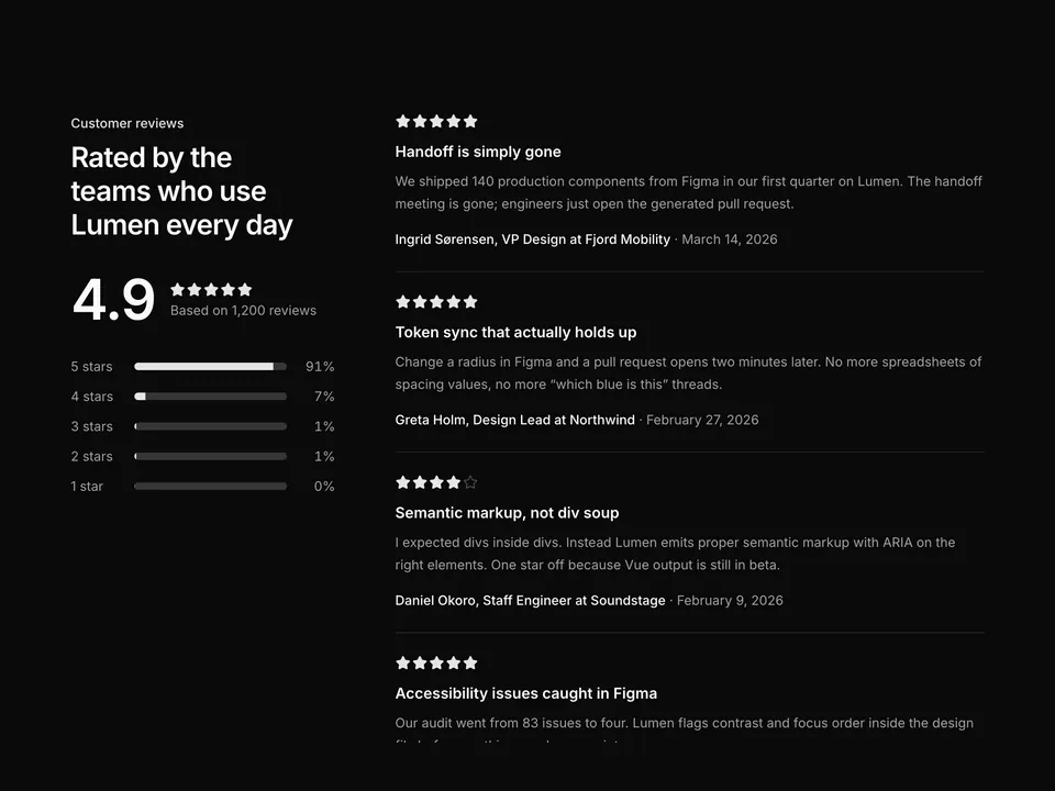
      'We shipped 140 production components from Figma in our first quarter on Lumen. The handoff meeting is gone; engineers just open the generated pull request.',
    name: 'Ingrid Sørensen',
    role: 'VP Design',
    company: 'Fjord Mobility',
    handle: 'ingrid-sorensen',
    initials: 'IS',
  },
  {
    quote:
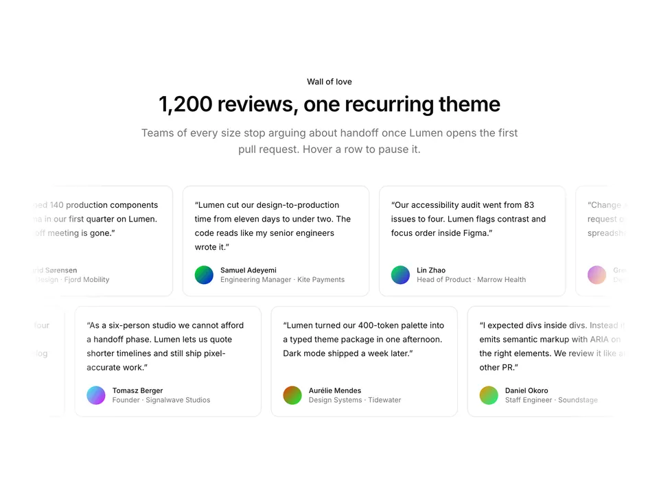
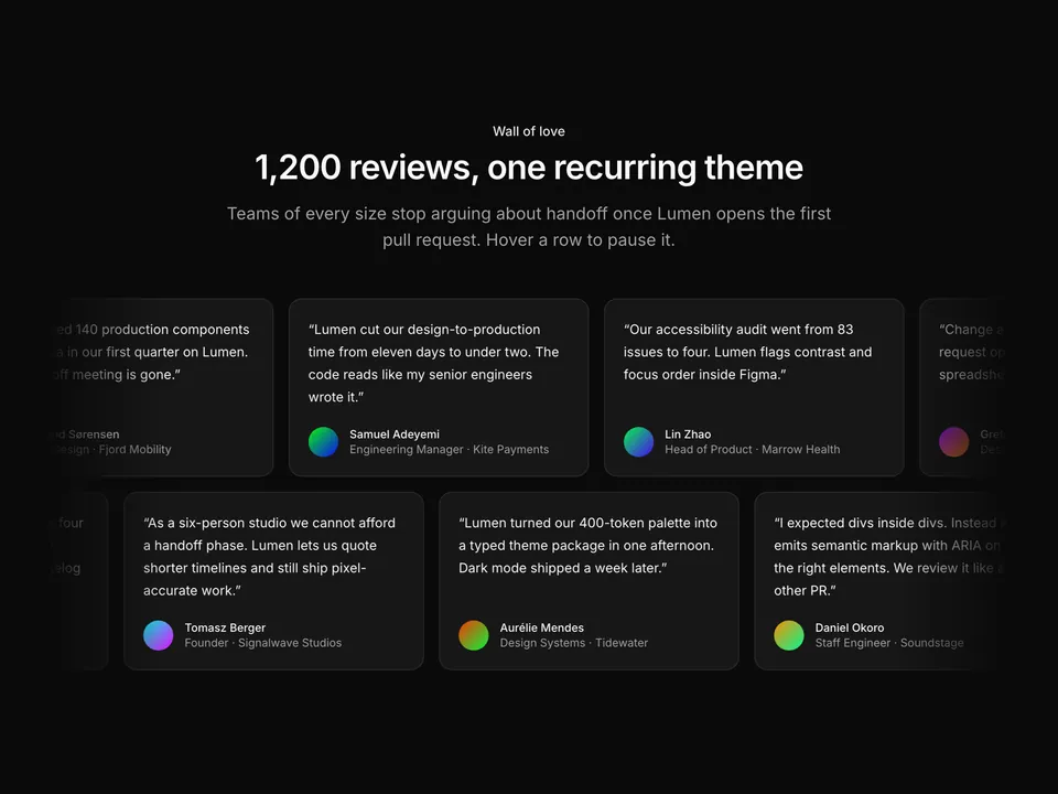
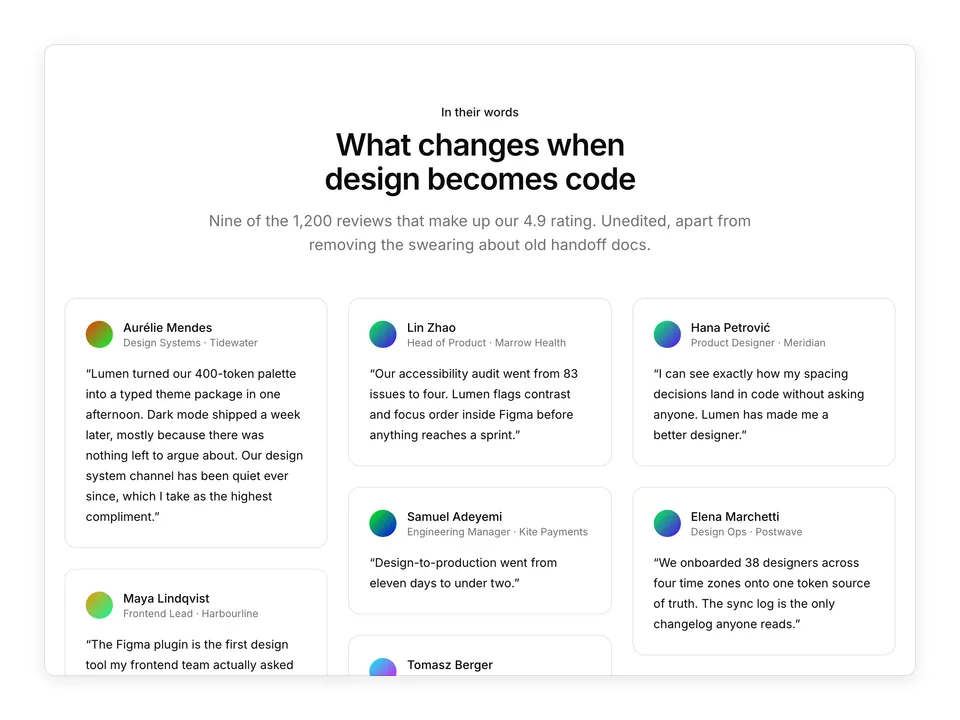
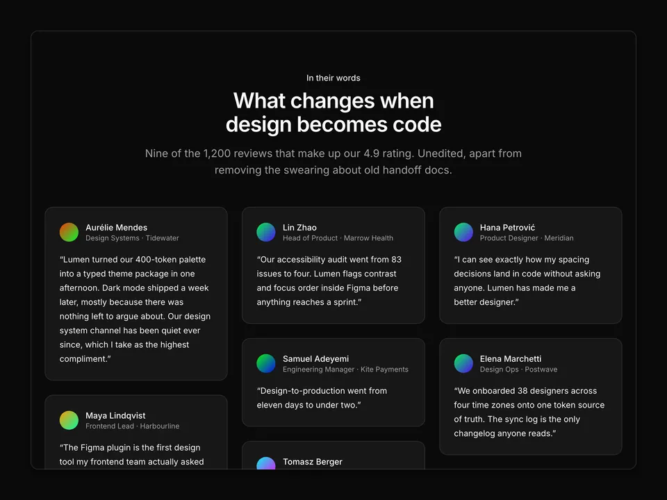
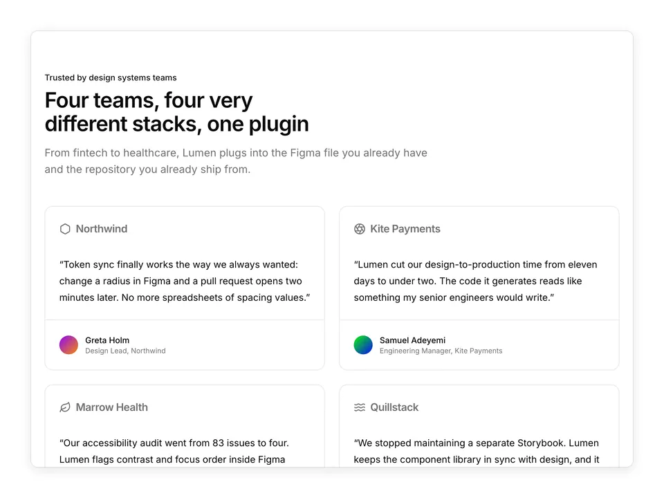
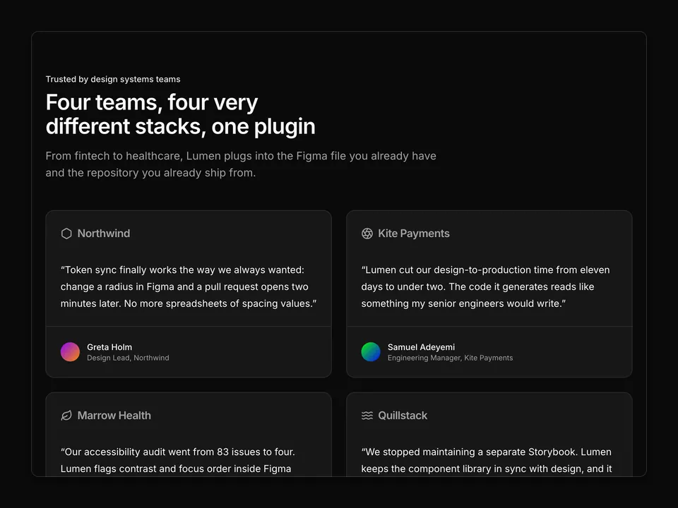
      'Lumen cut our design-to-production time from eleven days to under two. The code it generates reads like something my senior engineers would write.',
    name: 'Samuel Adeyemi',
    role: 'Engineering Manager',
    company: 'Kite Payments',
    handle: 'samuel-adeyemi',
    initials: 'SA',
  },
  {
    quote:
      'Our accessibility audit went from 83 issues to four. Lumen flags contrast and focus order inside Figma before anything reaches a sprint.',
    name: 'Lin Zhao',
    role: 'Head of Product',
    company: 'Marrow Health',
    handle: 'lin-zhao',
    initials: 'LZ',
  },
  {
    quote:
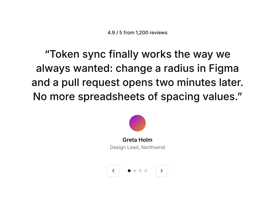
      'Token sync finally works the way we always wanted: change a radius in Figma and a pull request opens two minutes later. No more spreadsheets of spacing values.',
    name: 'Greta Holm',
    role: 'Design Lead',
    company: 'Northwind',
    handle: 'greta-holm',
    initials: 'GH',
  },
  {
    quote:
      'We stopped maintaining a separate Storybook. Lumen keeps the component library in sync with design, and it has saved us roughly one engineer-year so far.',
    name: 'Rafael Costa',
    role: 'CTO',
    company: 'Quillstack',
    handle: 'rafael-costa',
    initials: 'RC',
  },
  {
    quote:
      'The Figma plugin is the first design tool my frontend team actually asked to install. The generated Tailwind classes match our config exactly.',
    name: 'Maya Lindqvist',
    role: 'Frontend Lead',
    company: 'Harbourline',
    handle: 'maya-lindqvist',
    initials: 'ML',
  },
];

/**
 * Centred heading above a responsive three-column grid of six quote Cards, each with an Avatar, name and role.
 */
export default function Testimonials01() {
  return (
    <section className="w-full py-16 sm:py-24">
      <div className="mx-auto w-full max-w-6xl px-6">
        <div className="mx-auto max-w-2xl text-center">
          <p className="font-medium text-primary text-sm">Customer stories</p>
          <h2 className="mt-2 text-balance font-semibold text-3xl text-foreground tracking-tight sm:text-4xl">
            Design teams ship faster with Lumen
          </h2>
          <p className="mt-4 text-pretty text-lg text-muted-foreground">
            Rated 4.9 out of 5 from 1,200 reviews by designers, engineers and
            product leads who replaced handoff with a pull request.
          </p>
        </div>

        <div className="mt-12 grid grid-cols-1 gap-6 sm:grid-cols-2 md:grid-cols-3">
          {testimonials.map((item) => (
            <Card className="py-0 shadow-none" key={item.name}>
              <CardContent className="flex h-full flex-col justify-between gap-6 p-6">
                <blockquote className="text-pretty text-foreground text-sm leading-6">
                  “{item.quote}”
                </blockquote>
                <div className="flex items-center gap-3">
                  <Avatar>
                    <AvatarImage
                      alt={item.name}
                      src={`https://avatar.vercel.sh/${item.handle}`}
                    />
                    <AvatarFallback>{item.initials}</AvatarFallback>
                  </Avatar>
                  <div className="min-w-0 text-sm">
                    <p className="font-medium text-foreground">{item.name}</p>
                    <p className="text-muted-foreground text-xs">
                      {item.role} · {item.company}
                    </p>
                  </div>
                </div>
              </CardContent>
            </Card>
          ))}
        </div>
      </div>
    </section>
  );
}