'use client';

import { HeartIcon, Link2Icon, ShoppingBagIcon } from 'lucide-react';
import { useState } from 'react';

import { Badge } from '@/components/ui/badge';
import { Button } from '@/components/ui/button';
import {
  Tooltip,
  TooltipContent,
  TooltipProvider,
  TooltipTrigger,
} from '@/components/ui/tooltip';
import { cn } from '@/lib/utils';

const items = [
  {
    id: 'weekender',
    name: 'Strand Leather Weekender',
    price: 249,
    photo: '1553062407-98eeb64c6a62',
    colours: [
      { name: 'Tan', hex: '#B07A4A' },
      { name: 'Black', hex: '#1F1F1F' },
    ],
    stock: 'in' as const,
  },
  {
    id: 'headphones',
    name: 'Pulse Wireless Headphones',
    price: 199,
    was: 249,
    photo: '1583394838336-acd977736f90',
    colours: [
      { name: 'Fog', hex: '#C9CBCF' },
      { name: 'Charcoal', hex: '#3B3B3B' },
    ],
    stock: 'in' as const,
  },
  {
    id: 'chair',
    name: 'Loft Lounge Chair',
    price: 489,
    photo: '1567538096630-e0c55bd6374c',
    colours: [
      { name: 'Oat bouclé', hex: '#D9CDB8' },
      { name: 'Forest', hex: '#3F5742' },
    ],
    stock: 'in' as const,
  },
  {
    id: 'lamp',
    name: 'Mesa Table Lamp',
    price: 119,
    photo: '1507473885765-e6ed057f782c',
    colours: [
      { name: 'Sand', hex: '#D8C9A8' },
      { name: 'Terracotta', hex: '#B5593A' },
    ],
    stock: 'soon' as const,
  },
  {
    id: 'watch',
    name: 'Nord Field Watch',
    price: 229,
    photo: '1524805444758-089113d48a6d',
    colours: [
      { name: 'Steel', hex: '#9CA3AF' },
      { name: 'Brass', hex: '#B08D57' },
      { name: 'Black', hex: '#1F1F1F' },
    ],
    stock: 'in' as const,
  },
  {
    id: 'sunglasses',
    name: 'Vik Sunglasses',
    price: 149,
    photo: '1511499767150-a48a237f0083',
    colours: [
      { name: 'Tortoise', hex: '#6B4A2B' },
      { name: 'Smoke', hex: '#4B4B4B' },
    ],
    stock: 'in' as const,
  },
];

const eur = (value: number) => `€${value.toFixed(2)}`;

/**
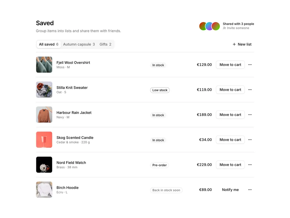
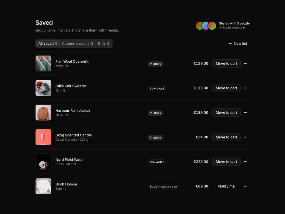
 * Saved-items wishlist grid built with shadcn/ui: a header with item count, Share and Add all to cart Buttons, then a two-to-three column grid of product cards with photo, price (one with a Price dropped Badge and strike-through), colour swatch chips, availability line, Add to cart Button and a filled Heart toggle with Tooltip.
 */
export default function Wishlist01() {
  const [saved, setSaved] = useState<string[]>(items.map((item) => item.id));

  const toggle = (id: string) =>
    setSaved((prev) =>
      prev.includes(id) ? prev.filter((value) => value !== id) : [...prev, id]
    );

  return (
    <TooltipProvider>
      <section className="w-full py-8 sm:py-12">
        <div className="mx-auto w-full max-w-5xl px-6">
          <div className="flex flex-col gap-4 sm:flex-row sm:items-end sm:justify-between">
            <div>
              <h1 className="font-semibold text-2xl text-foreground tracking-tight">
                Your wishlist
                <span className="ml-2 font-normal text-muted-foreground tabular-nums">
                  · {saved.length} items
                </span>
              </h1>
              <p className="mt-1 text-muted-foreground text-sm">
                Saved items stay here for 90 days. We will let you know when a
                price drops.
              </p>
            </div>
            <div className="flex gap-2">
              <Button type="button" variant="outline">
                <Link2Icon aria-hidden="true" />
                Share
              </Button>
              <Button type="button">
                <ShoppingBagIcon aria-hidden="true" />
                Add all to cart
              </Button>
            </div>
          </div>

          <ul className="mt-8 grid grid-cols-2 gap-x-4 gap-y-8 md:grid-cols-3 md:gap-x-6">
            {items.map((item) => {
              const isSaved = saved.includes(item.id);
              const soon = item.stock === 'soon';
              return (
                <li className="group flex flex-col" key={item.id}>
                  <div className="relative overflow-hidden rounded-xl bg-muted">
                    <img
                      alt={item.name}
                      className="aspect-square w-full object-cover transition-transform duration-300 group-hover:scale-105"
                      loading="lazy"
                      src={`https://images.unsplash.com/photo-${item.photo}?auto=format&fit=crop&w=800&q=80`}
                    />
                    {item.was ? (
                      <Badge className="absolute top-3 left-3">
                        Price dropped −{Math.round((1 - item.price / item.was) * 100)}%
                      </Badge>
                    ) : null}
                    <Tooltip>
                      <TooltipTrigger
                        render={
                          <Button
                            aria-label={
                              isSaved ? 'Remove from wishlist' : 'Save to wishlist'
                            }
                            aria-pressed={isSaved}
                            className="absolute top-2 right-2 rounded-full bg-background/90 shadow-xs backdrop-blur hover:bg-background"
                            onClick={() => toggle(item.id)}
                            size="icon-sm"
                            type="button"
                            variant="ghost"
                          />
                        }
                      >
                        <HeartIcon
                          aria-hidden="true"
                          className={cn(
                            'size-4 transition-colors',
                            isSaved
                              ? 'fill-destructive text-destructive'
                              : 'text-foreground'
                          )}
                        />
                      </TooltipTrigger>
                      <TooltipContent side="left">
                        {isSaved ? 'Remove' : 'Save again'}
                      </TooltipContent>
                    </Tooltip>
                  </div>

                  <div className="mt-3 flex flex-1 flex-col">
                    <div className="flex items-start justify-between gap-3">
                      <h2 className="font-medium text-foreground text-sm leading-5">
                        <a className="hover:underline" href="#">
                          {item.name}
                        </a>
                      </h2>
                      <p className="shrink-0 text-right text-sm tabular-nums">
                        <span className="font-medium text-foreground">
                          {eur(item.price)}
                        </span>
                        {item.was ? (
                          <span className="block text-muted-foreground text-xs line-through">
                            {eur(item.was)}
                          </span>
                        ) : null}
                      </p>
                    </div>
                    <div className="mt-2 flex items-center gap-1.5">
                      {item.colours.map((colour) => (
                        <span
                          aria-label={colour.name}
                          className="size-4 rounded-full border border-border ring-1 ring-background"
                          key={colour.name}
                          role="img"
                          style={{ backgroundColor: colour.hex }}
                          title={colour.name}
                        />
                      ))}
                      <span className="ml-1 text-muted-foreground text-xs">
                        {item.colours.length} colours
                      </span>
                    </div>
                    <p
                      className={cn(
                        'mt-1.5 flex items-center gap-1.5 text-xs',
                        soon ? 'text-muted-foreground' : 'text-foreground'
                      )}
                    >
                      <span
                        aria-hidden="true"
                        className={cn(
                          'size-1.5 rounded-full',
                          soon ? 'bg-muted-foreground/50' : 'bg-chart-2'
                        )}
                      />
                      {soon ? 'Back in stock soon' : 'In stock · ships in 2–4 days'}
                    </p>
                    <div className="mt-auto pt-3">
                      <Button
                        className="w-full"
                        size="sm"
                        type="button"
                        variant={soon ? 'outline' : 'default'}
                      >
                        {soon ? 'Notify me' : 'Add to cart'}
                      </Button>
                    </div>
                  </div>
                </li>
              );
            })}
          </ul>
        </div>
      </section>
    </TooltipProvider>
  );
}