'use client';
import { CreditCardIcon, DownloadIcon } from 'lucide-react';
import { Bar, BarChart, CartesianGrid, XAxis, YAxis } from 'recharts';
import { Badge } from '@/components/ui/badge';
import { Button } from '@/components/ui/button';
import {
Card,
CardAction,
CardContent,
CardDescription,
CardFooter,
CardHeader,
CardTitle,
} from '@/components/ui/card';
import {
type ChartConfig,
ChartContainer,
ChartTooltip,
ChartTooltipContent,
} from '@/components/ui/chart';
import { Progress } from '@/components/ui/progress';
import { Separator } from '@/components/ui/separator';
import {
Table,
TableBody,
TableCell,
TableHead,
TableHeader,
TableRow,
} from '@/components/ui/table';
import {
Tooltip,
TooltipContent,
TooltipProvider,
TooltipTrigger,
} from '@/components/ui/tooltip';
import { cn } from '@/lib/utils';
const usage = [
{ month: 'May', automation: 38, api: 41 },
{ month: 'Jun', automation: 44, api: 47 },
{ month: 'Jul', automation: 41, api: 52 },
{ month: 'Aug', automation: 49, api: 55 },
{ month: 'Sep', automation: 53, api: 58 },
{ month: 'Oct', automation: 57, api: 60 },
];
const chartConfig = {
automation: { label: 'Automation runs', color: 'var(--chart-1)' },
api: { label: 'API requests', color: 'var(--chart-2)' },
} satisfies ChartConfig;
const limits = [
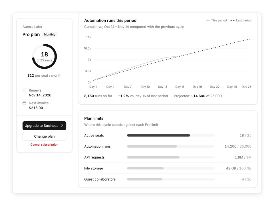
{ label: 'Automation runs', used: '14,200', limit: '25,000', value: 57 },
{ label: 'API requests', used: '1.8M', limit: '3M', value: 60 },
{ label: 'File storage', used: '42 GB', limit: '100 GB', value: 42 },
];
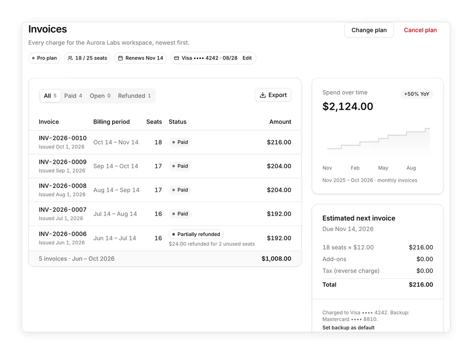
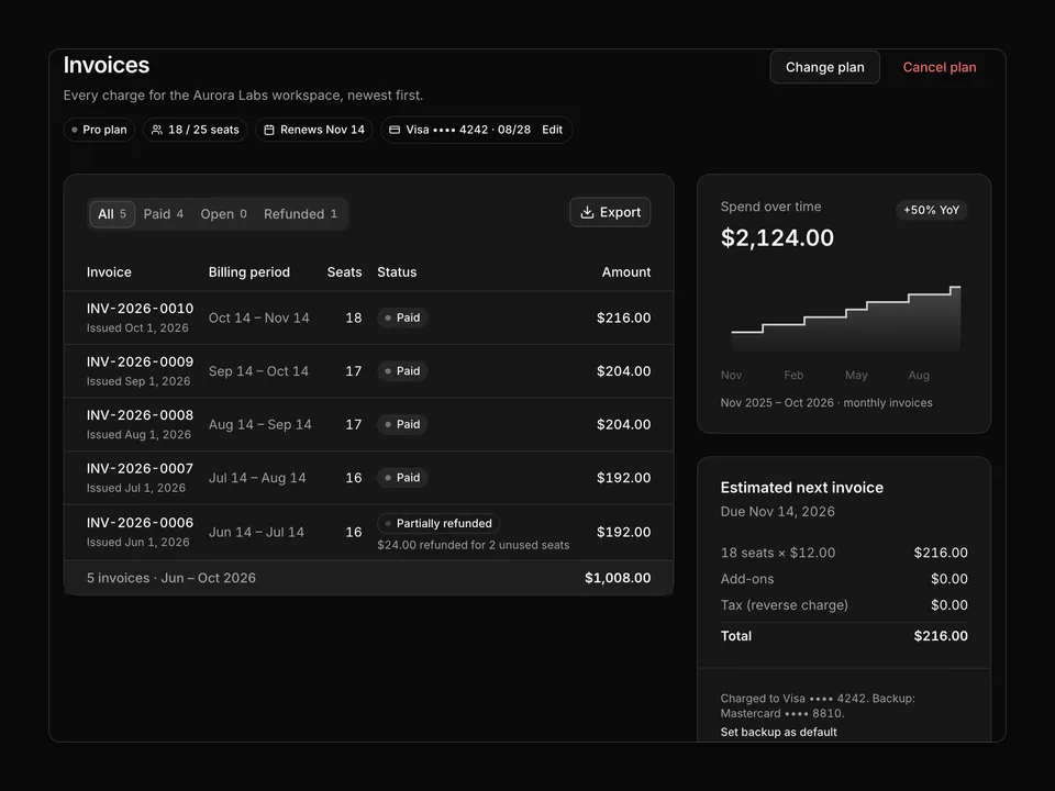
const invoices = [
{
number: 'INV-2026-0010',
date: 'Oct 1, 2026',
amount: '$216.00',
status: 'Paid',
},
{
number: 'INV-2026-0009',
date: 'Sep 1, 2026',
amount: '$204.00',
status: 'Paid',
},
{
number: 'INV-2026-0008',
date: 'Aug 1, 2026',
amount: '$204.00',
status: 'Paid',
},
{
number: 'INV-2026-0007',
date: 'Jul 1, 2026',
amount: '$192.00',
status: 'Paid',
},
{
number: 'INV-2026-0006',
date: 'Jun 1, 2026',
amount: '$192.00',
status: 'Partially refunded',
},
];
/**
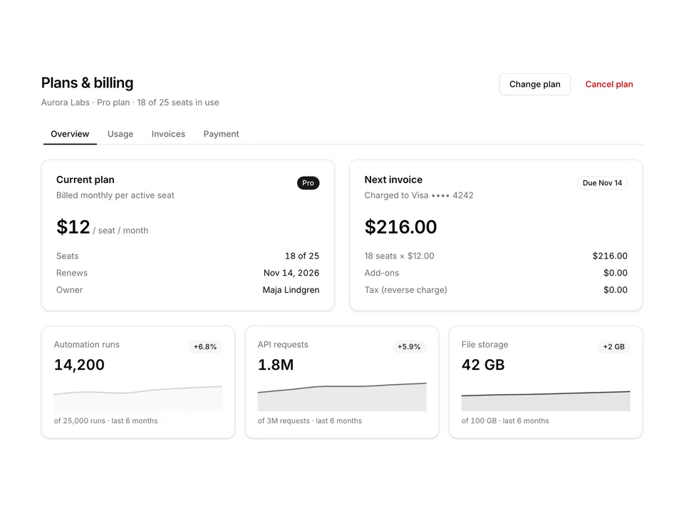
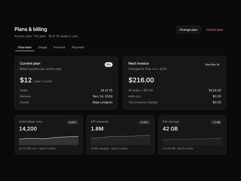
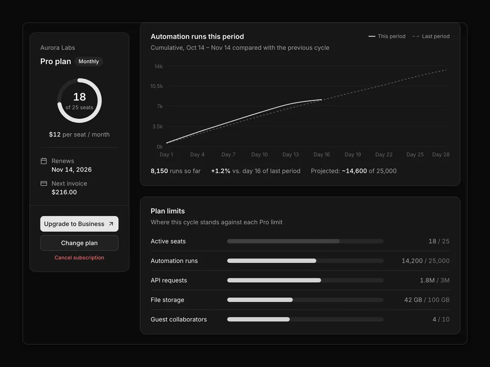
* Classic billing page: header, plan + payment method cards, a full-width usage card with a stacked monthly bar chart and progress rows, then an invoices table.
*/
export default function Billing01() {
return (
<TooltipProvider>
<div className="w-full max-w-5xl px-4">
<div className="flex flex-col gap-1.5 sm:flex-row sm:items-end sm:justify-between">
<div className="space-y-1.5">
<h1 className="text-balance font-semibold text-2xl text-foreground tracking-tight">
Billing
</h1>
<p className="text-pretty text-muted-foreground text-sm">
Manage the Aurora Labs subscription, payment method and invoices.
</p>
</div>
<p className="text-muted-foreground text-sm tabular-nums">
Workspace ID{' '}
<span className="font-mono text-foreground">ws_8f2k1a</span>
</p>
</div>
<div className="mt-8 grid gap-6 md:grid-cols-3">
<Card className="md:col-span-2">
<CardHeader>
<CardTitle>Current plan</CardTitle>
<CardDescription>
Billed monthly · renews on Nov 14, 2026
</CardDescription>
<CardAction>
<Badge>Pro</Badge>
</CardAction>
</CardHeader>
<CardContent>
<div className="flex items-baseline gap-1">
<span className="font-semibold text-3xl text-foreground tabular-nums tracking-tight">
$12
</span>
<span className="text-muted-foreground text-sm">
per seat / month
</span>
</div>
<dl className="mt-6 grid gap-4 text-sm sm:grid-cols-3">
<div className="space-y-1.5">
<dt className="text-muted-foreground">Seats</dt>
<dd className="font-medium text-foreground tabular-nums">
18 of 25 used
</dd>
</div>
<div className="space-y-1.5">
<dt className="text-muted-foreground">Next invoice</dt>
<dd className="font-medium text-foreground tabular-nums">
$216.00 on Nov 14
</dd>
</div>
<div className="space-y-1.5">
<dt className="text-muted-foreground">Billing email</dt>
<dd className="truncate font-medium text-foreground">
finance@auroralabs.io
</dd>
</div>
</dl>
</CardContent>
<CardFooter className="gap-2 border-t">
<Button type="button" variant="outline">
Change plan
</Button>
<Button
className="text-destructive hover:text-destructive"
type="button"
variant="ghost"
>
Cancel subscription
</Button>
</CardFooter>
</Card>
<Card>
<CardHeader>
<CardTitle>Payment method</CardTitle>
<CardDescription>Charged on the renewal date</CardDescription>
</CardHeader>
<CardContent className="flex-1">
<div className="flex items-center gap-3">
<span className="flex size-10 shrink-0 items-center justify-center rounded-md border bg-muted">
<CreditCardIcon
aria-hidden="true"
className="size-5 text-foreground"
/>
</span>
<div className="min-w-0 flex-1">
<p className="flex items-center gap-2 font-medium text-foreground text-sm">
Visa <span className="tabular-nums">•••• 4242</span>
<Badge variant="secondary">Default</Badge>
</p>
<p className="text-muted-foreground text-sm tabular-nums">
Expires 08/28
</p>
</div>
</div>
<Separator className="my-4" />
<div className="flex items-center justify-between gap-3 text-sm">
<div className="min-w-0">
<p className="truncate text-foreground">
Mastercard <span className="tabular-nums">•••• 8810</span>
</p>
<p className="text-muted-foreground text-xs tabular-nums">
Backup · expires 03/27
</p>
</div>
<Button
className="h-auto shrink-0 p-0"
type="button"
variant="link"
>
Set default
</Button>
</div>
</CardContent>
<CardFooter className="border-t">
<Button className="w-full" type="button" variant="outline">
Edit payment method
</Button>
</CardFooter>
</Card>
</div>
<Card className="mt-6">
<CardHeader>
<CardTitle>Usage</CardTitle>
<CardDescription>
Share of the Pro plan limits used each month, May – Oct 2026
</CardDescription>
<CardAction>
<div className="flex items-center gap-4 text-muted-foreground text-xs">
{Object.entries(chartConfig).map(([key, item]) => (
<span className="flex items-center gap-1.5" key={key}>
<span
aria-hidden="true"
className="size-2 rounded-sm"
style={{ background: item.color }}
/>
{item.label}
</span>
))}
</div>
</CardAction>
</CardHeader>
<CardContent>
<ChartContainer
className="aspect-auto h-56 w-full"
config={chartConfig}
>
<BarChart accessibilityLayer barSize={28} data={usage}>
<CartesianGrid vertical={false} />
<XAxis
axisLine={false}
dataKey="month"
tickLine={false}
tickMargin={8}
/>
<YAxis
axisLine={false}
tickFormatter={(value: number) => `${value}%`}
tickLine={false}
width={40}
/>
<ChartTooltip
content={
<ChartTooltipContent
formatter={(value, name, item) => (
<>
<span
aria-hidden="true"
className="size-2.5 shrink-0 rounded-sm"
style={{ background: item.color }}
/>
<span className="flex flex-1 items-center justify-between gap-4">
<span className="text-muted-foreground">
{chartConfig[name as keyof typeof chartConfig]
?.label ?? name}
</span>
<span className="font-medium font-mono text-foreground tabular-nums">
{value}% of limit
</span>
</span>
</>
)}
/>
}
cursor={false}
/>
<Bar
dataKey="automation"
fill="var(--color-automation)"
radius={[0, 0, 4, 4]}
stackId="usage"
/>
<Bar
dataKey="api"
fill="var(--color-api)"
radius={[4, 4, 0, 0]}
stackId="usage"
/>
</BarChart>
</ChartContainer>
<div className="mt-6 grid gap-5 sm:grid-cols-3">
{limits.map((item) => (
<div className="space-y-2" key={item.label}>
<div className="flex items-baseline justify-between text-sm">
<span className="text-foreground">{item.label}</span>
<span className="text-muted-foreground tabular-nums">
{item.used}{' '}
<span className="text-muted-foreground/70">
/ {item.limit}
</span>
</span>
</div>
<Progress
aria-label={`${item.label}: ${item.value}% used`}
value={item.value}
/>
</div>
))}
</div>
</CardContent>
</Card>
<Card className="mt-6 pb-0">
<CardHeader>
<CardTitle>Invoices</CardTitle>
<CardDescription>
Receipts are emailed to finance@auroralabs.io on each charge.
</CardDescription>
<CardAction>
<Button size="sm" type="button" variant="outline">
Billing history
</Button>
</CardAction>
</CardHeader>
<CardContent className="px-0">
<Table>
<TableHeader>
<TableRow className="hover:bg-transparent">
<TableHead className="pl-6">Invoice</TableHead>
<TableHead>Date</TableHead>
<TableHead>Status</TableHead>
<TableHead className="text-right">Amount</TableHead>
<TableHead className="w-16 pr-6">
<span className="sr-only">Download</span>
</TableHead>
</TableRow>
</TableHeader>
<TableBody>
{invoices.map((invoice) => (
<TableRow key={invoice.number}>
<TableCell className="pl-6 font-medium text-foreground tabular-nums">
{invoice.number}
</TableCell>
<TableCell className="text-muted-foreground tabular-nums">
{invoice.date}
</TableCell>
<TableCell>
<Badge
className="gap-1.5"
variant={
invoice.status === 'Paid' ? 'secondary' : 'outline'
}
>
<span
aria-hidden="true"
className={cn(
'size-1.5 rounded-full',
invoice.status === 'Paid'
? 'bg-chart-2'
: 'bg-chart-4'
)}
/>
{invoice.status}
</Badge>
</TableCell>
<TableCell className="text-right text-foreground tabular-nums">
{invoice.amount}
</TableCell>
<TableCell className="pr-6 text-right">
<Tooltip>
<TooltipTrigger asChild>
<Button
aria-label={`Download ${invoice.number}`}
size="icon-sm"
type="button"
variant="ghost"
>
<DownloadIcon aria-hidden="true" />
</Button>
</TooltipTrigger>
<TooltipContent>Download PDF</TooltipContent>
</Tooltip>
</TableCell>
</TableRow>
))}
</TableBody>
</Table>
</CardContent>
</Card>
</div>
</TooltipProvider>
);
}