'use client';

import {
  CreditCardIcon,
  LogOutIcon,
  MapPinIcon,
  PackageIcon,
  RotateCcwIcon,
  SearchIcon,
  SettingsIcon,
} from 'lucide-react';
import { useState } from 'react';

import { Avatar, AvatarFallback, AvatarImage } from '@/components/ui/avatar';
import { Badge } from '@/components/ui/badge';
import { Button } from '@/components/ui/button';
import { Card, CardContent, CardFooter, CardHeader } from '@/components/ui/card';
import { Input } from '@/components/ui/input';
import { Tabs, TabsList, TabsTrigger } from '@/components/ui/tabs';
import { cn } from '@/lib/utils';

const navItems = [
  { label: 'Orders', icon: PackageIcon, current: true },
  { label: 'Addresses', icon: MapPinIcon, current: false },
  { label: 'Payment', icon: CreditCardIcon, current: false },
  { label: 'Returns', icon: RotateCcwIcon, current: false },
  { label: 'Settings', icon: SettingsIcon, current: false },
];

type Status = 'In transit' | 'Delivered' | 'Returned';

const orders: {
  number: string;
  date: string;
  total: string;
  status: Status;
  note: string;
  items: { name: string; photo: string }[];
}[] = [
  {
    number: '#NR-48377',
    date: 'Oct 27, 2026',
    total: '€268.00',
    status: 'In transit',
    note: 'Arriving Nov 1 with Nordpost',
    items: [
      { name: 'Tern Sneakers', photo: '1491553895911-0055eca6402d' },
      { name: 'Fjell Wool Overshirt', photo: '1523381210434-271e8be1f52b' },
    ],
  },
  {
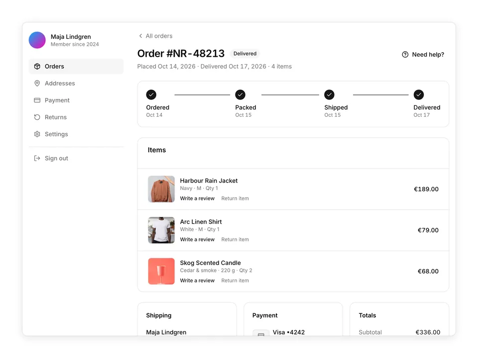
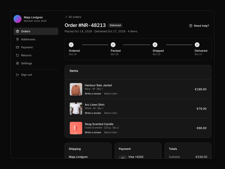
    number: '#NR-48213',
    date: 'Oct 14, 2026',
    total: '€336.00',
    status: 'Delivered',
    note: 'Delivered Oct 17 · 4 items',
    items: [
      { name: 'Harbour Rain Jacket', photo: '1591047139829-d91aecb6caea' },
      { name: 'Arc Linen Shirt', photo: '1521572163474-6864f9cf17ab' },
      { name: 'Skog Scented Candle', photo: '1560393464-5c69a73c5770' },
    ],
  },
  {
    number: '#NR-47902',
    date: 'Sep 28, 2026',
    total: '€199.00',
    status: 'Delivered',
    note: 'Delivered Oct 1 · 1 item',
    items: [
      { name: 'Pulse Wireless Headphones', photo: '1583394838336-acd977736f90' },
    ],
  },
  {
    number: '#NR-47560',
    date: 'Sep 3, 2026',
    total: '€188.00',
    status: 'Returned',
    note: '€59.00 refunded to Visa •4242',
    items: [
      { name: 'Fjell Wool Overshirt, Charcoal', photo: '1611312449408-fcece27cdbb7' },
      { name: 'Dune Canvas Tote', photo: '1491637639811-60e2756cc1c7' },
    ],
  },
];

const filters: { value: 'all' | Status; label: string }[] = [
  { value: 'all', label: 'All' },
  { value: 'In transit', label: 'In transit' },
  { value: 'Delivered', label: 'Delivered' },
  { value: 'Returned', label: 'Returned' },
];

function StatusBadge({ status }: { status: Status }) {
  if (status === 'In transit') {
    return (
      <Badge className="gap-1.5" variant="outline">
        <span
          aria-hidden="true"
          className="size-1.5 animate-pulse rounded-full bg-chart-2"
        />
        In transit
      </Badge>
    );
  }
  if (status === 'Delivered') {
    return <Badge variant="secondary">Delivered</Badge>;
  }
  return (
    <Badge className="text-muted-foreground" variant="outline">
      Returned
    </Badge>
  );
}

/**
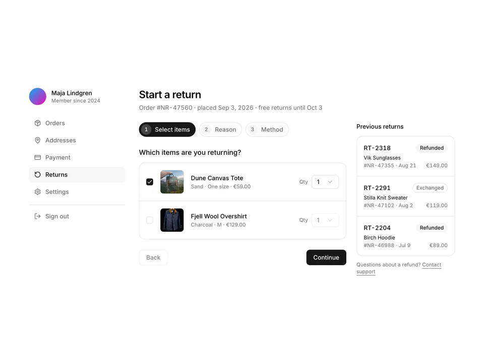
 * Account shell with a left navigation rail (Avatar, name, Orders active) and an order history that filters with Tabs and a search Input; each order is a Card with number, date, total, status Badge, overlapping product thumbnails and View order / Buy again Buttons.
 */
export default function AccountOrders01() {
  const [filter, setFilter] = useState<'all' | Status>('all');
  const visible = orders.filter(
    (order) => filter === 'all' || order.status === filter
  );

  return (
    <div className="w-full max-w-5xl px-4 py-8">
      <div className="grid gap-8 md:grid-cols-4">
        <aside>
          <div className="flex items-center gap-3">
            <Avatar className="size-10">
              <AvatarImage
                alt="Maja Lindgren"
                src="https://avatar.vercel.sh/maja-lindgren"
              />
              <AvatarFallback>ML</AvatarFallback>
            </Avatar>
            <div className="min-w-0">
              <p className="truncate font-medium text-foreground text-sm">
                Maja Lindgren
              </p>
              <p className="truncate text-muted-foreground text-xs">
                Member since 2024
              </p>
            </div>
          </div>
          <nav aria-label="Account" className="mt-6">
            <ul className="-mx-1 flex gap-1 overflow-x-auto md:mx-0 md:flex-col">
              {navItems.map((item) => (
                <li key={item.label}>
                  <a
                    aria-current={item.current ? 'page' : undefined}
                    className={cn(
                      'flex items-center gap-2.5 whitespace-nowrap rounded-md px-3 py-2 font-medium text-sm transition-colors',
                      item.current
                        ? 'bg-muted text-foreground'
                        : 'text-muted-foreground hover:bg-muted/60 hover:text-foreground'
                    )}
                    href="#"
                  >
                    <item.icon aria-hidden="true" className="size-4 shrink-0" />
                    {item.label}
                  </a>
                </li>
              ))}
              <li className="md:mt-2 md:border-t md:pt-2">
                <a
                  className="flex items-center gap-2.5 whitespace-nowrap rounded-md px-3 py-2 font-medium text-muted-foreground text-sm transition-colors hover:bg-muted/60 hover:text-foreground"
                  href="#"
                >
                  <LogOutIcon aria-hidden="true" className="size-4 shrink-0" />
                  Sign out
                </a>
              </li>
            </ul>
          </nav>
        </aside>

        <main className="md:col-span-3">
          <div className="flex flex-col gap-1">
            <h1 className="font-semibold text-2xl text-foreground tracking-tight">
              Orders
            </h1>
            <p className="text-muted-foreground text-sm">
              4 orders placed in 2026 · €991.00 in total
            </p>
          </div>

          <div className="mt-6 flex flex-col gap-3 sm:flex-row sm:items-center sm:justify-between">
            <Tabs
              onValueChange={(value) => setFilter(value as 'all' | Status)}
              value={filter}
            >
              <TabsList>
                {filters.map((item) => (
                  <TabsTrigger key={item.value} value={item.value}>
                    {item.label}
                  </TabsTrigger>
                ))}
              </TabsList>
            </Tabs>
            <div className="relative sm:w-60">
              <SearchIcon
                aria-hidden="true"
                className="-translate-y-1/2 pointer-events-none absolute top-1/2 left-2.5 size-4 text-muted-foreground"
              />
              <Input
                aria-label="Search orders"
                autoComplete="off"
                className="pl-8"
                name="query"
                placeholder="Search by product or order"
                type="search"
              />
            </div>
          </div>

          <div className="mt-6 flex flex-col gap-4">
            {visible.map((order) => (
              <Card className="gap-0 py-0 shadow-none" key={order.number}>
                <CardHeader className="flex flex-row flex-wrap items-center gap-x-6 gap-y-2 border-b px-6 py-4">
                  <div className="min-w-0">
                    <p className="font-medium text-foreground text-sm tabular-nums">
                      {order.number}
                    </p>
                    <p className="text-muted-foreground text-xs tabular-nums">
                      Placed {order.date}
                    </p>
                  </div>
                  <div className="hidden sm:block">
                    <p className="text-muted-foreground text-xs">Total</p>
                    <p className="font-medium text-foreground text-sm tabular-nums">
                      {order.total}
                    </p>
                  </div>
                  <div className="ml-auto">
                    <StatusBadge status={order.status} />
                  </div>
                </CardHeader>
                <CardContent className="flex items-center gap-4 px-6 py-4">
                  <div className="-space-x-2 flex shrink-0">
                    {order.items.map((item) => (
                      <img
                        alt={item.name}
                        className="size-12 rounded-md border-2 border-background object-cover ring-1 ring-border"
                        key={item.photo}
                        loading="lazy"
                        src={`https://images.unsplash.com/photo-${item.photo}?auto=format&fit=crop&w=160&q=80`}
                      />
                    ))}
                  </div>
                  <div className="min-w-0 flex-1">
                    <p className="truncate font-medium text-foreground text-sm">
                      {order.items.map((item) => item.name).join(', ')}
                    </p>
                    <p className="text-muted-foreground text-xs tabular-nums">
                      {order.note}
                      <span className="sm:hidden"> · {order.total}</span>
                    </p>
                  </div>
                </CardContent>
                <CardFooter className="gap-2 border-t px-6 py-3">
                  <Button size="sm" type="button" variant="outline">
                    View order
                  </Button>
                  <Button size="sm" type="button" variant="ghost">
                    Buy again
                  </Button>
                </CardFooter>
              </Card>
            ))}
            {visible.length === 0 ? (
              <div className="rounded-xl border border-dashed p-10 text-center">
                <p className="font-medium text-foreground text-sm">
                  No orders here
                </p>
                <p className="mt-1 text-muted-foreground text-sm">
                  Try another filter or clear the search.
                </p>
              </div>
            ) : null}
          </div>
        </main>
      </div>
    </div>
  );
}