'use client';

import {
  ArrowRightIcon,
  CompassIcon,
  FeatherIcon,
  HeartPulseIcon,
  RadioIcon,
  WavesIcon,
  ZapIcon,
} from 'lucide-react';

import { Badge } from '@/components/ui/badge';
import { Card, CardContent } from '@/components/ui/card';

const stories = [
  {
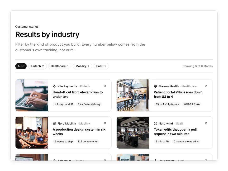
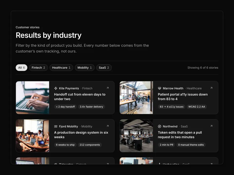
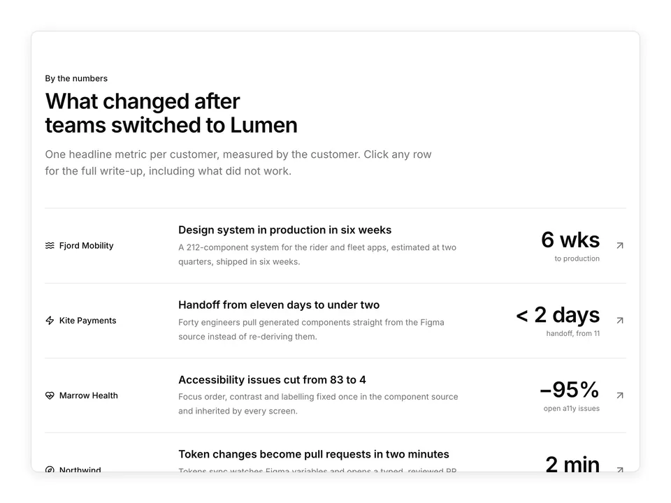
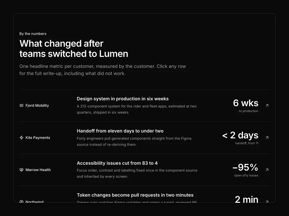
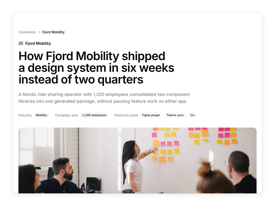
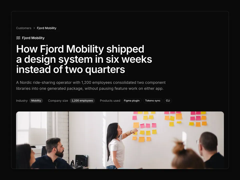
    company: 'Fjord Mobility',
    icon: WavesIcon,
    industry: 'Mobility',
    title: 'Six weeks to a production design system',
    metric: '6 wks',
    metricLabel: 'to a production design system',
    image:
      'https://images.unsplash.com/photo-1522071820081-009f0129c71c?auto=format&fit=crop&w=1000&q=80',
    alt: 'Fjord Mobility design team around a table',
  },
  {
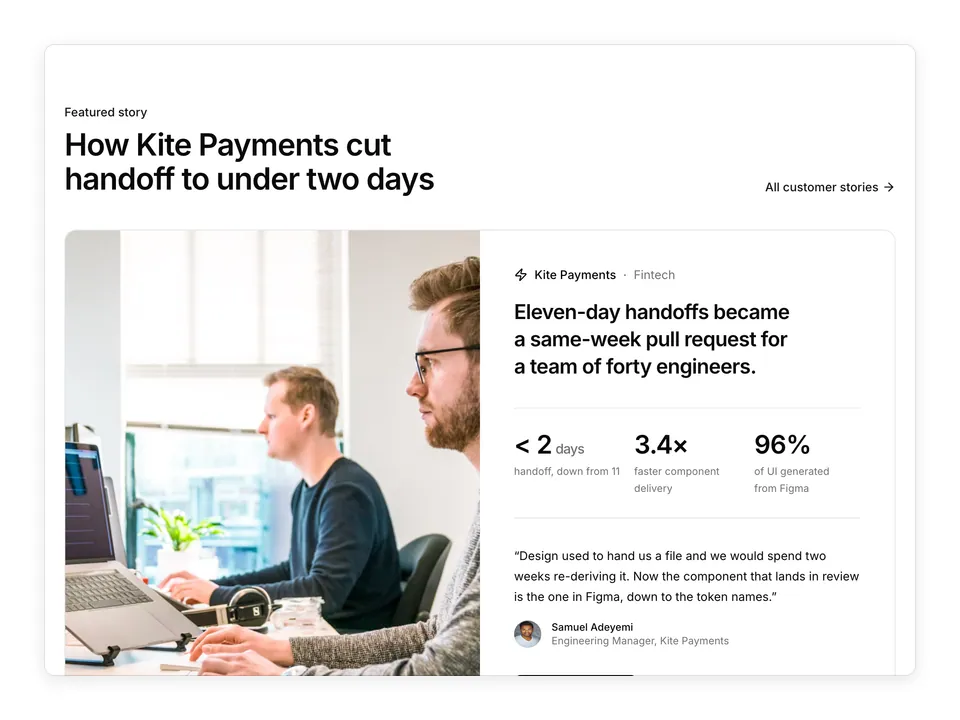
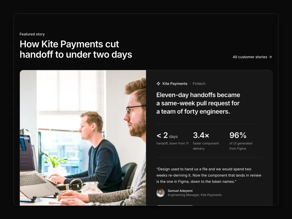
    company: 'Kite Payments',
    icon: ZapIcon,
    industry: 'Fintech',
    title: 'Handoff cut from eleven days to under two',
    metric: '< 2 days',
    metricLabel: 'design-to-code handoff',
    image:
      'https://images.unsplash.com/photo-1498050108023-c5249f4df085?auto=format&fit=crop&w=1000&q=80',
    alt: 'Laptop showing generated component code',
  },
  {
    company: 'Marrow Health',
    icon: HeartPulseIcon,
    industry: 'Healthcare',
    title: '83 accessibility issues down to 4',
    metric: '83 → 4',
    metricLabel: 'open accessibility issues',
    image:
      'https://images.unsplash.com/photo-1573164713988-8665fc963095?auto=format&fit=crop&w=1000&q=80',
    alt: 'Product manager reviewing the patient portal on a laptop',
  },
  {
    company: 'Northwind',
    icon: CompassIcon,
    industry: 'SaaS',
    title: 'Token edits that open a PR in two minutes',
    metric: '2 min',
    metricLabel: 'from token edit to pull request',
    image:
      'https://images.unsplash.com/photo-1555066931-4365d14bab8c?auto=format&fit=crop&w=1000&q=80',
    alt: 'Code editor with a theme file open',
  },
  {
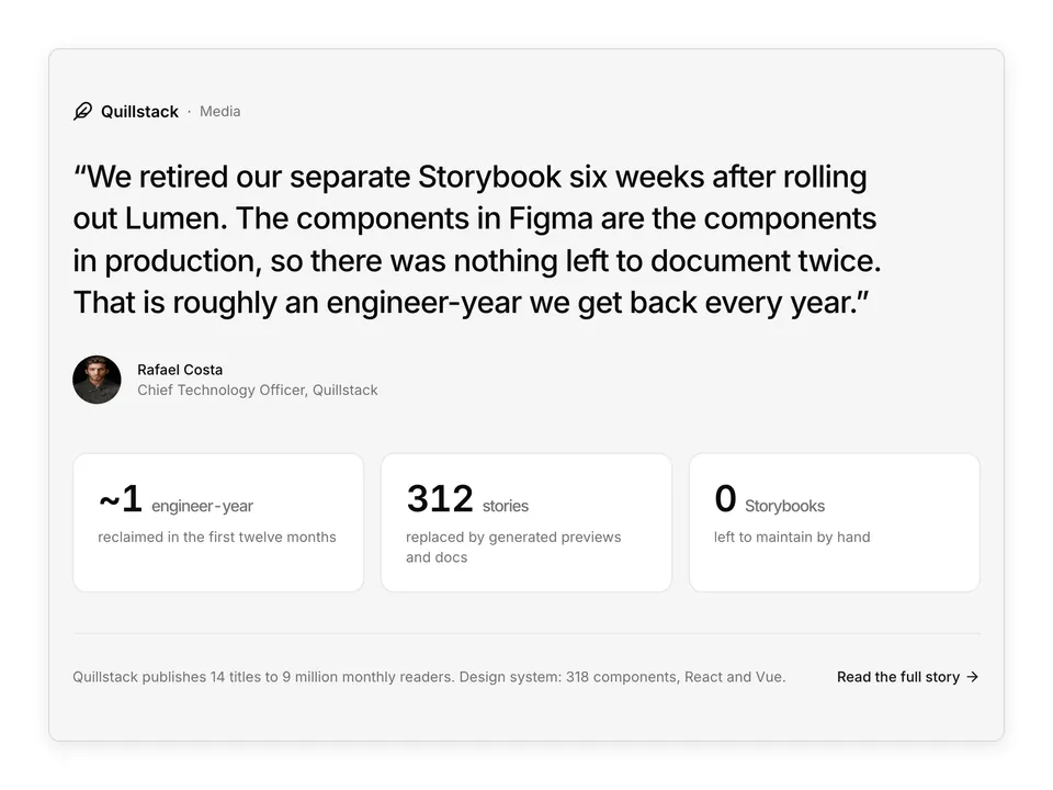
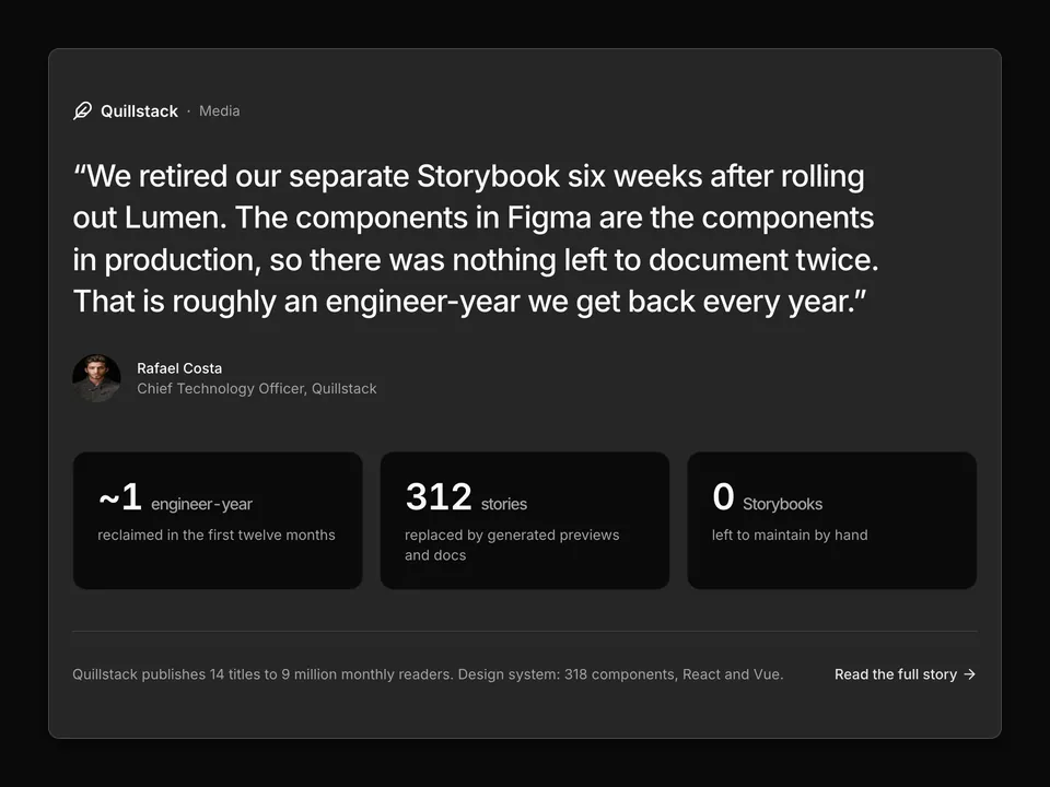
    company: 'Quillstack',
    icon: FeatherIcon,
    industry: 'Media',
    title: 'Retiring Storybook, saving an engineer-year',
    metric: '~1 yr',
    metricLabel: 'of engineering time saved',
    image:
      'https://images.unsplash.com/photo-1497366216548-37526070297c?auto=format&fit=crop&w=1000&q=80',
    alt: 'Quillstack newsroom office interior',
  },
  {
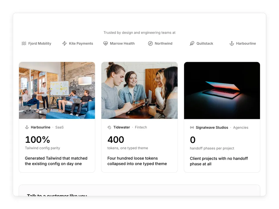
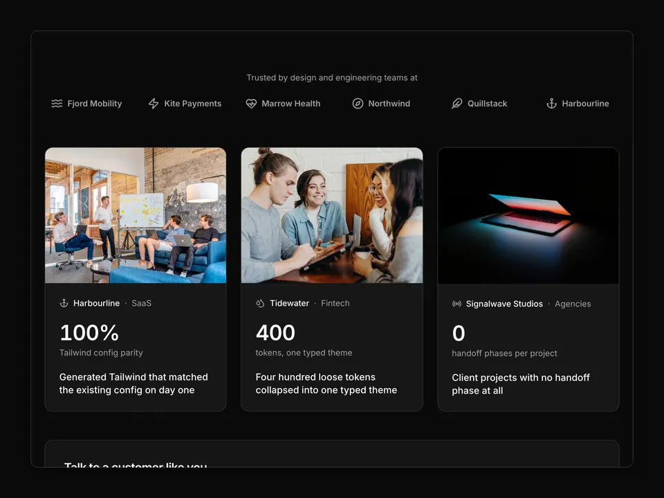
    company: 'Signalwave Studios',
    icon: RadioIcon,
    industry: 'Agencies',
    title: 'Client projects with no handoff phase',
    metric: '0',
    metricLabel: 'handoff phases per project',
    image:
      'https://images.unsplash.com/photo-1600880292203-757bb62b4baf?auto=format&fit=crop&w=1000&q=80',
    alt: 'Two designers planning with sticky notes',
  },
];

/**
 * Centred heading over a three-column grid of six customer story Cards, each with a cover photo, industry Badge, wordmark, title, one headline metric and a "Read story" link.
 */
export default function CaseStudies01() {
  return (
    <section className="w-full py-16 sm:py-24">
      <div className="mx-auto w-full max-w-6xl px-6">
        <div className="mx-auto max-w-2xl text-center">
          <p className="font-medium text-primary text-sm">Customer stories</p>
          <h2 className="mt-2 text-balance font-semibold text-3xl text-foreground tracking-tight sm:text-4xl">
            Teams that stopped rebuilding their designs in code
          </h2>
          <p className="mt-4 text-pretty text-lg text-muted-foreground">
            How product teams in fintech, healthcare, mobility and media use
            Lumen to turn Figma into production components and keep them in
            sync.
          </p>
        </div>

        <div className="mt-12 grid grid-cols-1 gap-6 sm:grid-cols-2 md:grid-cols-3">
          {stories.map((story) => (
            <Card
              className="group relative flex flex-col gap-0 overflow-hidden py-0 shadow-none transition-colors hover:border-foreground/20"
              key={story.company}
            >
              <div className="relative">
                <img
                  alt={story.alt}
                  className="aspect-[16/10] w-full object-cover transition-transform duration-300 group-hover:scale-[1.02]"
                  loading="lazy"
                  src={story.image}
                />
                <Badge
                  className="absolute top-3 left-3 bg-background/90 text-foreground backdrop-blur"
                  variant="outline"
                >
                  {story.industry}
                </Badge>
              </div>
              <CardContent className="flex flex-1 flex-col p-6">
                <div className="flex items-center gap-2 text-foreground">
                  <story.icon aria-hidden="true" className="size-4" />
                  <span className="font-medium text-sm">{story.company}</span>
                </div>
                <h3 className="mt-3 mb-6 text-pretty font-semibold text-foreground text-lg leading-snug">
                  <a className="after:absolute after:inset-0" href="#">
                    {story.title}
                  </a>
                </h3>
                <div className="mt-auto border-border border-t pt-5">
                  <p className="font-semibold text-3xl text-foreground tabular-nums tracking-tight">
                    {story.metric}
                  </p>
                  <p className="mt-1 text-muted-foreground text-sm">
                    {story.metricLabel}
                  </p>
                </div>
                <p className="mt-auto flex items-center gap-1 pt-6 font-medium text-primary text-sm">
                  Read story
                  <ArrowRightIcon
                    aria-hidden="true"
                    className="size-4 transition-transform group-hover:translate-x-0.5"
                  />
                </p>
              </CardContent>
            </Card>
          ))}
        </div>
      </div>
    </section>
  );
}