'use client';

import { Badge } from '@/components/ui/badge';
import { cn } from '@/lib/utils';

type EntryType = 'New' | 'Improved' | 'Fixed' | 'Breaking';

const typeStyles: Record<EntryType, string> = {
  New: 'bg-chart-2/15 text-chart-2',
  Improved: 'bg-chart-1/15 text-chart-1',
  Fixed: 'bg-chart-3/15 text-chart-3',
  Breaking: 'bg-destructive/10 text-destructive',
};

const releases: {
  version: string;
  date: string;
  title: string;
  summary: string;
  groups: { type: EntryType; items: string[] }[];
  image?: { src: string; alt: string };
}[] = [
  {
    version: 'v3.2.0',
    date: 'Oct 21, 2026',
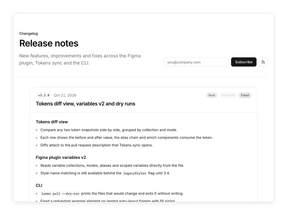
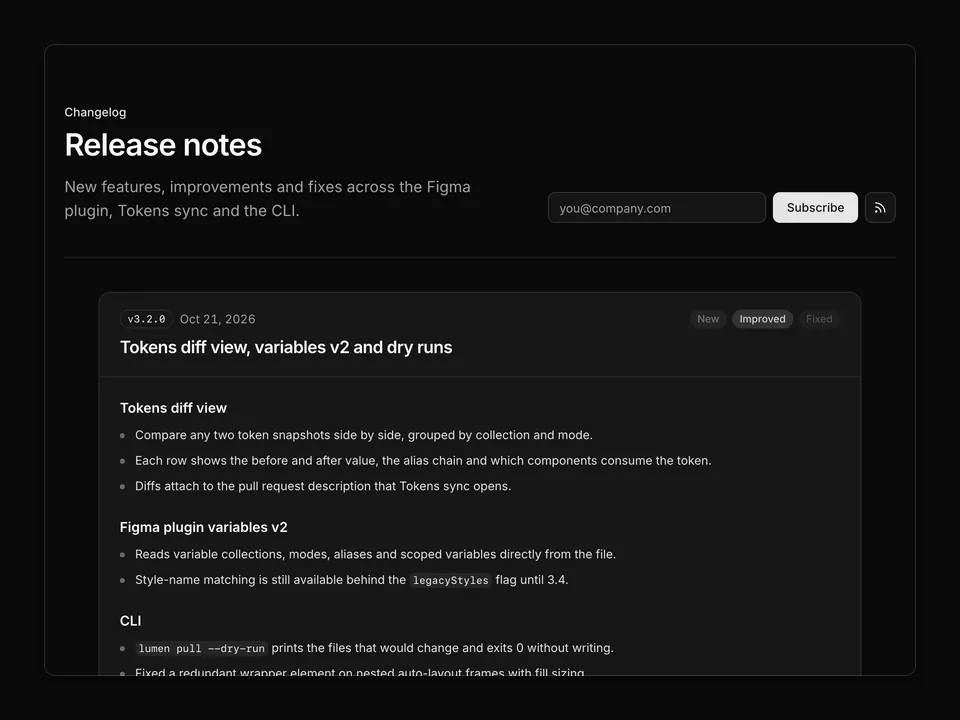
    title: 'Tokens diff view, variables v2 and dry runs',
    summary:
      'This release is about seeing a change before it lands. The new diff view shows which tokens a Figma edit will touch, the plugin reads Figma variables natively, and the CLI can rehearse a pull without writing a single file.',
    groups: [
      {
        type: 'New',
        items: [
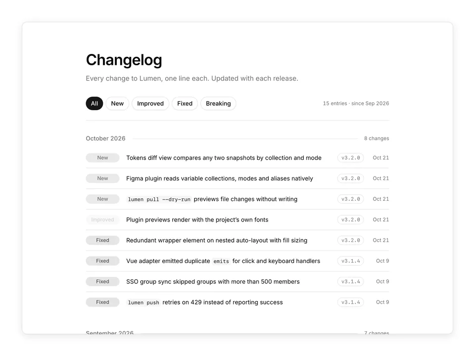
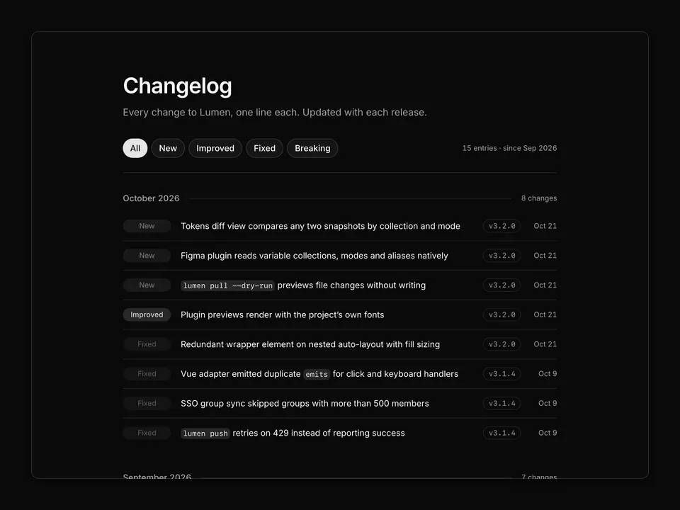
          'Tokens diff view compares any two token snapshots side by side, grouped by collection and mode, with a per-token before and after.',
          'Figma plugin variables v2 reads variable collections, modes, aliases and scoped variables directly instead of matching style names.',
          '`lumen pull --dry-run` prints the files that would change and exits without touching the working tree.',
        ],
      },
      {
        type: 'Improved',
        items: [
          'Component previews inside the plugin render with the project’s own fonts.',
          'Token names are validated against your naming convention on save, not at build time.',
        ],
      },
      {
        type: 'Fixed',
        items: [
          'Nested auto-layout frames with fill sizing no longer produce a redundant wrapper element.',
        ],
      },
    ],
    image: {
      src: 'https://images.unsplash.com/photo-1460925895917-afdab827c52f?auto=format&fit=crop&w=1200&q=80',
      alt: 'The new tokens diff view on a laptop screen',
    },
  },
  {
    version: 'v3.1.4',
    date: 'Oct 9, 2026',
    title: 'Maintenance release',
    summary:
      'A handful of fixes reported through support over the past two weeks. No new flags and no migration steps.',
    groups: [
      {
        type: 'Fixed',
        items: [
          'The Vue adapter emitted duplicate `emits` entries for components with both click and keyboard handlers.',
          'SSO group sync skipped identity-provider groups with more than 500 members.',
          '`lumen push` reported success when the API answered 429; it now retries with backoff and fails loudly.',
          'Dark-mode aliases resolved to the light value in the Tailwind preset when the mode was named “Dark” with a capital D.',
        ],
      },
    ],
  },
  {
    version: 'v3.1.0',
    date: 'Sep 24, 2026',
    title: 'Vue adapter beta and SSO group sync',
    summary:
      'The compiler we shipped in 3.0 was built to target more than one framework. Vue is the first adapter to come out of that work, and enterprise workspaces get group-based access from their identity provider.',
    groups: [
      {
        type: 'New',
        items: [
          'Vue 3 adapter (beta) generates `<script setup>` single-file components with typed props and slots from the same source as the React output.',
          'SSO group sync maps identity-provider groups to Lumen teams; membership changes propagate within 15 minutes.',
        ],
      },
      {
        type: 'Improved',
        items: [
          'Generated React components ship with `displayName` set for readable DevTools traces.',
          'Plugin sign-in now persists between Figma sessions.',
        ],
      },
    ],
  },
  {
    version: 'v3.0.0',
    date: 'Sep 2, 2026',
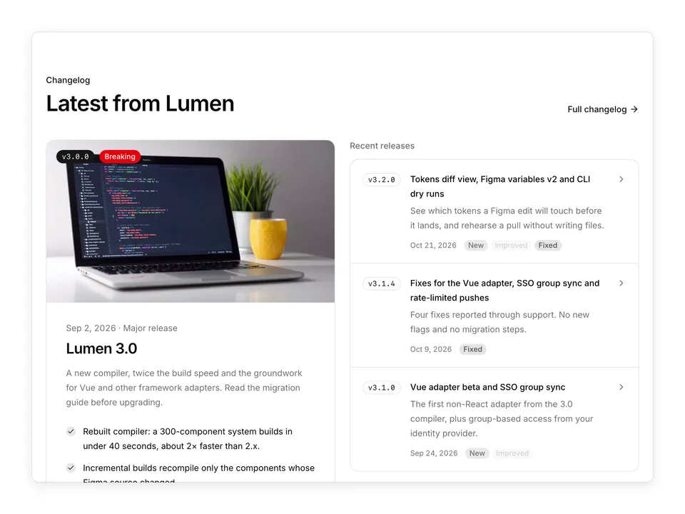
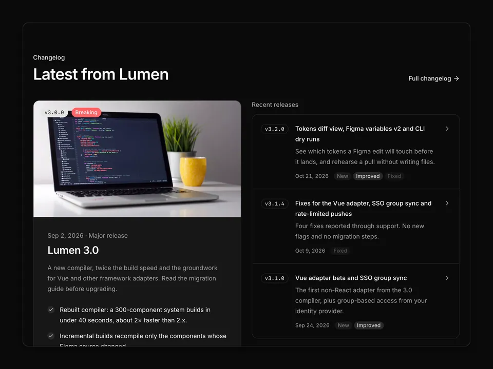
    title: 'Lumen 3.0',
    summary:
      'A rebuilt compiler that is roughly twice as fast on real design systems, incremental builds, and the groundwork for multi-framework output. This is a major release with two breaking changes.',
    groups: [
      {
        type: 'New',
        items: [
          'New compiler builds a 300-component design system in under 40 seconds in our benchmarks, about 2× faster than 2.x.',
          'Incremental builds recompile only the components whose Figma source changed.',
        ],
      },
      {
        type: 'Improved',
        items: [
          'Tokens sync is transactional: a failed push leaves the repository untouched.',
        ],
      },
      {
        type: 'Breaking',
        items: [
          'Node 20 or later is required. Node 18 reached end of life and the compiler relies on the built-in fetch and watch mode.',
          '`lumen.config.js` must export an object; the function form is removed. Run `lumen migrate config` to update.',
        ],
      },
    ],
    image: {
      src: 'https://images.unsplash.com/photo-1498050108023-c5249f4df085?auto=format&fit=crop&w=1200&q=80',
      alt: 'Generated component code from the Lumen 3.0 compiler',
    },
  },
];

/** Renders `backtick` spans in release notes as inline code. */
function renderInline(text: string) {
  return text.split(/(`[^`]+`)/g).map((part, index) =>
    part.startsWith('`') ? (
      <code
        className="rounded-sm bg-muted px-1 py-0.5 font-mono text-foreground text-xs"
        key={index}
      >
        {part.slice(1, -1)}
      </code>
    ) : (
      <span key={index}>{part}</span>
    )
  );
}

/**
 * Vertical release timeline: a sticky date and version Badge column on the left, a dotted rail, and release content on the right with title, summary, type-grouped bullet lists and an optional photo.
 */
export default function Changelog01() {
  return (
    <section className="w-full py-16 sm:py-24">
      <div className="mx-auto w-full max-w-6xl px-6">
        <div className="max-w-2xl">
          <p className="font-medium text-primary text-sm">Changelog</p>
          <h2 className="mt-2 text-balance font-semibold text-3xl text-foreground tracking-tight sm:text-4xl">
            What’s new in Lumen
          </h2>
          <p className="mt-4 text-pretty text-lg text-muted-foreground">
            Every release of the Figma plugin, Tokens sync and the CLI, in one
            place. Minor versions ship roughly every two weeks.
          </p>
        </div>

        <ol className="mt-12">
          {releases.map((release, index) => (
            <li
              className="group grid grid-cols-[auto_1fr] gap-x-5 md:grid-cols-[10rem_auto_1fr] md:gap-x-8"
              key={release.version}
            >
              <div className="hidden md:block md:sticky md:top-6 md:self-start md:pb-12">
                <p className="font-medium text-foreground text-sm tabular-nums">
                  {release.date}
                </p>
                <Badge
                  className="mt-2 font-mono"
                  variant={index === 0 ? 'default' : 'outline'}
                >
                  {release.version}
                </Badge>
              </div>

              <div
                aria-hidden="true"
                className="flex flex-col items-center"
              >
                <span
                  className={cn(
                    'mt-1.5 size-2.5 shrink-0 rounded-full ring-4 ring-background',
                    index === 0 ? 'bg-primary' : 'bg-muted-foreground/50'
                  )}
                />
                <span className="w-px flex-1 bg-border group-last:hidden" />
              </div>

              <div className="min-w-0 pb-12 group-last:pb-0">
                <div className="flex items-center gap-3 md:hidden">
                  <p className="font-medium text-foreground text-sm tabular-nums">
                    {release.date}
                  </p>
                  <Badge
                    className="font-mono"
                    variant={index === 0 ? 'default' : 'outline'}
                  >
                    {release.version}
                  </Badge>
                </div>
                <h3 className="mt-2 text-balance font-semibold text-foreground text-xl tracking-tight md:mt-0">
                  {release.title}
                </h3>
                <p className="mt-3 max-w-2xl text-pretty text-muted-foreground text-sm leading-6">
                  {release.summary}
                </p>

                {release.image ? (
                  <img
                    alt={release.image.alt}
                    className="mt-6 aspect-[2/1] w-full max-w-xl rounded-xl border border-border object-cover"
                    loading="lazy"
                    src={release.image.src}
                  />
                ) : null}

                <div className="mt-6 max-w-2xl space-y-5">
                  {release.groups.map((group) => (
                    <div key={group.type}>
                      <Badge
                        className={cn('border-transparent', typeStyles[group.type])}
                        variant="outline"
                      >
                        {group.type}
                      </Badge>
                      <ul className="mt-3 space-y-2">
                        {group.items.map((item) => (
                          <li
                            className="flex gap-3 text-pretty text-foreground/90 text-sm leading-6"
                            key={item}
                          >
                            <span
                              aria-hidden="true"
                              className="mt-2.5 size-1.5 shrink-0 rounded-full bg-muted-foreground/60"
                            />
                            <span>{renderInline(item)}</span>
                          </li>
                        ))}
                      </ul>
                    </div>
                  ))}
                </div>
              </div>
            </li>
          ))}
        </ol>
      </div>
    </section>
  );
}