'use client';

import { CheckIcon } from 'lucide-react';

import { Tabs, TabsContent, TabsList, TabsTrigger } from '@/components/ui/tabs';

const modules = [
  {
    value: 'payroll',
    label: 'Payroll',
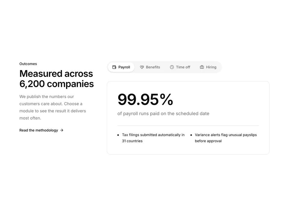
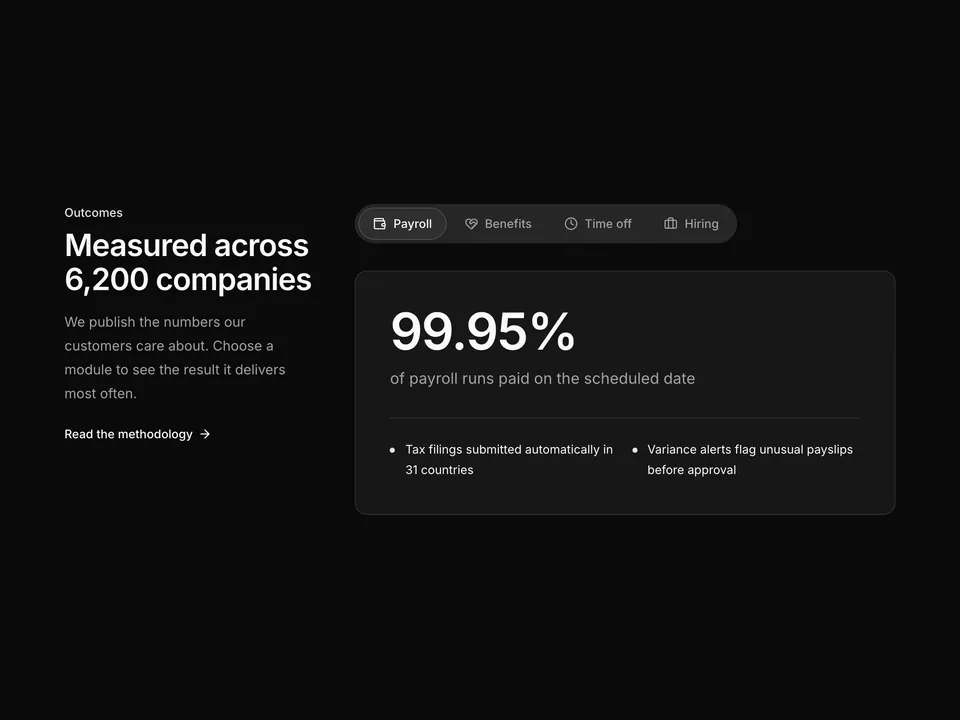
    title: 'Run payroll in 31 countries from one screen',
    description:
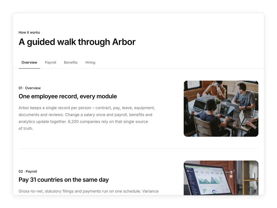
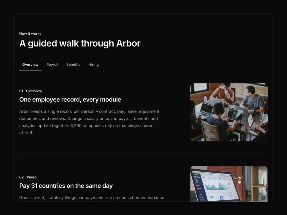
      'Arbor calculates gross-to-net, files local taxes and pays every employee and contractor on the same day – without a spreadsheet in sight.',
    bullets: [
      'Automatic tax filings and year-end forms',
      'Off-cycle runs and corrections in two clicks',
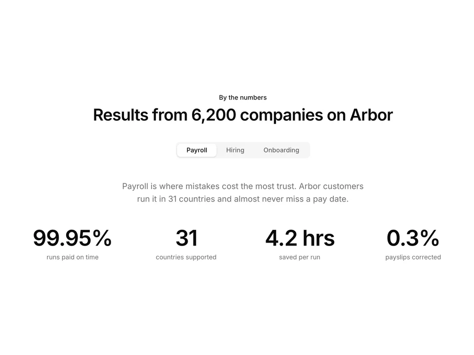
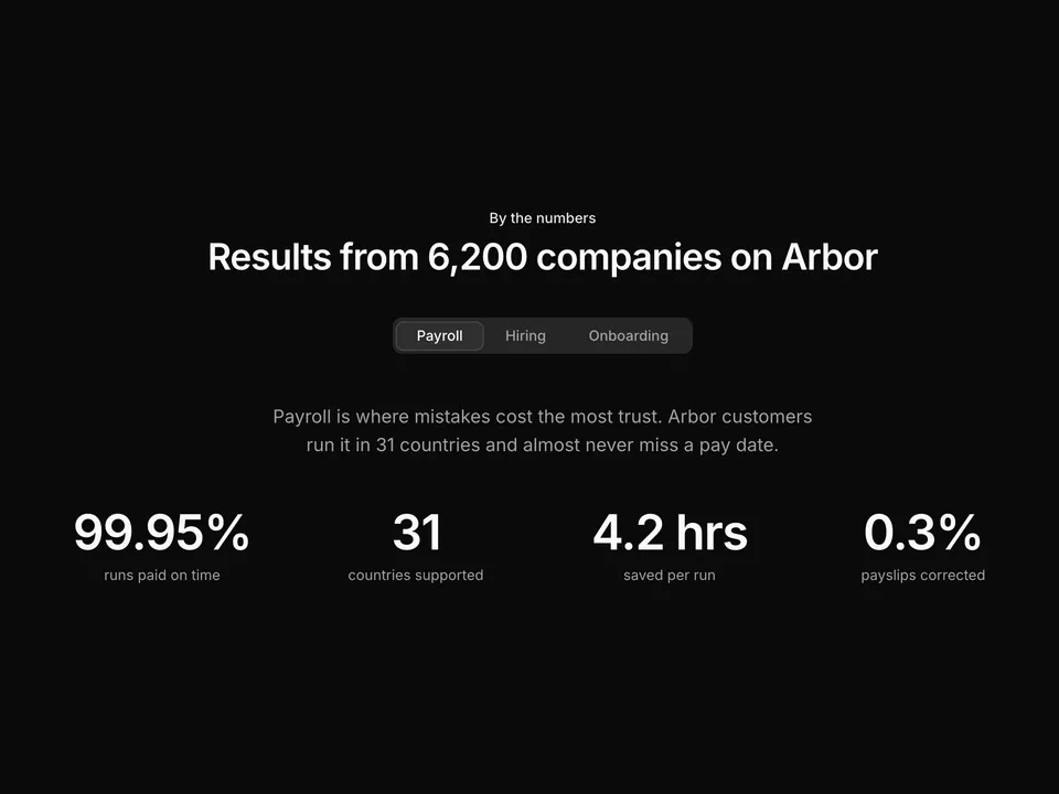
      '99.95% of payroll runs land on time',
    ],
    image:
      'https://images.unsplash.com/photo-1460925895917-afdab827c52f?auto=format&fit=crop&w=800&q=80',
    alt: 'Payroll analytics dashboard on a laptop',
  },
  {
    value: 'benefits',
    label: 'Benefits',
    title: 'Benefits your team actually understands',
    description:
      'Compare plans side by side, enrol new hires automatically and sync deductions to payroll so nothing is billed twice.',
    bullets: [
      'Health, dental, pension and commuter plans',
      'Open enrolment with guided plan comparison',
      'Deductions flow straight into payroll',
    ],
    image:
      'https://images.unsplash.com/photo-1543269865-cbf427effbad?auto=format&fit=crop&w=800&q=80',
    alt: 'Colleagues laughing together in an office',
  },
  {
    value: 'time-off',
    label: 'Time off',
    title: 'Leave policies that follow local rules',
    description:
      'Set accrual rules once per country or team. Requests route to the right manager and balances update in payroll automatically.',
    bullets: [
      'Country-aware public holidays and accruals',
      'Approve from chat, email or mobile',
      'Shared team calendar with coverage warnings',
    ],
    image:
      'https://images.unsplash.com/photo-1507525428034-b723cf961d3e?auto=format&fit=crop&w=800&q=80',
    alt: 'Quiet beach at golden hour',
  },
  {
    value: 'hiring',
    label: 'Hiring',
    title: 'From job post to signed offer in one flow',
    description:
      'Publish roles to 20+ job boards, score candidates together and send offers that turn into employee records the moment they are signed.',
    bullets: [
      'Structured scorecards for every interview',
      'Offer letters with e-signature built in',
      'Hired candidates become onboarding tasks',
    ],
    image:
      'https://images.unsplash.com/photo-1556761175-5973dc0f32e7?auto=format&fit=crop&w=800&q=80',
    alt: 'Team discussing candidates around a table',
  },
];

/**
 * Centred heading over default shadcn Tabs for four HR modules; each panel splits into copy with three Check bullets and a rounded photo frame.
 */
export default function Tabs01() {
  return (
    <section className="w-full py-16 sm:py-24">
      <div className="mx-auto w-full max-w-6xl px-6">
        <div className="mx-auto max-w-2xl text-center">
          <p className="font-medium text-primary text-sm">Platform</p>
          <h2 className="mt-2 text-balance font-semibold text-3xl text-foreground tracking-tight sm:text-4xl">
            Everything HR, connected in one place
          </h2>
          <p className="mt-4 text-pretty text-lg text-muted-foreground">
            6,200 growing companies run people operations on Arbor. Pick a
            module to see how it fits together.
          </p>
        </div>

        <Tabs className="mt-12 gap-10" defaultValue="payroll">
          <TabsList className="mx-auto">
            {modules.map((module) => (
              <TabsTrigger
                className="px-4"
                key={module.value}
                value={module.value}
              >
                {module.label}
              </TabsTrigger>
            ))}
          </TabsList>

          {modules.map((module) => (
            <TabsContent key={module.value} value={module.value}>
              <div className="grid grid-cols-1 items-center gap-10 md:grid-cols-2 lg:gap-16">
                <div>
                  <h3 className="text-balance font-semibold text-2xl text-foreground tracking-tight">
                    {module.title}
                  </h3>
                  <p className="mt-4 text-pretty text-muted-foreground leading-7">
                    {module.description}
                  </p>
                  <ul className="mt-6 space-y-3">
                    {module.bullets.map((bullet) => (
                      <li
                        className="flex items-start gap-3 text-foreground text-sm"
                        key={bullet}
                      >
                        <span className="mt-0.5 flex size-5 shrink-0 items-center justify-center rounded-full bg-primary/10 text-primary">
                          <CheckIcon aria-hidden="true" className="size-3" />
                        </span>
                        {bullet}
                      </li>
                    ))}
                  </ul>
                </div>
                <div className="overflow-hidden rounded-xl border bg-muted p-2">
                  <img
                    alt={module.alt}
                    className="aspect-[4/3] w-full rounded-lg object-cover"
                    loading="lazy"
                    src={module.image}
                  />
                </div>
              </div>
            </TabsContent>
          ))}
        </Tabs>
      </div>
    </section>
  );
}