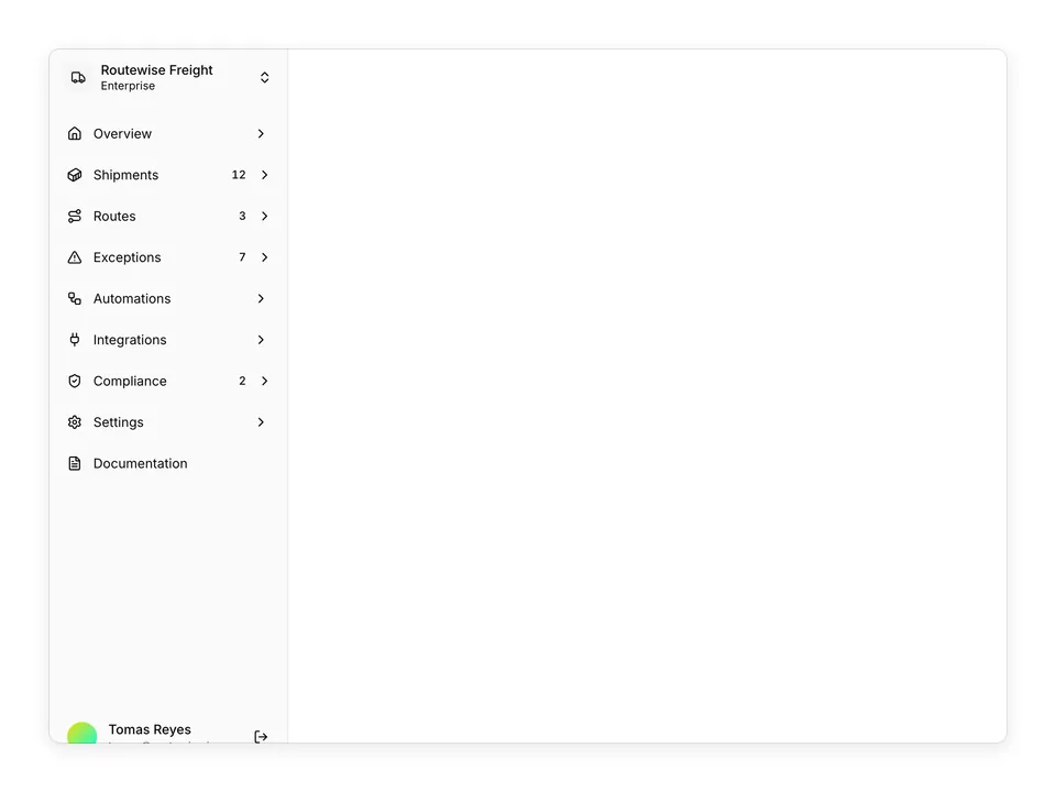
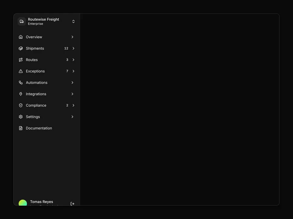
'use client';

import * as React from 'react';
import {
  BellRingIcon,
  CalendarIcon,
  CalendarRangeIcon,
  CircleCheckIcon,
  LayoutDashboardIcon,
  ListChecksIcon,
  MegaphoneIcon,
  NewspaperIcon,
  NotebookIcon,
  PackageIcon,
  WrenchIcon,
} from 'lucide-react';
import { Sidebar, SidebarContent } from '@/components/ui/sidebar';
import { NavCollapsible } from '@/components/sidebar-01/nav-collapsible';
import { NavFooter } from '@/components/sidebar-01/nav-footer';
import { NavHeader } from '@/components/sidebar-01/nav-header';
import { NavMain } from '@/components/sidebar-01/nav-main';
import type { SidebarData } from '@/components/sidebar-01/types';

const data: SidebarData = {
  user: {
    name: 'Lena Okafor',
    email: 'lena@routewise.io',
    avatar: 'https://avatar.vercel.sh/lena-okafor',
  },
  navMain: [
    {
      id: 'overview',
      title: 'Overview',
      url: '#',
      icon: LayoutDashboardIcon,
      isActive: true,
    },
    {
      id: 'shipments',
      title: 'Shipments',
      url: '#',
      icon: ListChecksIcon,
    },
    {
      id: 'dispatch',
      title: 'Dispatch board',
      url: '#',
      icon: CalendarRangeIcon,
    },
    {
      id: 'notes',
      title: 'Notes',
      url: '#',
      icon: NotebookIcon,
    },
    {
      id: 'calendar',
      title: 'Calendar',
      url: '#',
      icon: CalendarIcon,
    },
    {
      id: 'delivered',
      title: 'Delivered',
      url: '#',
      icon: CircleCheckIcon,
    },
    {
      id: 'notifications',
      title: 'Notifications',
      url: '#',
      icon: BellRingIcon,
    },
  ],
  navCollapsible: {
    favorites: [
      {
        id: 'warehouse-ops',
        title: 'Warehouse ops',
        href: '#',
        color: 'bg-chart-1',
      },
      {
        id: 'cold-chain',
        title: 'Cold chain',
        href: '#',
        color: 'bg-chart-2',
      },
      {
        id: 'returns',
        title: 'Returns desk',
        href: '#',
        color: 'bg-chart-3',
      },
      {
        id: 'customs',
        title: 'Customs filings',
        href: '#',
        color: 'bg-chart-4',
      },
    ],
    teams: [
      {
        id: 'fleet-maintenance',
        title: 'Fleet maintenance',
        icon: WrenchIcon,
      },
      {
        id: 'carrier-relations',
        title: 'Carrier relations',
        icon: MegaphoneIcon,
      },
    ],
    topics: [
      {
        id: 'release-notes',
        title: 'Release notes',
        icon: PackageIcon,
      },
      {
        id: 'network-updates',
        title: 'Network updates',
        icon: NewspaperIcon,
      },
    ],
  },
};

export function AppSidebar({ ...props }: React.ComponentProps<typeof Sidebar>) {
  return (
    <Sidebar {...props}>
      <NavHeader data={data} />
      <SidebarContent>
        <NavMain items={data.navMain} />
        <NavCollapsible
          favorites={data.navCollapsible.favorites}
          teams={data.navCollapsible.teams}
          topics={data.navCollapsible.topics}
        />
      </SidebarContent>
      <NavFooter user={data.user} />
    </Sidebar>
  );
}