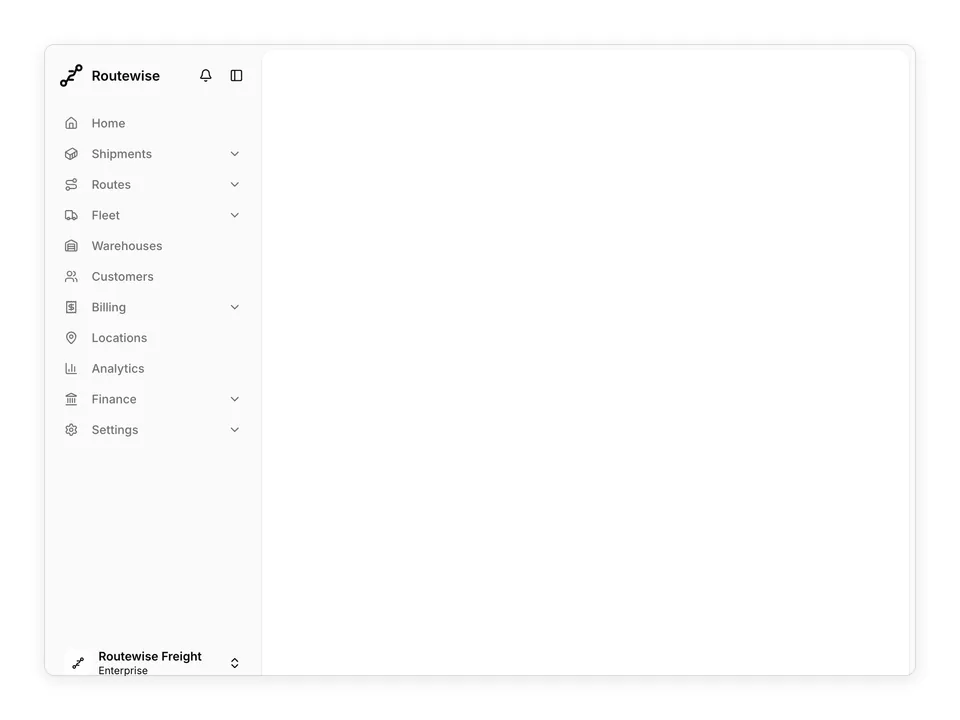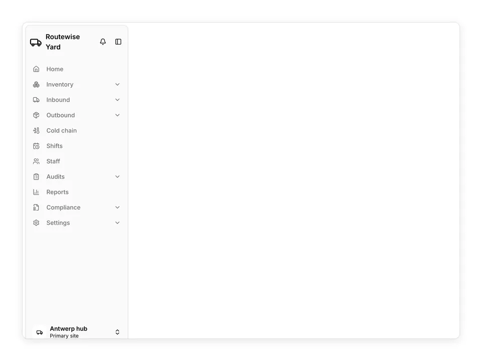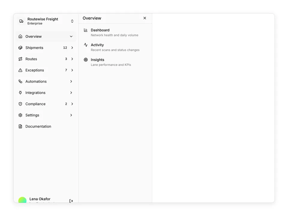
BlocksSidebarTwo-column mail client with folder nav and message list

shadcn/ui Sidebar blockTwo-column mail client with folder nav and message list

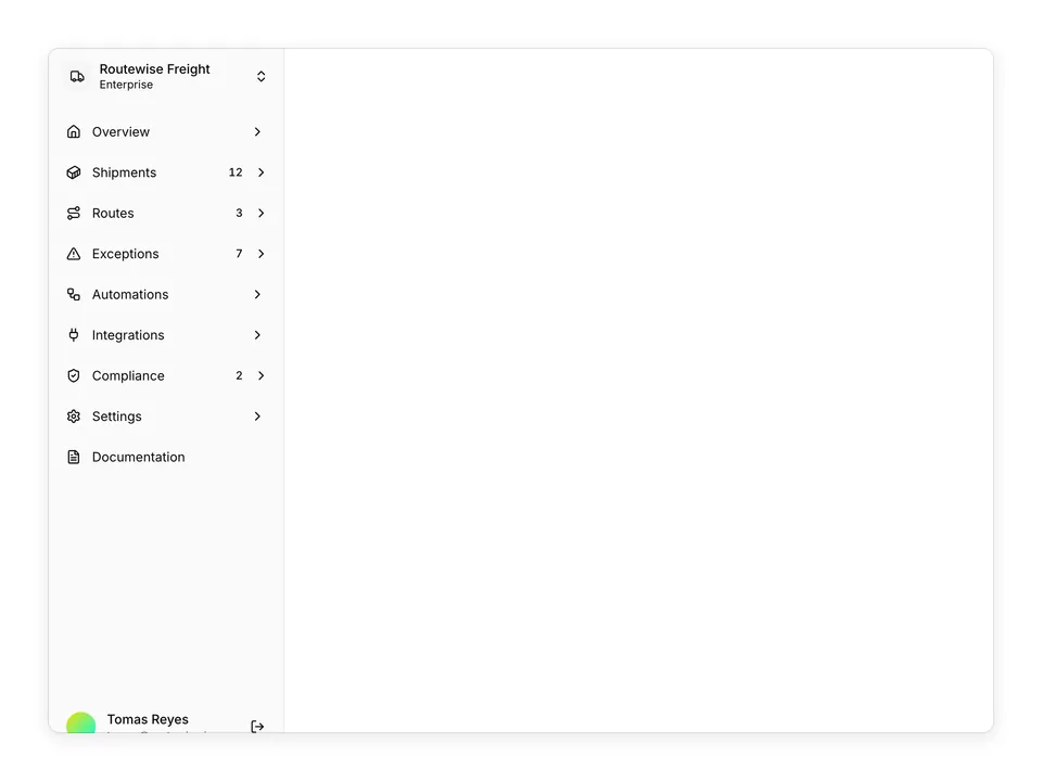
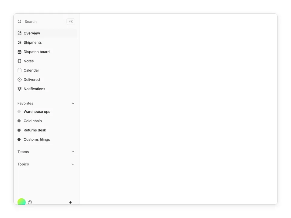
A mail-client layout composed of two non-collapsible shadcn/ui Sidebar instances: a narrow folder sidebar with SidebarMenu, label swatches and a user DropdownMenu with Avatar, and a wider message-list sidebar with SidebarInput search and selectable items. Selecting a message renders a preview pane inside SidebarInset via React context. Perfect for inboxes, ticket queues and any master-detail reading experience.

Pro@shadcnpro/sidebar-04

Preview

Installation

Part of shadcn/ui Pro

Pro unlocks the source code and one-command install of all 439 blocks, plus the Figma kit, themes and the MCP server for your AI editor.

Let your AI editor install it

The shadcn/ui Pro MCP server lets Cursor, Claude Code and VS Code find and install blocks like Two-column mail client with folder nav and message list from one prompt. It is included in every Pro plan.

Add the shadcn/ui components

Two-column mail client with folder nav and message list uses Avatar, Dropdown Menu and Sidebar.

npx shadcn@latest add avatar dropdown-menu sidebar

Install the npm packages

npm install lucide-react

Copy the code

Paste it into components/sidebar-04/app-sidebar.tsx.

components/sidebar-04/app-sidebar.tsx

Part of shadcn/ui Pro

Pro unlocks the source code and one-command install of all 439 blocks, plus the Figma kit, themes and the MCP server for your AI editor.

Use it

Multi-file block: 4 files are installed under components/sidebar-04/.

Usage
import { AppSidebar } from '@/components/sidebar-04/app-sidebar';
<AppSidebar />

Overview

Two-column mail client with folder nav and message list is a Pro sidebar block for shadcn/ui. It is built from the Avatar, Dropdown Menu and Sidebar components with lucide-react, and installs as 4 files you own and can edit.

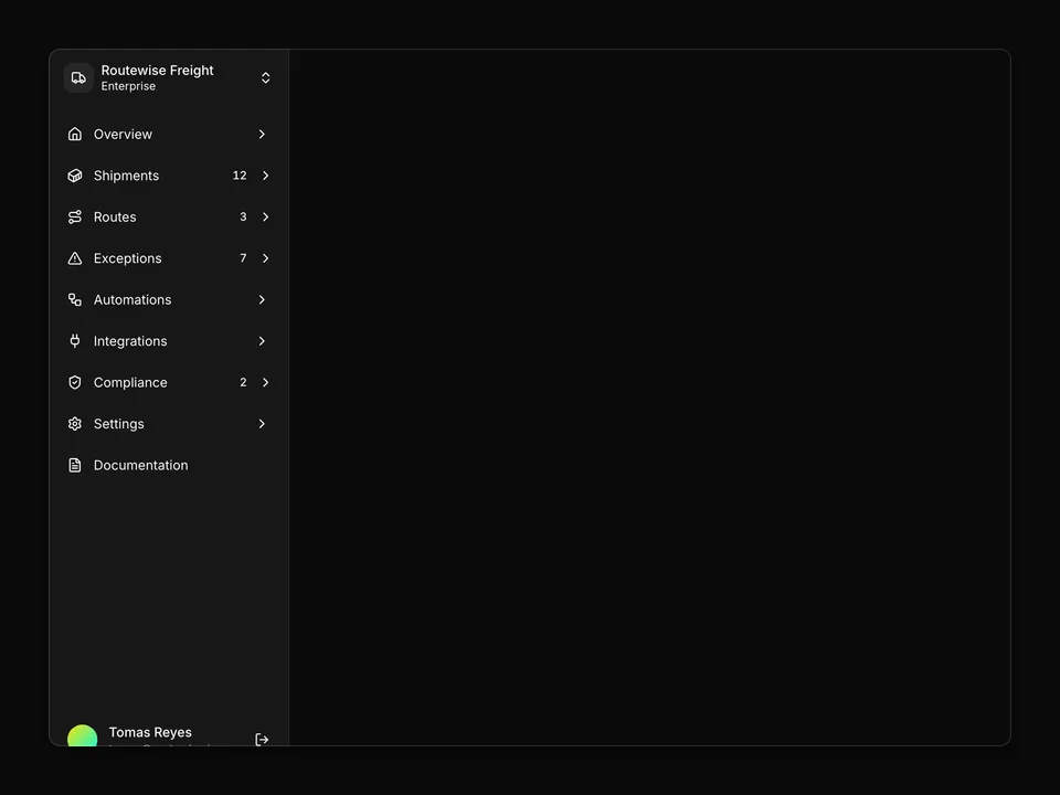
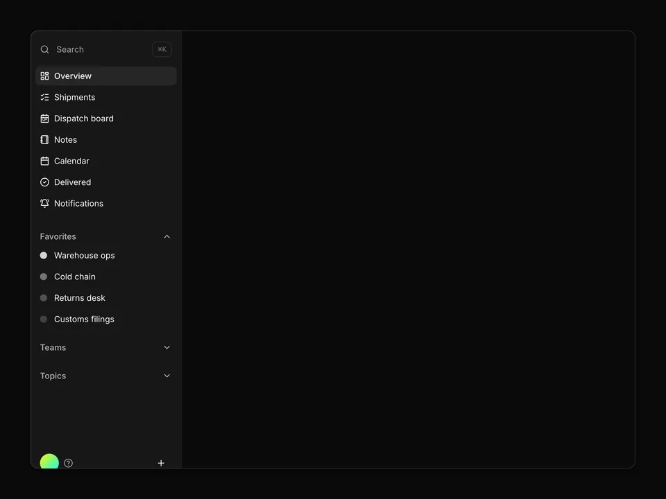
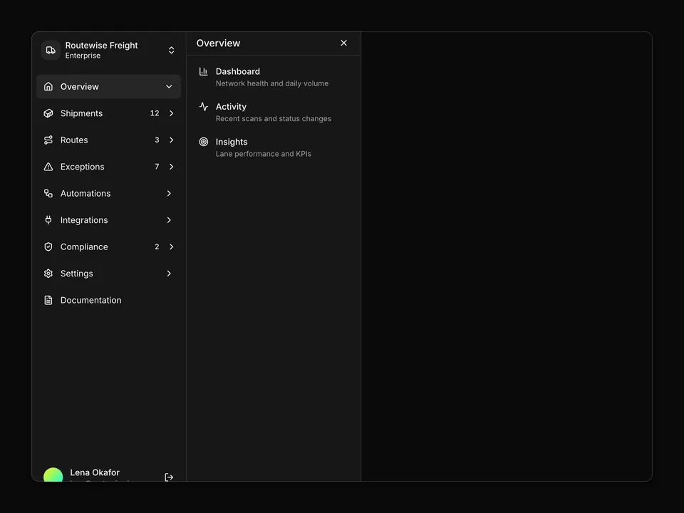
It only uses semantic tokens such as bg-background, text-muted-foreground and border-border, so it follows your theme, radius and fonts and switches with dark mode. It is responsive from desktop to mobile; the width controls above the preview show each size. The same layout is in the shadcn/ui Pro Figma kit, so design and code start from one source.

Category
Sidebar
Component library
Radix UI (radix-ui)
Also available for
Base UI, React Aria
npm packages
lucide-react
Files
4 files in components/sidebar-04/
Access
Included in every plan

Frequently asked questions

Pricing, installation and Radix UI details for Two-column mail client with folder nav and message list.