 Free

404
404
Production-ready 404 and error page blocks for shadcn/ui. Empty states and not-found layouts from the shadcn/ui Pro kit.
shadcn/ui
ProA seven-tile impact bento for shadcn/ui: a double-size photo tile with a dark overlay headline, two big-number stat tiles (one with a Progress bar), a muted quote tile with Avatar, two icon tiles including a tiny bar sparkline, and an inverted bg-primary CTA tile with a secondary Button and three check items. Four columns with fixed 11rem rows on desktop, two columns on tablet, a single stack on mobile. Good for sustainability, impact or results sections.
@shadcnpro/bento-grid-01npx shadcn@latest add @shadcnpro/bento-grid-01First time? Add the @shadcnpro registry to components.json as shown in Installation. Free blocks install without a license key.
Let your AI editor install it
The shadcn/ui Pro MCP server lets Cursor, Claude Code and VS Code find and install blocks like Impact bento with photo, stats and CTA from one prompt. It is included in every Pro plan.
Impact bento with photo, stats and CTA uses Avatar, Button and Progress.
npx shadcn@latest add avatar button progressnpm install lucide-reactPaste it into components/blocks/bento-grid-01.tsx.
'use client';

import {
  BatteryChargingIcon,
  CheckIcon,
  LeafIcon,
  ShieldCheckIcon,
} from 'lucide-react';

import { Avatar, AvatarFallback, AvatarImage } from '@/components/ui/avatar';
import { Button } from '@/components/ui/button';
import { Progress } from '@/components/ui/progress';

const sparkline = [38, 52, 46, 64, 58, 72, 66, 84, 78, 90, 86, 100];

const ctaPoints = [
  'Results within 48 hours',
  'Fixed all-in quote',
  'No sales visit required',
];

/**
 * Impact bento: a double-size photo tile, two stat tiles (one with a Progress bar), a quote tile, two icon tiles and an inverted CTA tile.
 */
export default function BentoGrid01() {
  return (
    <section className="w-full py-16 sm:py-24">
      <div className="mx-auto w-full max-w-6xl px-6">
        <div className="flex flex-col gap-4 md:flex-row md:items-end md:justify-between">
          <div className="max-w-xl">
            <p className="font-medium text-primary text-sm">Our impact</p>
            <h2 className="mt-2 text-balance font-semibold text-3xl text-foreground tracking-tight sm:text-4xl">
              What rooftop solar has changed so far
            </h2>
          </div>
          <p className="max-w-sm text-pretty text-muted-foreground text-sm">
            Every figure below comes from the homes we have connected since
            2019 and is updated at the end of each quarter.
          </p>
        </div>

        <div className="mt-12 grid grid-cols-1 gap-4 sm:grid-cols-2 md:auto-rows-[11rem] md:grid-cols-4">
          <div className="relative min-h-72 overflow-hidden rounded-xl border bg-card sm:col-span-2 md:col-span-2 md:row-span-2">
            <img
              alt="Family home with solar panels at dusk"
              className="absolute inset-0 size-full object-cover"
              loading="lazy"
              src="https://images.unsplash.com/photo-1600047509807-ba8f99d2cdde?auto=format&fit=crop&w=1200&q=80"
            />
            <div className="absolute inset-x-0 bottom-0 bg-black/60 p-6 text-white">
              <p className="font-semibold text-4xl tracking-tight sm:text-5xl">
                12,400 homes
              </p>
              <p className="mt-2 text-sm text-white/80">
                running on their own roof, from Gdańsk to Wrocław.
              </p>
            </div>
          </div>

          <div className="flex flex-col justify-between gap-4 overflow-hidden rounded-xl border bg-card p-5 md:col-span-1">
            <div className="flex items-start justify-between gap-4">
              <p className="font-semibold text-4xl text-foreground tracking-tight">
                48,000 t
              </p>
              <LeafIcon
                aria-hidden="true"
                className="size-4 shrink-0 text-primary"
              />
            </div>
            <p className="text-pretty text-muted-foreground text-sm leading-6">
              CO₂ avoided every year
            </p>
          </div>

          <div className="flex flex-col justify-between gap-4 overflow-hidden rounded-xl border bg-card p-5 md:col-span-1">
            <p className="font-semibold text-4xl text-foreground tracking-tight">
              71%
            </p>
            <div>
              <Progress
                aria-label="Average electricity bill reduction: 71 percent"
                value={71}
              />
              <p className="mt-3 text-pretty text-muted-foreground text-sm leading-6">
                average electricity bill reduction
              </p>
            </div>
          </div>

          <figure className="flex flex-col justify-between gap-4 overflow-hidden rounded-xl border bg-muted p-5 sm:col-span-2 md:col-span-2">
            <blockquote className="text-pretty text-foreground text-sm leading-6 sm:text-base">
              “Our first full month on Halo was €9 of grid electricity. The app
              shows exactly where every kilowatt went.”
            </blockquote>
            <figcaption className="flex items-center gap-3">
              <Avatar>
                <AvatarImage
                  alt="Marta Kowalczyk"
                  src="https://avatar.vercel.sh/marta-kowalczyk"
                />
                <AvatarFallback>MK</AvatarFallback>
              </Avatar>
              <div className="min-w-0 text-xs">
                <p className="font-medium text-foreground">Marta Kowalczyk</p>
                <p className="text-muted-foreground">Homeowner, Gdańsk</p>
              </div>
            </figcaption>
          </figure>

          <div className="flex flex-col justify-between gap-4 overflow-hidden rounded-xl border bg-card p-5 md:col-span-1">
            <span className="flex size-10 items-center justify-center rounded-lg bg-primary/10 text-primary">
              <ShieldCheckIcon aria-hidden="true" className="size-5" />
            </span>
            <div>
              <h3 className="font-semibold text-foreground">25-year warranty</h3>
              <p className="mt-1 text-muted-foreground text-sm leading-6">
                on every panel we fit.
              </p>
            </div>
          </div>

          <div className="flex flex-col justify-between gap-4 overflow-hidden rounded-xl border bg-card p-5 md:col-span-1">
            <div className="flex items-start justify-between gap-4">
              <span className="flex size-10 items-center justify-center rounded-lg bg-primary/10 text-primary">
                <BatteryChargingIcon aria-hidden="true" className="size-5" />
              </span>
              <div
                aria-hidden="true"
                className="flex h-10 items-end gap-0.5"
              >
                {sparkline.map((height, index) => (
                  <span
                    className="w-1 rounded-full bg-primary/40"
                    key={index}
                    style={{ height: `${height}%` }}
                  />
                ))}
              </div>
            </div>
            <div>
              <h3 className="font-semibold text-foreground">18h backup</h3>
              <p className="mt-1 text-muted-foreground text-sm leading-6">
                average battery runtime during an outage.
              </p>
            </div>
          </div>

          <div className="flex flex-col justify-between gap-4 overflow-hidden rounded-xl border border-primary bg-primary p-5 text-primary-foreground sm:col-span-2 md:col-span-2">
            <div>
              <h3 className="text-balance font-semibold text-xl tracking-tight">
                Get a free roof assessment
              </h3>
              <p className="mt-1 text-pretty text-primary-foreground/80 text-sm leading-6">
                A satellite scan tells you what your roof could generate.
              </p>
            </div>
            <div className="flex flex-col gap-4 sm:flex-row sm:items-end sm:justify-between">
              <ul className="flex flex-wrap gap-x-4 gap-y-1 text-primary-foreground/80 text-xs">
                {ctaPoints.map((point) => (
                  <li className="flex items-center gap-1.5" key={point}>
                    <CheckIcon aria-hidden="true" className="size-3.5 shrink-0" />
                    <span>{point}</span>
                  </li>
                ))}
              </ul>
              <Button
                className="shrink-0 self-start sm:self-auto"
                size="sm"
                type="button"
                variant="secondary"
              >
                Start assessment
              </Button>
            </div>
          </div>
        </div>
      </div>
    </section>
  );
}
Import it where you need it and update the import path to match your project.
import BentoGrid01 from '@/components/blocks/bento-grid-01';

export default function Page() {
  return <BentoGrid01 />;
}Impact bento with photo, stats and CTA is a free bento grid block for shadcn/ui. It is built from the Avatar, Button and Progress components with lucide-react, and installs as a single file you own and can edit.
It only uses semantic tokens such as bg-background, text-muted-foreground and border-border, so it follows your theme, radius and fonts and switches with dark mode. It is responsive from desktop to mobile; the width controls above the preview show each size. The same layout is in the shadcn/ui Pro Figma kit, so design and code start from one source.
Free404
Production-ready 404 and error page blocks for shadcn/ui. Empty states and not-found layouts from the shadcn/ui Pro kit.
 Free
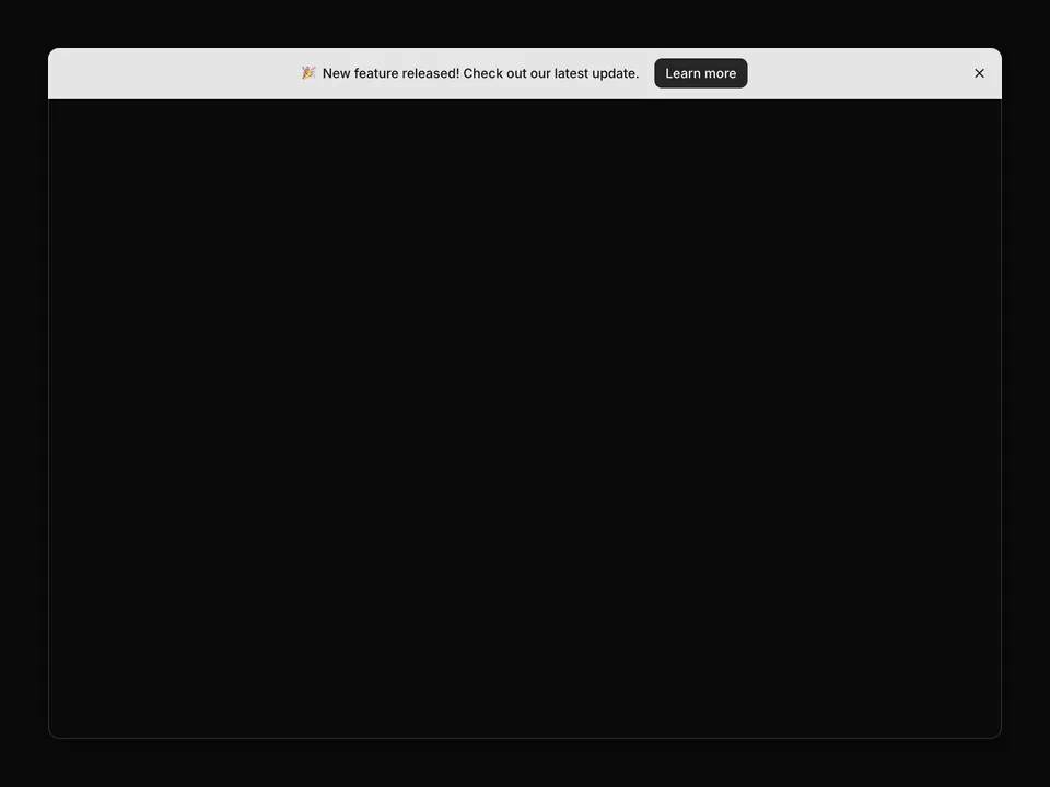
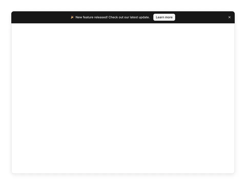
Banners
Ready-to-use banner and announcement bar blocks for shadcn/ui. Promotional ribbons, alerts, and notification bars from the shadcn figma design kit.
 Free
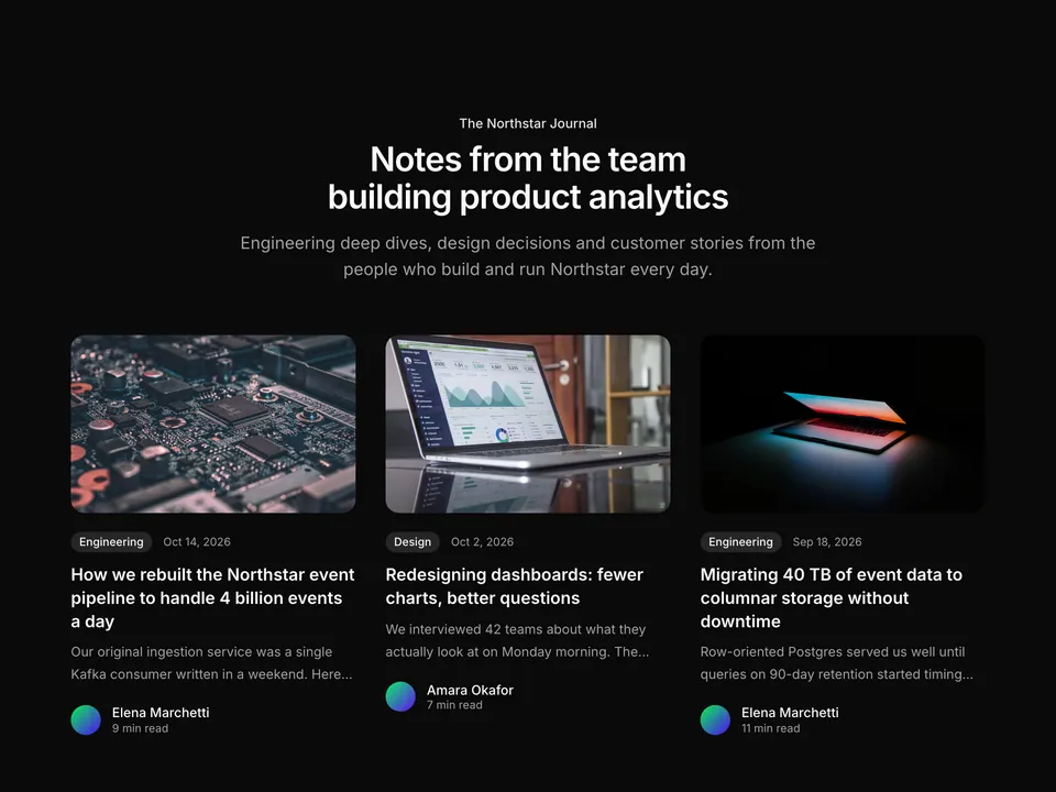
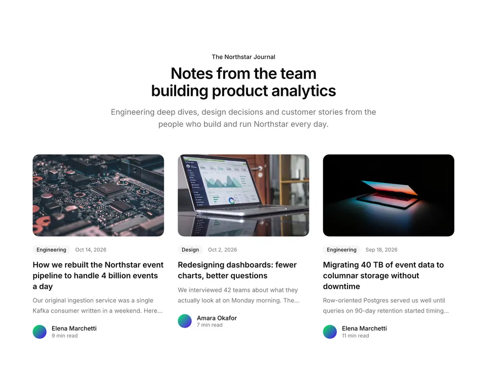
Blog
Classic blog listing section for shadcn/ui with a centred heading and lead above a responsive three-column grid of six post cards. Each card combines a cover image, a category Badge with the publish date, a two-line excerpt and an Avatar author row with read time. A dependable default for any company blog index.
 Free
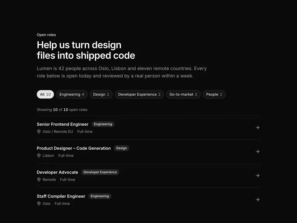
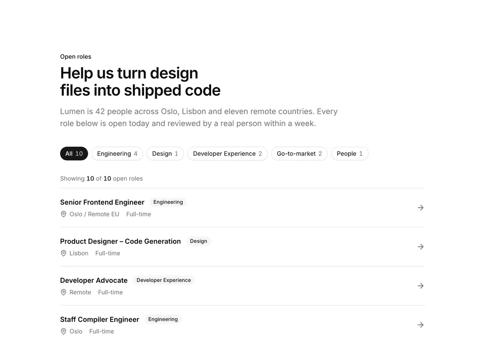
Careers
Careers listing built with shadcn/ui Button chips and Badge. A heading and lead sit above a row of department filter pills with live counts, and a divided list of role rows shows the title, department Badge, MapPin location, contract type and an arrow. Good as the main jobs board on a careers page.
 Free
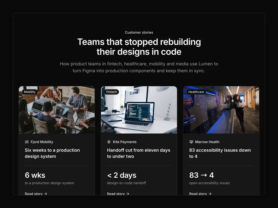
Case studies
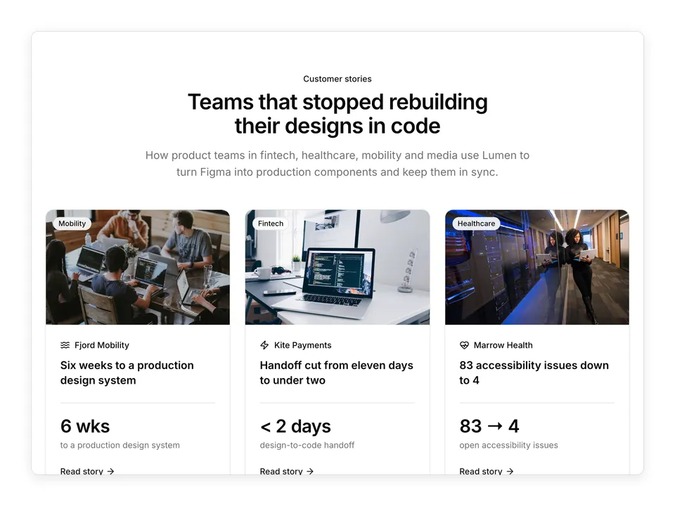
Customer story grid for shadcn/ui: a centred heading stack over six Cards, each with a cover photo, an industry Badge floating on the image, a lucide wordmark, a story title, one large tabular headline metric with its label and a "Read story" arrow link that covers the whole card. Collapses to two columns on tablets and one on phones. The default customers index for a product marketing site.
 Free
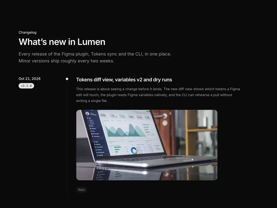
Changelog
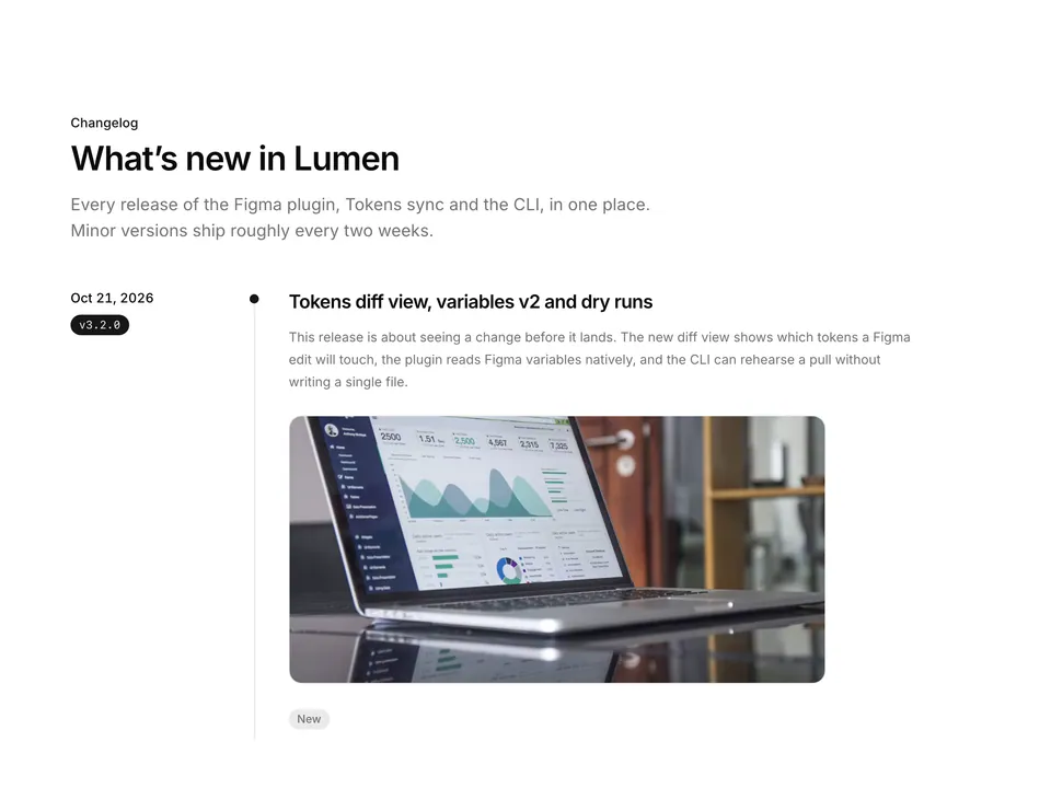
Release timeline for shadcn/ui: four entries on a dotted vertical rail, each with a sticky date and mono version Badge column on the left and, on the right, a title, summary paragraph, optional screenshot and bullet lists grouped under tinted New, Improved, Fixed and Breaking Badges. Inline code spans are rendered from backticks. The classic long-form changelog page.
Pricing, installation and Radix UI details for Impact bento with photo, stats and CTA.
Yes. Impact bento with photo, stats and CTA (bento-grid-01) is one of the 62 free blocks in shadcn/ui Pro: the code is on this page and it installs with the shadcn CLI without a license key.
Add the @shadcnpro registry to components.json once, as described in Installation, then run npx shadcn@latest add @shadcnpro/bento-grid-01. The shadcn CLI writes components/blocks/bento-grid-01.tsx and adds the Avatar, Button and Progress components if your project does not have them yet. It is free, so no license key is needed.
Avatar, Button and Progress from shadcn/ui, plus the npm package lucide-react. Colors, radius and fonts come from semantic tokens such as bg-background and text-muted-foreground, so it follows your theme.
Yes. Besides this Radix UI version, Impact bento with photo, stats and CTA ships for Base UI (@shadcnpro/base/bento-grid-01) and React Aria (@shadcnpro/aria/bento-grid-01) with the same layout and copy. Plain @shadcnpro/bento-grid-01 installs the version that matches the style in your components.json.
Yes. It uses semantic classes such as bg-background, text-foreground and border-border, so it picks up your colors, radius and fonts and switches with dark mode. The theme menu above the preview shows it in the shadcn/ui Pro themes.
Yes. Every block has a matching frame in the shadcn/ui Pro Figma kit, so designers and developers start from the same layout and component names.
Yes. With the shadcn/ui Pro MCP server connected to Cursor, Claude Code or VS Code, ask: "Use shadcnpro to add bento-grid-01." The agent finds the block, shows its install command and runs it after you approve.